
RESEARCH - UX - UI - BRANDING
WasteNot
The brief
WasteNot is a mobile app for people who are interested in reducing their household food waste. The app features a grocery list, pantry inventory, and recipe finder. The focus of this project was creating an end-to-end design with the MVP of tracking expiration dates of items. This was a speculative (& hugely passionate) project.
ROLE: UX Researcher, UX/UI Designer, Brand lead
TIMELINE: November - February 2021
Challenge and goals
Challenge
How can people be encouraged to reduce their personal food waste impact via an app. How do we get people engaged and excited to make an impact?
Goals
The app must be an end-to-end design
It needs to be an MVP, focusing on at least one key feature done really well
It needs to be easy for users to track expiration dates
Users need to enter the least amount of information possible to get the job done
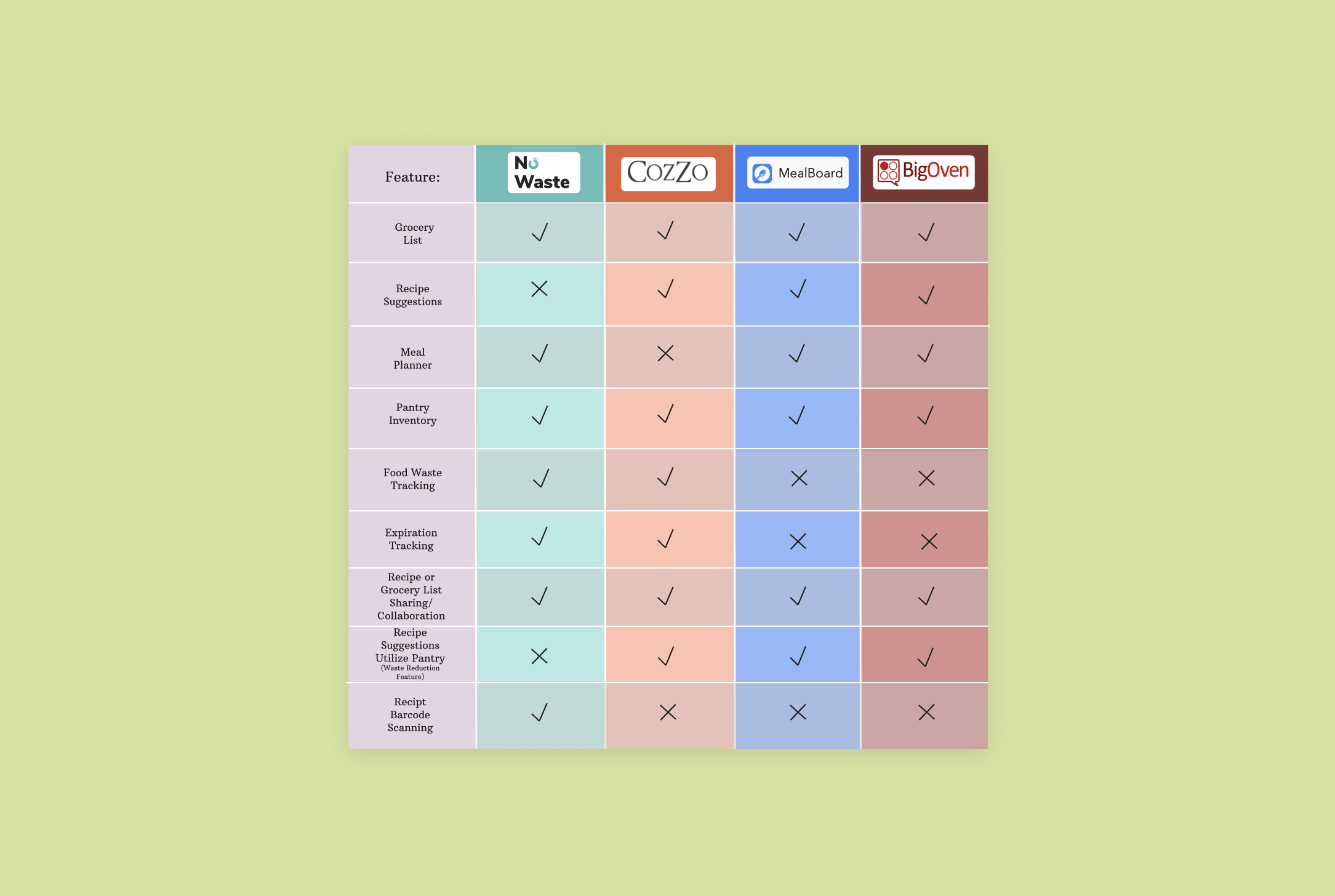
Competitor Analysis
The stakeholders sited Shotgun and Twitch as their top competitors and said they wanted to create messaging capabilities similar to those of Zoom. For further research, I included YouTube Live and Cercle as other live streaming platforms that I suspected I could learn from.
Opportunity space
Receipt barcode scanning is a rare feature
Attractive UI
Top-rated recipe options that include items from the pantry
Smooth transition from pantry to recipes in the app (without forwarding to another site’s page)
Emphasize creativity by using what you already have
User interviews
I interviewed 4 participants (aged 26-58) over the phone and focused my questions around grocery shopping, recipe searches, environmentalism and how participants currently keep track of what items they already have. I interviewed people who fit the persona of being at least relatively environmentally conscious.
Takeaways
Participants all wish they could reduce their own food waste further
Participants didn’t want to waste time on manually inputing all of their groceries.
Participants liked the idea of something that would keep track of inventory and expiration dates for them - ease of use is paramount
2 out of 4 participants wanted inspiration for recipes
All participants liked the idea of expiration notifications
Eating healthy and getting creative in the kitchen is important
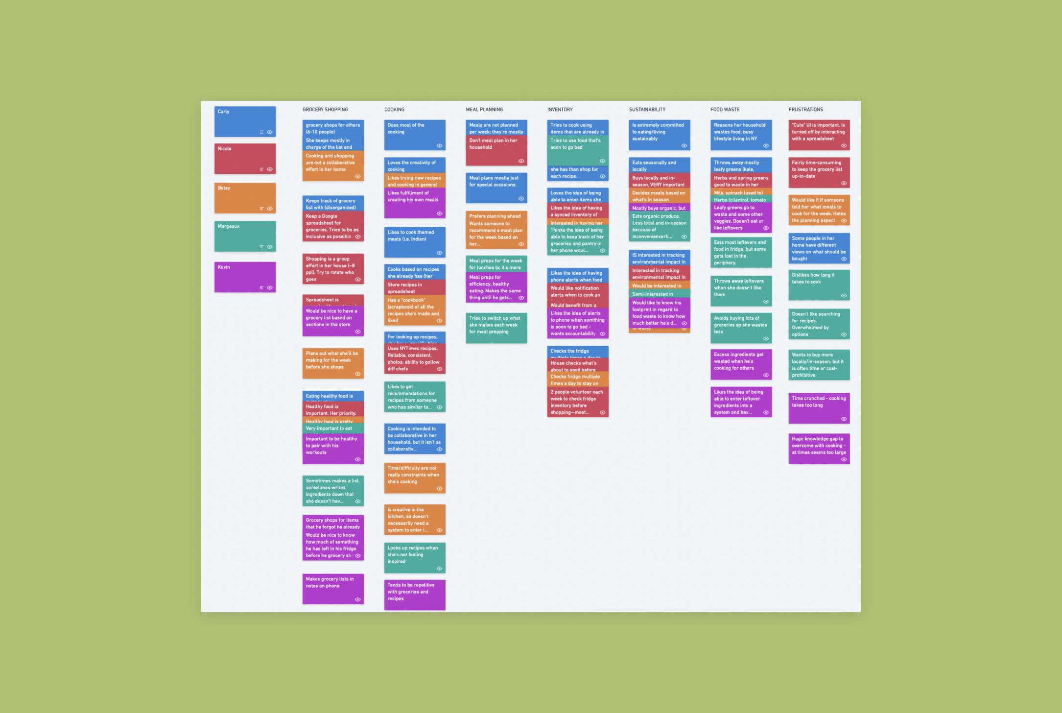
Affinity map
When my research interviews were complete, I used an affinity mapping exercise to compile all of the user feedback I received into specific categories and make the data more cohesive. I compiled the results by stacking similar points of feedback into categories. I received tons of information about what my participants’ grocery and meal habits and what aspects of sustainability they are most concerned with. This exercise was a great entry point into understanding the needs and views of potential users.
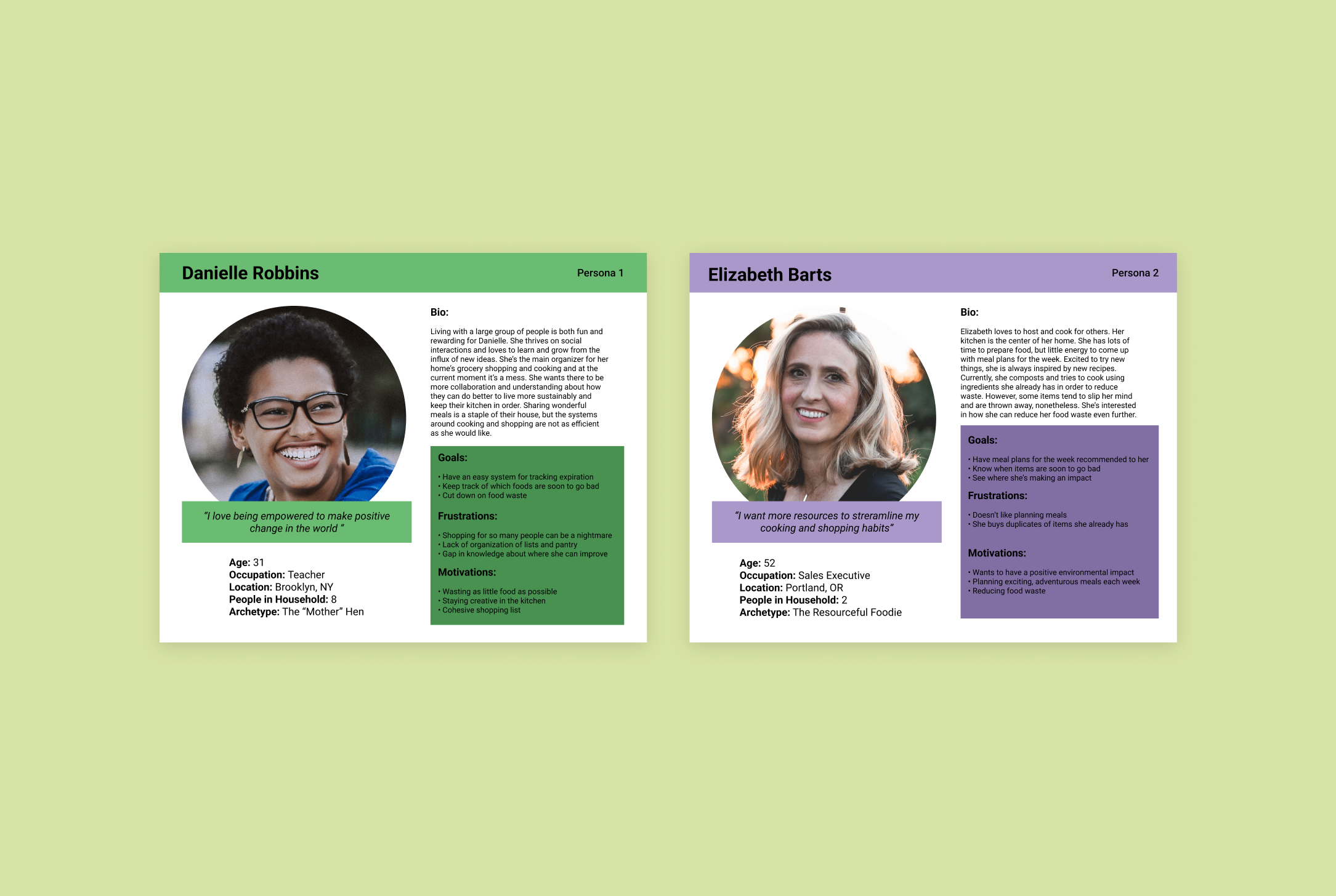
Personas
With both eco-consciousness and inflation on the uptick, people are seeking ways to reduce food waste in order to lessen their household impact on the environment and save money on groceries. Based on my interviews, I came up with two personas: Danielle and Elizabeth. These two encompass specific users that I think WasteNot would target best. The overarching goal of both personas is to cut down on food waste, but the two want to do so in different home environments. The activity of creating these personas was really useful toward zeroing in on the goals and frustrations of potential users.
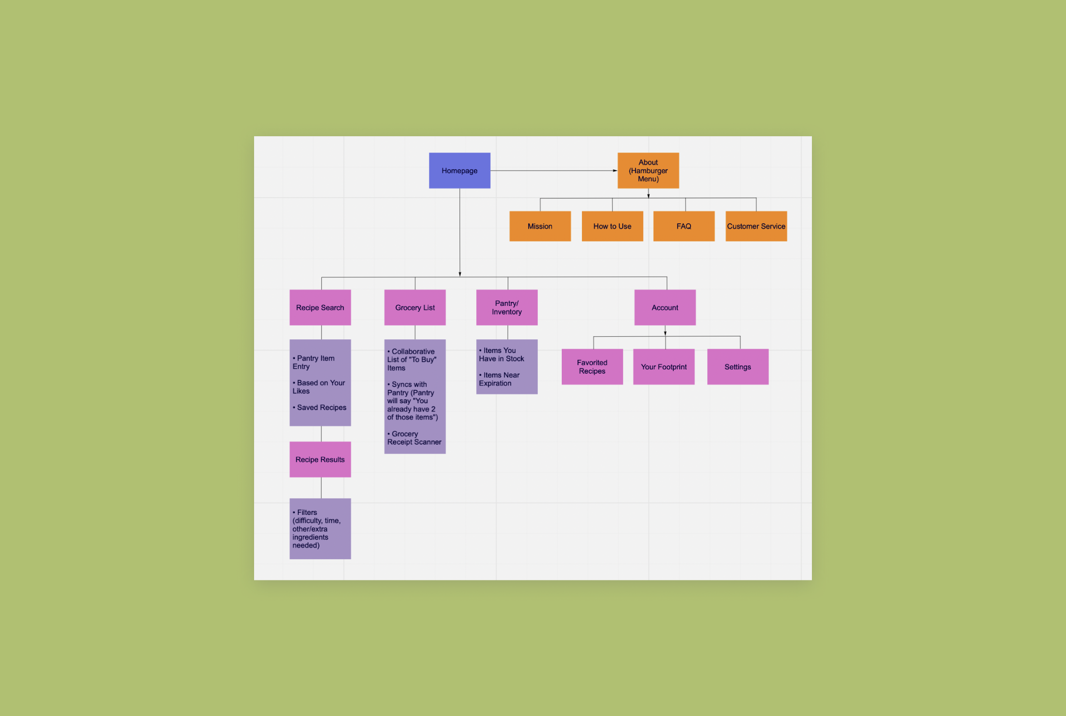
Sitemap
After researching people interested in the subject of food waste and discovering information about food waste and grocery apps, I came up with the sitemap below. The most important pages I wanted to focus on were the recipes page, grocery list, pantry, and the account page. In later phases, I’d nix the about page in favor of an onboarding process. After creating the sitemap, I focused most heavily on the pantry and grocery list. The functions in each of these pages would be the meat and potatoes of the app’s UX. Once I'd parsed that out, I was able to focus my attention on how to connect those pages to the function in the recipe page. Creating cross functions between these 3 pages was the most fun and complex part of creating this app.
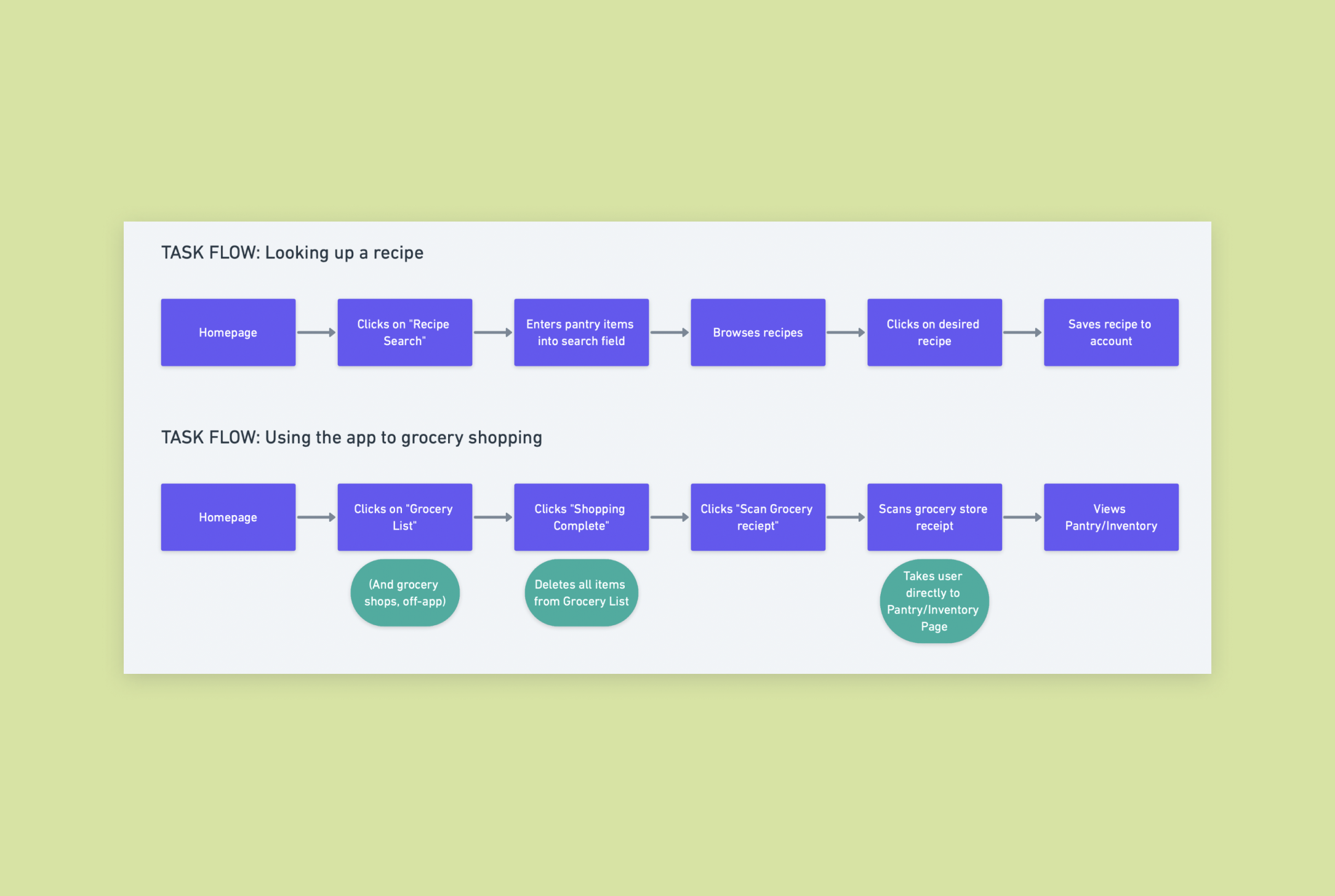
Task flow: the buying process
Based on my research, I came up with 2 main task flows for my app: looking up a recipe & using the app to grocery shop. In later steps in the design process, I realized that neither flow was the ideal flow to get the job done. Upon reflection, both flows had the user manually entering too much information. The onus in these flows was on the user to complete tasks. The high level of effort in the user’s hands meant that the drop-off rate of using the app would be high.
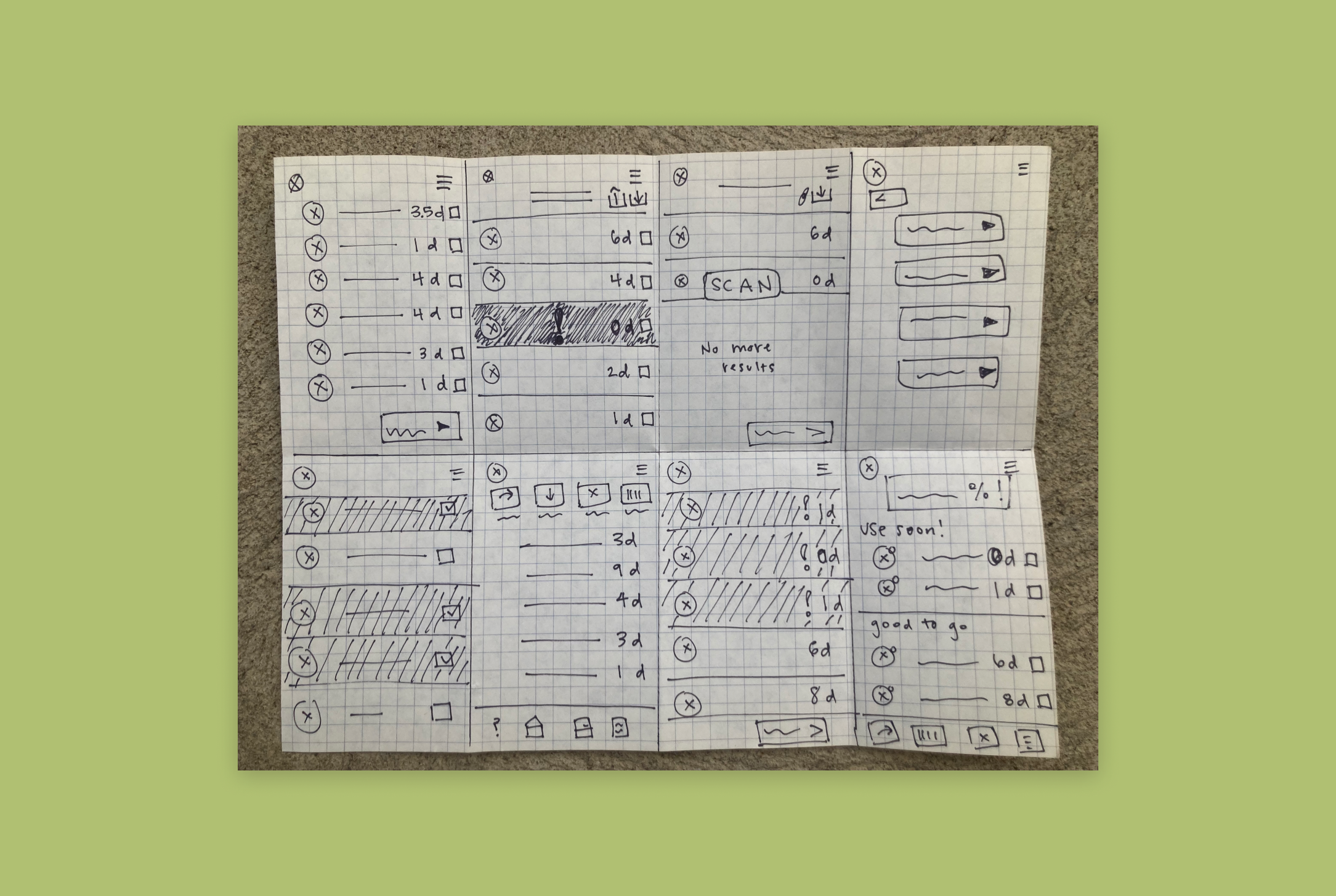
Sketching
I used an exercise where I made very quick sketch drafts of potential pantry page ideas. My goal for this stage was to try out different ideas to allow the user to track expiration dates and have options for editing their pantry list. The goal of this exercise was to sketch out as many possible solutions in 8 minutes (one minute per quadrant). The aim is quantity of ideas and really helps get my creative juices flowing.
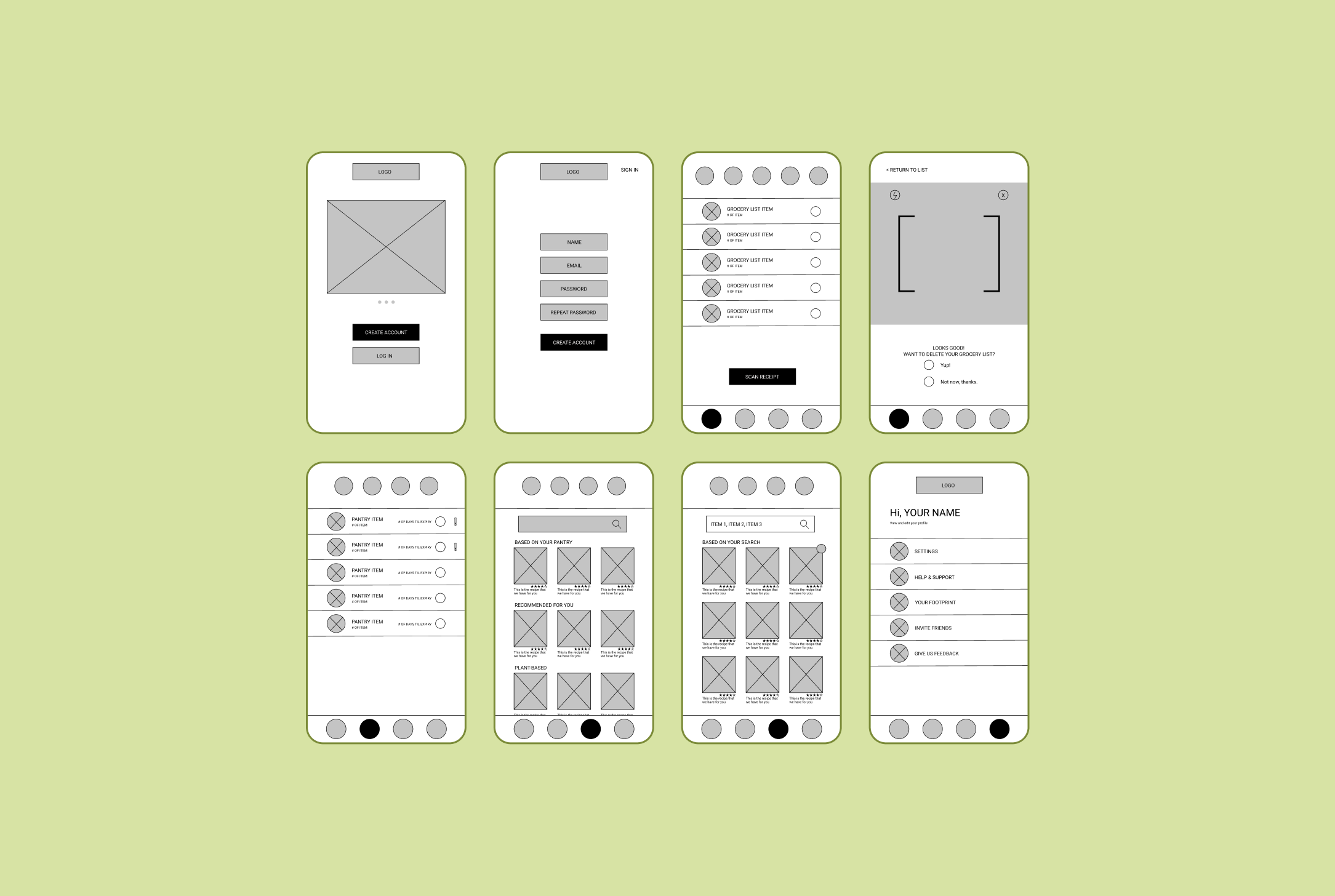
Wireframes
For the initial wireframes, I focused on mapping out the key elements of each of the 4 pages. I had a grocery list, pantry, recipe page and account page to envision. I also included a receipt scanner as function within the grocery list and pantry pages. To create these wireframes, I looked at many grocery and recipe apps and I browsed a lot online for design pattern inspiration.
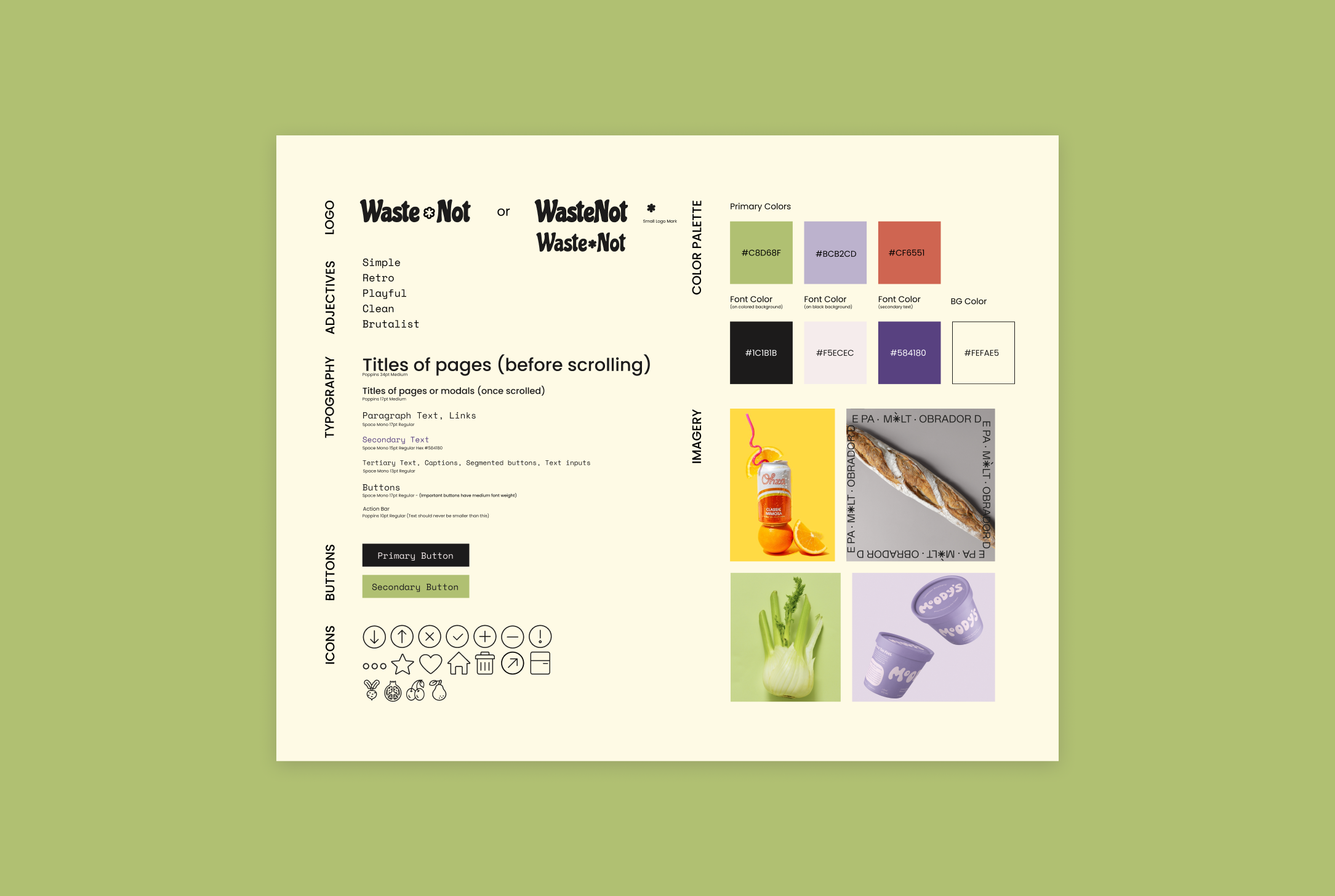
UI kit
I continued my design inspiration research to find out what style I wanted to reflect in the app. I imagined a fun, retro, funky kind of style. I wanted to incorporate a lot of green since the app is focusing on sustainability. The logo and branding of the app was meant to feel a bit hippie and definitely be playful and fun to use. Down the line, I’d change this UI kit significantly, but some items, such as the logo, stuck. Changing the style and visual elements of the app was a great learning process in not getting too attached to an idea or style. At first, this was a struggle for me, but by the end, I became obsessed with finding visual design inspiration and playing around with different styles.
Mid-fi prototype
With this prototype, I filled in the blanks of my wireframes and added the colors and stylistic elements that I’d chosen. Looking back, this prototype feels quite amateurish and lo-fi to a fault. I’m almost embarrassed to show this version, but compared to the end result of this project, I think it shows how far I’ve come as a designer and how willing I am to learn and improve my projects.
UI kit 2.0
After realizing that my initial prototype didn’t quite look like I’d hoped it would, I iterated upon the UI kit. I decided that the typography did not fit with the style at all. I changed the icons to be more uniform by using an icon family. I changed the colors and button styles and created a cleaner, less clunky looking app. Not being too attached to initial designs was the most important takeaway of this project. I let go of my initial designs and gave myself room to create something way better.
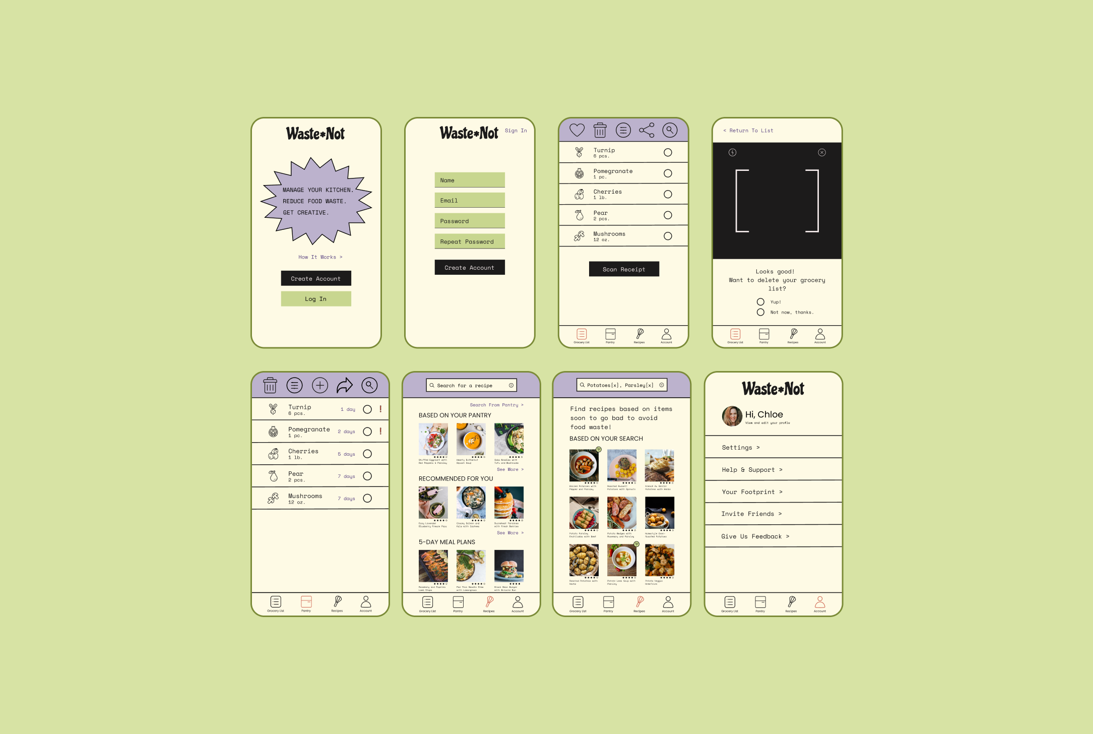
Hi-fi prototype
These are some of the most important screens I created. To view all the screens, click on the video prototype to see the app in action. In this version of the app, I added many more functions and honed in on a cuter, cleaner style. I think here the style of the app is more aligned with what I’d imagined, but there are items such as the button styles, icons, and other elements that will be iterated upon in later designs.
Usability testing
I interviewed 4 participants (aged 28-58) remotely using Zoom. With permission, I recorded their interaction with my prototype on Figma using screen sharing.
Tasks
You are about to go grocery shopping and would like to add items to your list, how would you do so
You would like to import all of the grocery items you purchased into the app. How would you do that?
You would like to use up your mushrooms and spinach, so you want to find a recipe with these items. How would you go about doing that?
Test Objectives
Find out if users understand how to utilize the grocery list, pantry, and recipes page
See if users feel that the app is intuitive to use
Observe any areas of hesitation, confusion, difficulty, etc.
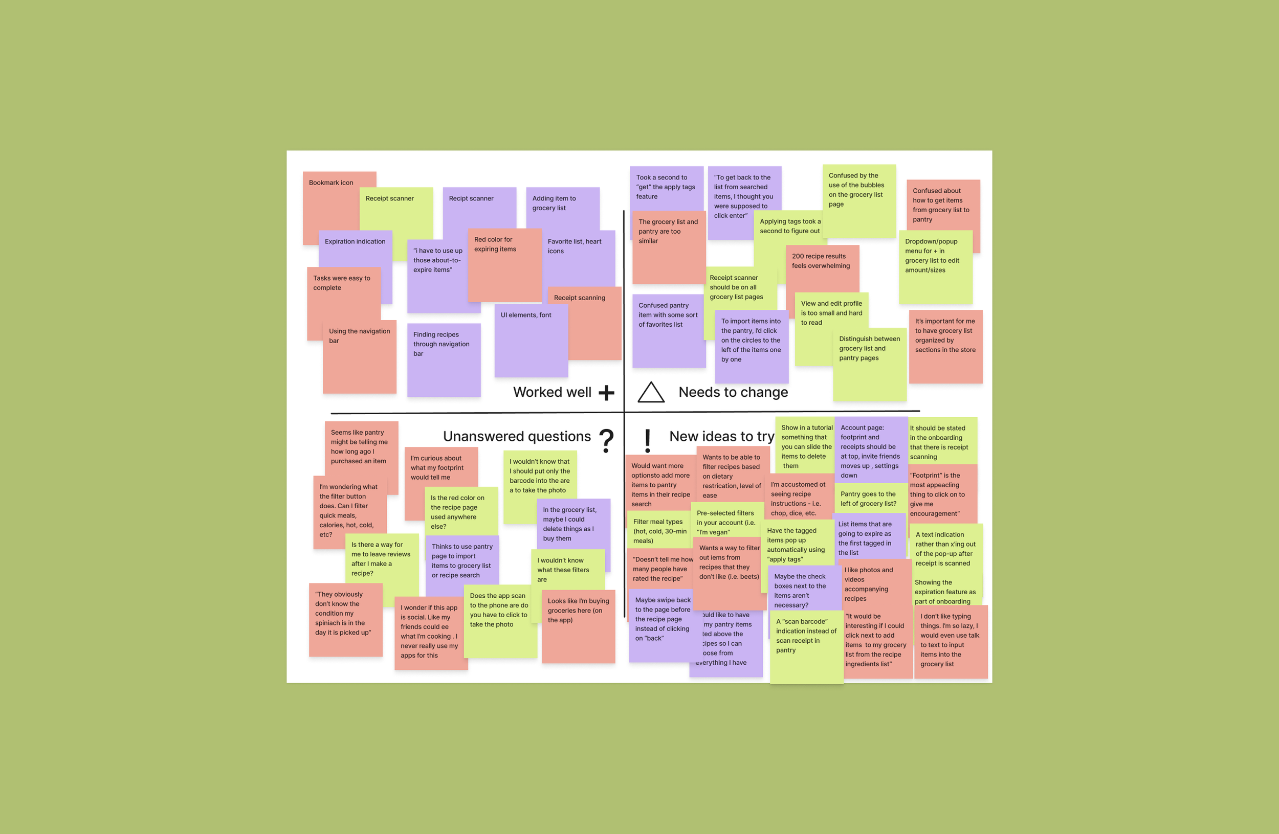
Feedback grid
After I completed my interviews, I went back over the recordings and created a feedback grid, recording feedback from my users into 4 quadrants: what worked, what needed to be changed, questions participants had, and lastly, new ideas.
Takeaways
What felt right:
Participants felt tasks were intuitive — there was a 0% error rate in completing tasks
Participants really liked the UI elements of the design. Thought the look was great for the service provided.
All participants were really excited by the recipe scanner feature
Room for improvement:
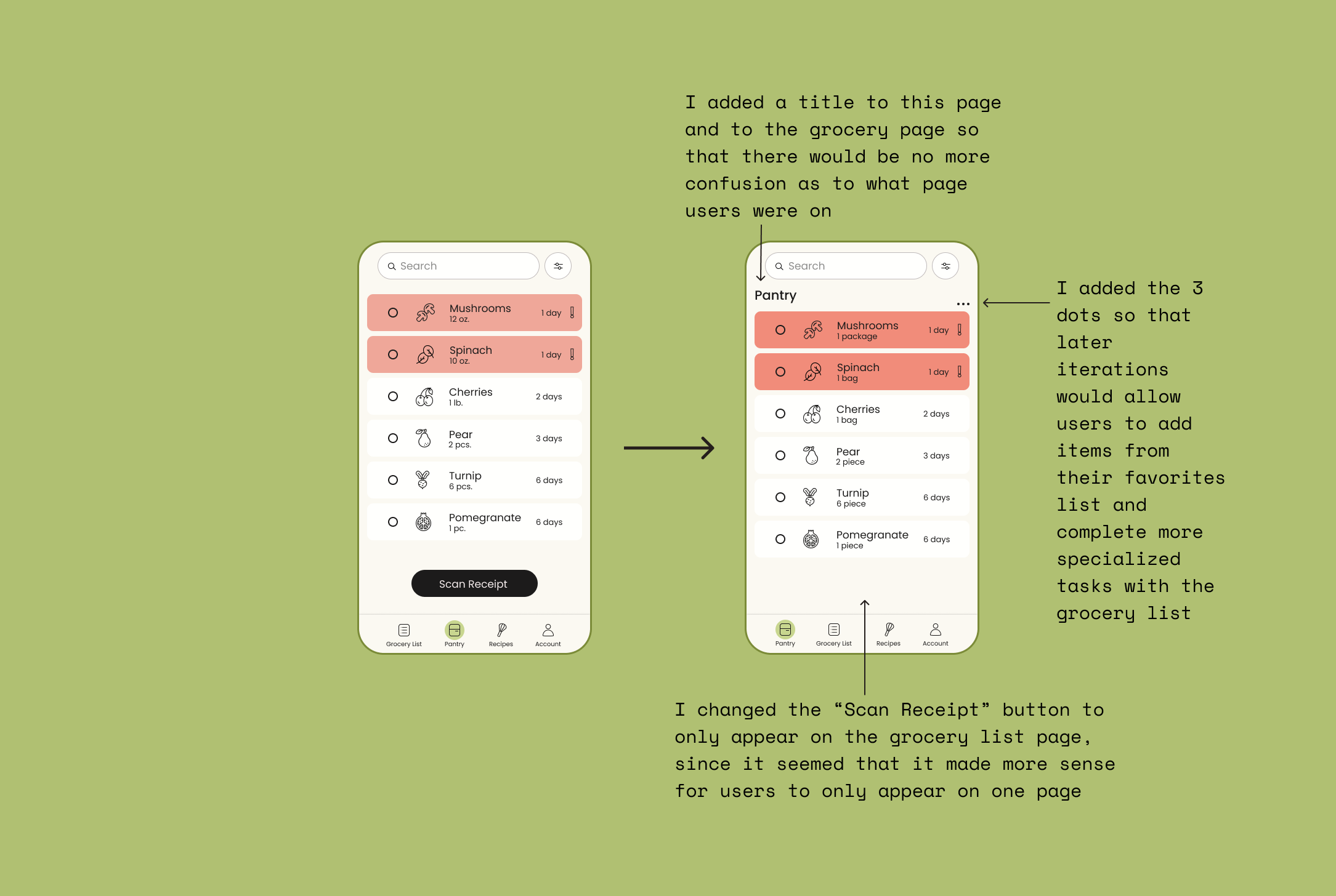
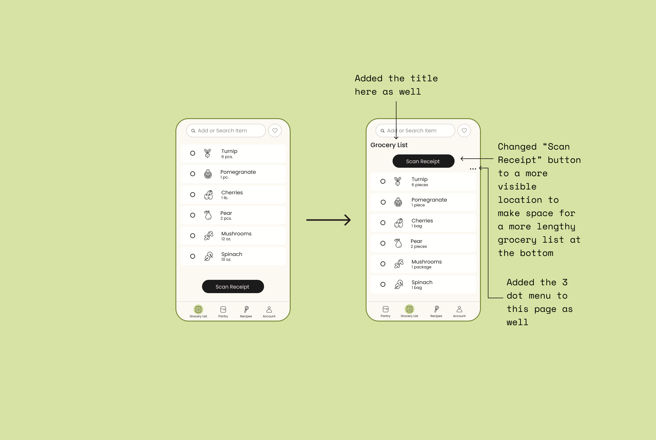
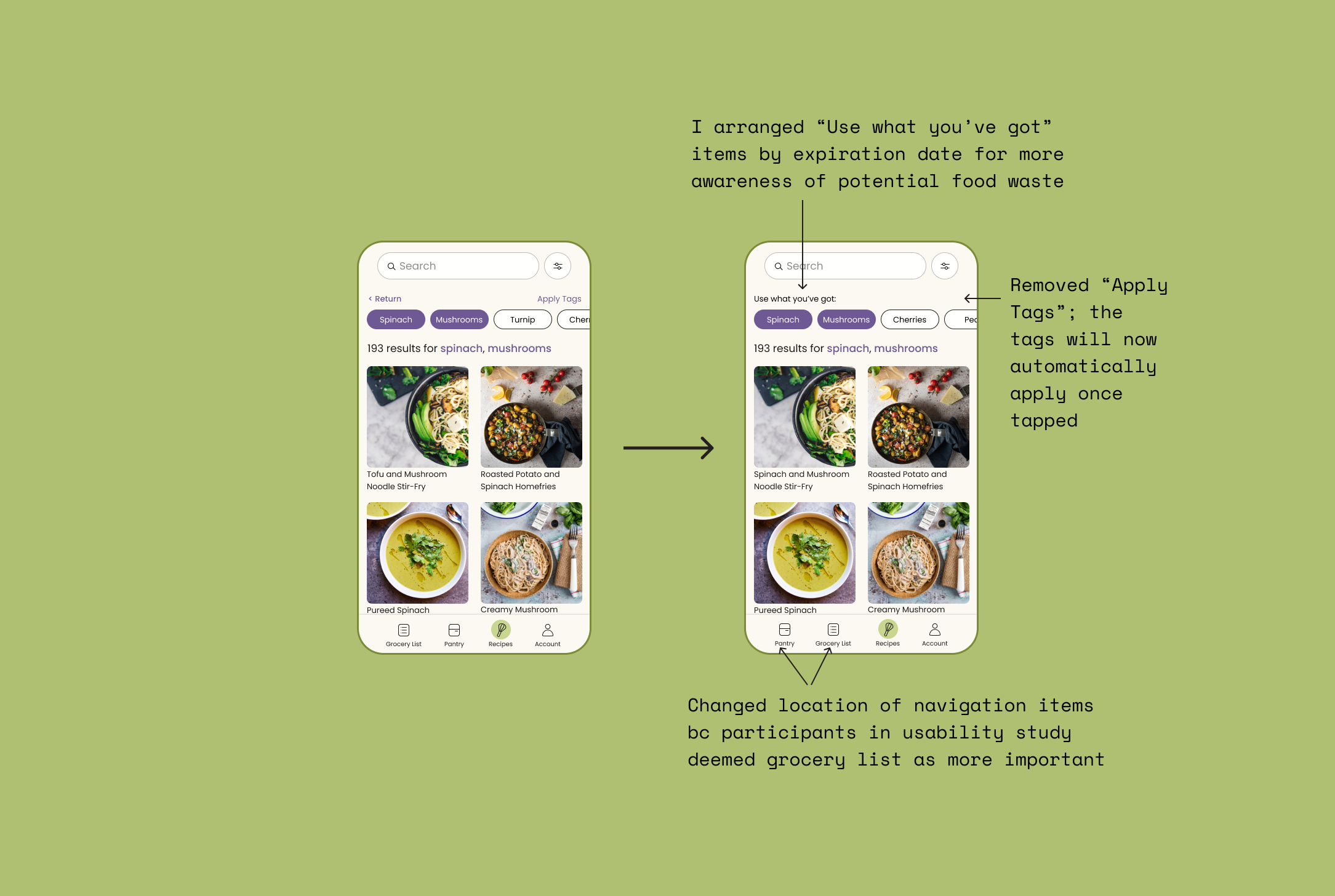
Participants had a hard time understanding the difference between the pantry page and the grocery list page
Filtering recipes by using tags to select items from their pantry didn’t come instinctively to participants
The purpose of the radio buttons (bubbles) next to the listed items confused participants
It seemed that participants would use the pantry and recipe pages more often than the grocery list page
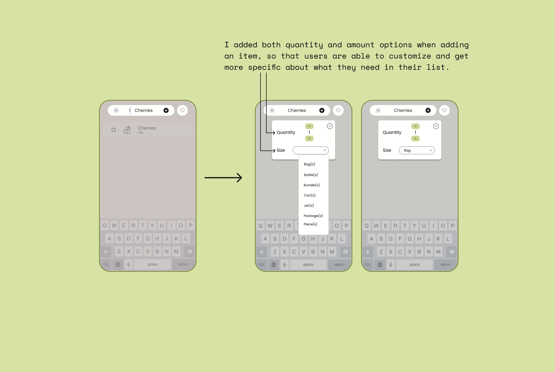
There was confusion around how to customize the items in the grocery list for sizes, amounts, etc.
In the next step, I focus on the “Needs to change” section in order to iterate upon the first prototype, incorporating my usability study results.
Iterations
Below I show to the left my original designs of the page, and to the right I show the iterated designs that I created after I conducted the usability study and received feedback. I annotated every improvement I made. I focused a lot on improving hierarchy of information and decreasing the amount of steps users have to take to complete a task. I really utilized the feedback grid to help make decisions on what the most important changes were to make to reduce confusion and meet the needs of potential users.
You can view a video of the new prototype with iterations here:
Project Takeaways
People expect the least barrier to entry when using an app. It was paramount that the receipt scanner was intuitive so that the legwork of using the app was taken care of. I gained a lot of insight on how to make an app that supports environmental change through my interview process and research. This was also my first project where I came up with the entire idea, so I really had free rein to play around with UI elements and features which was very fun and exciting for me.
Next Steps
Create filters for recipes
Create a way to track environmental footprint of users based on their food waste and grocery shopping habits
Find a way to make the function of the radio buttons next to the items in the grocery list and pantry more intuitive
Include a more comprehensive onboarding
Project revamp
Since I wasn’t 100% happy with my visual design skills after I finished UX Academy, I decided to find a new mentor to teach me the ins and outs of visual design. With her help, I recreated hi-fi prototypes for the app. I wanted to be able to truly get excited about what I put forth in my portfolio, so recreating WasteNot was a passion project for me in order to gain the confidence that I needed in my work. During the redo, I obtained many useful new Figma skills, learned tons about the visual design process, and ended up with a finished product that I am really proud of.
*In the prototype, the lines separating items are not visible because of an issue with Figma. I am not inconsistent in my line placement, if you notice the photos of my pages below. The pages that have errors in the prototype are the Create Account and Account pages, as well as the bottom sheet when I click on the kebab menu for mushrooms and spinach. (My neurotic perfectionist side can’t allow viewers of the prototype to think that I just didn’t notice/care about these inconsistencies 😅).
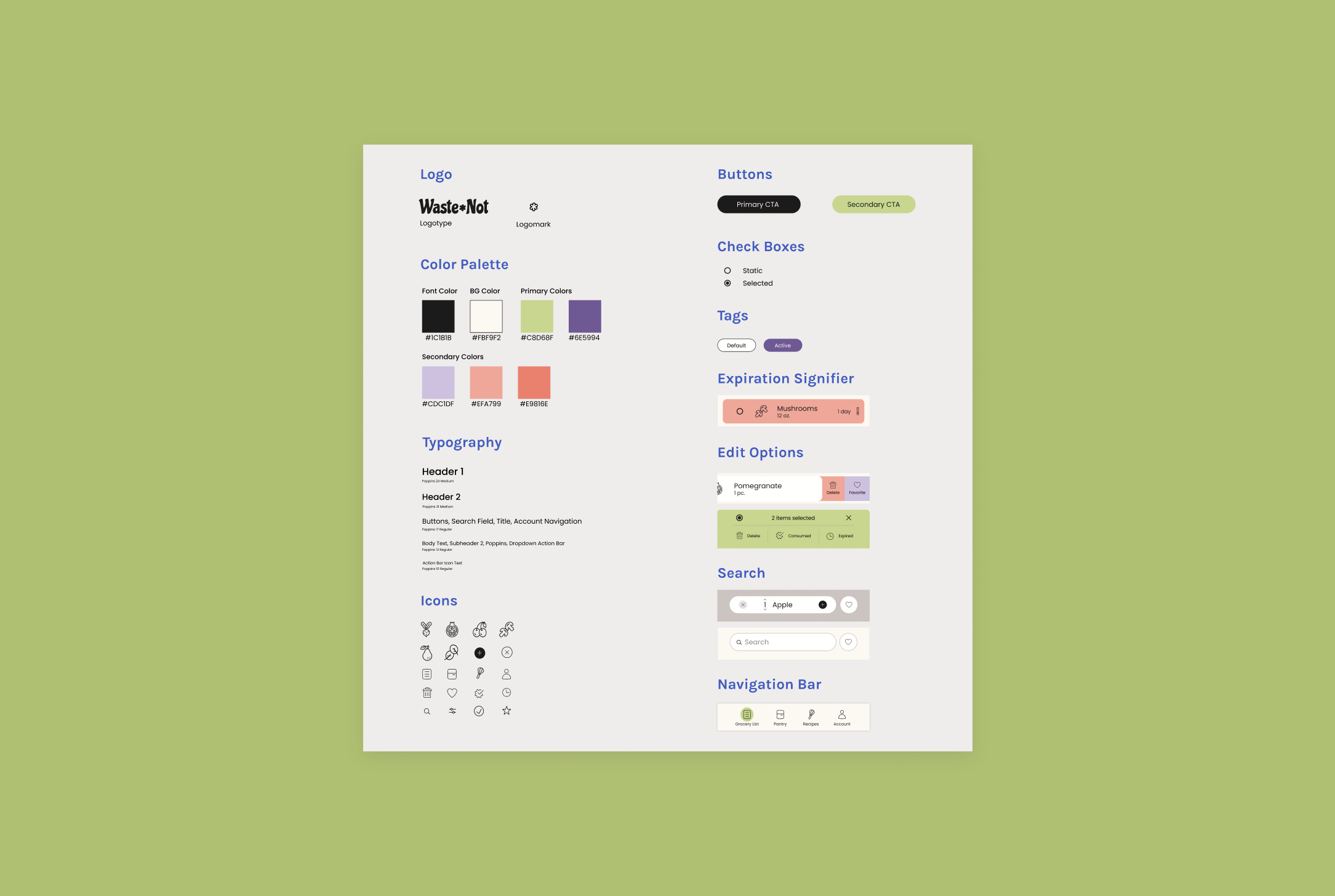
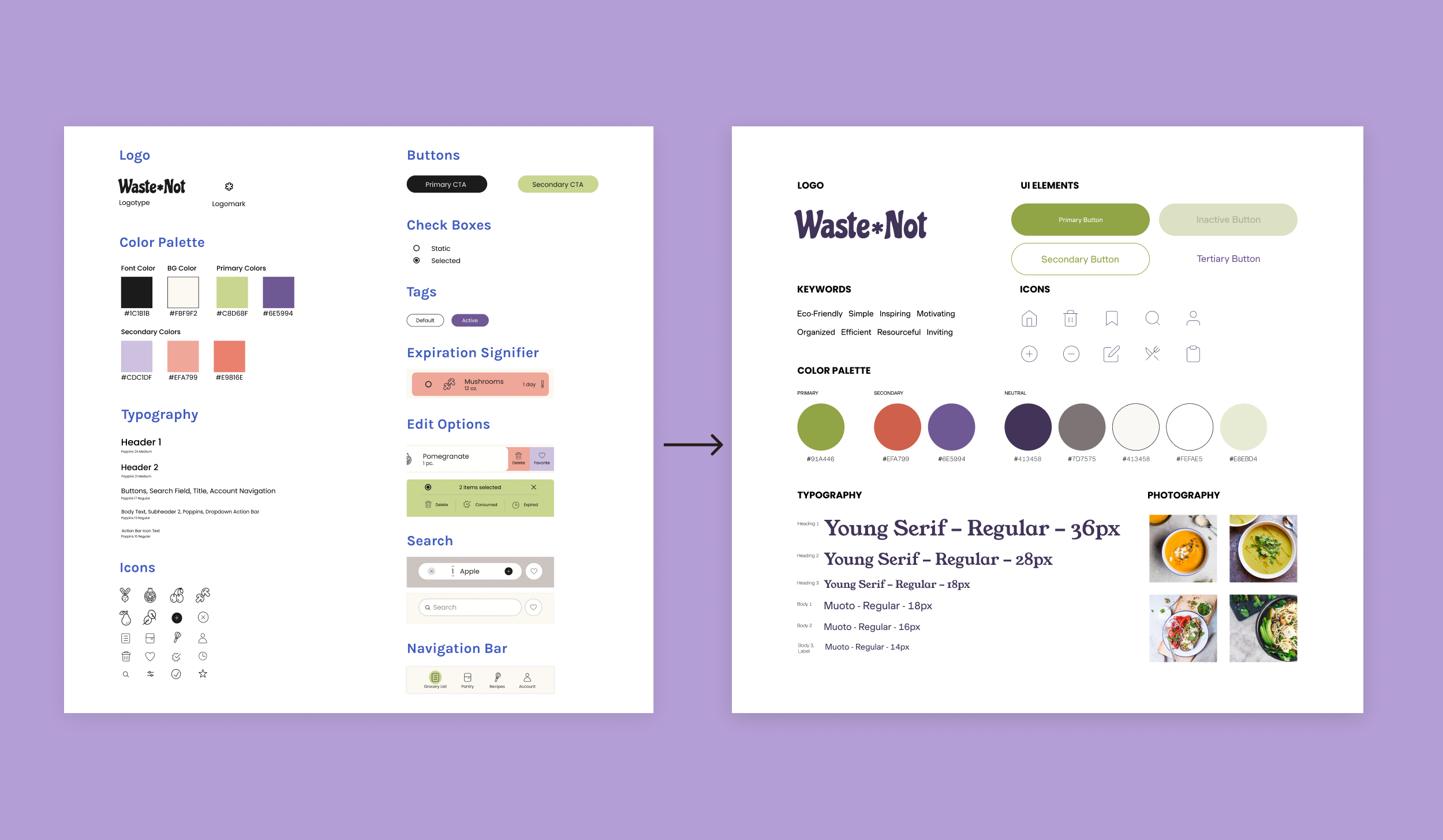
UI kit
The most important aspect I needed to iterate upon turned out to be hierarchy. WasteNot as it was before appeared a bit clunky and outdated-looking. Further, the typography and colors I chose previously did not necessarily denote intuit importance of actions and of information.
In order elevate the app’s designs, I:
traded in a Google font (Poppins) for the pairing of both Young Serif and Muoto fonts
increased the hierarchy of typography by adding more variations of text size
changed the color of the typography and icons from black to a deep purple to help with softness and brand identity (the apps primary colors are purple and green)
thinned the strokes of the icons to create a fresher, sleeker look
changed the background color from a yellowed shade to a lighter, soft pink shade
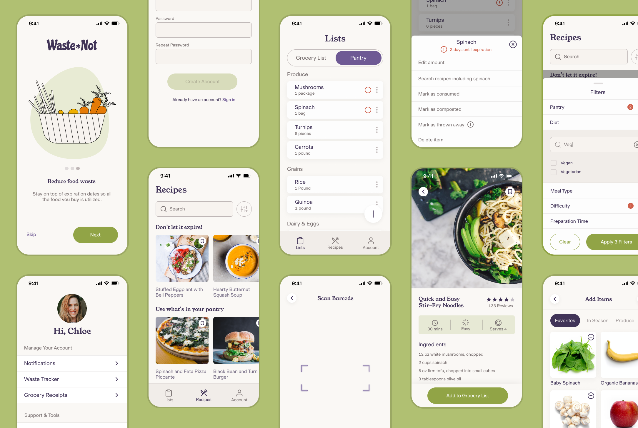
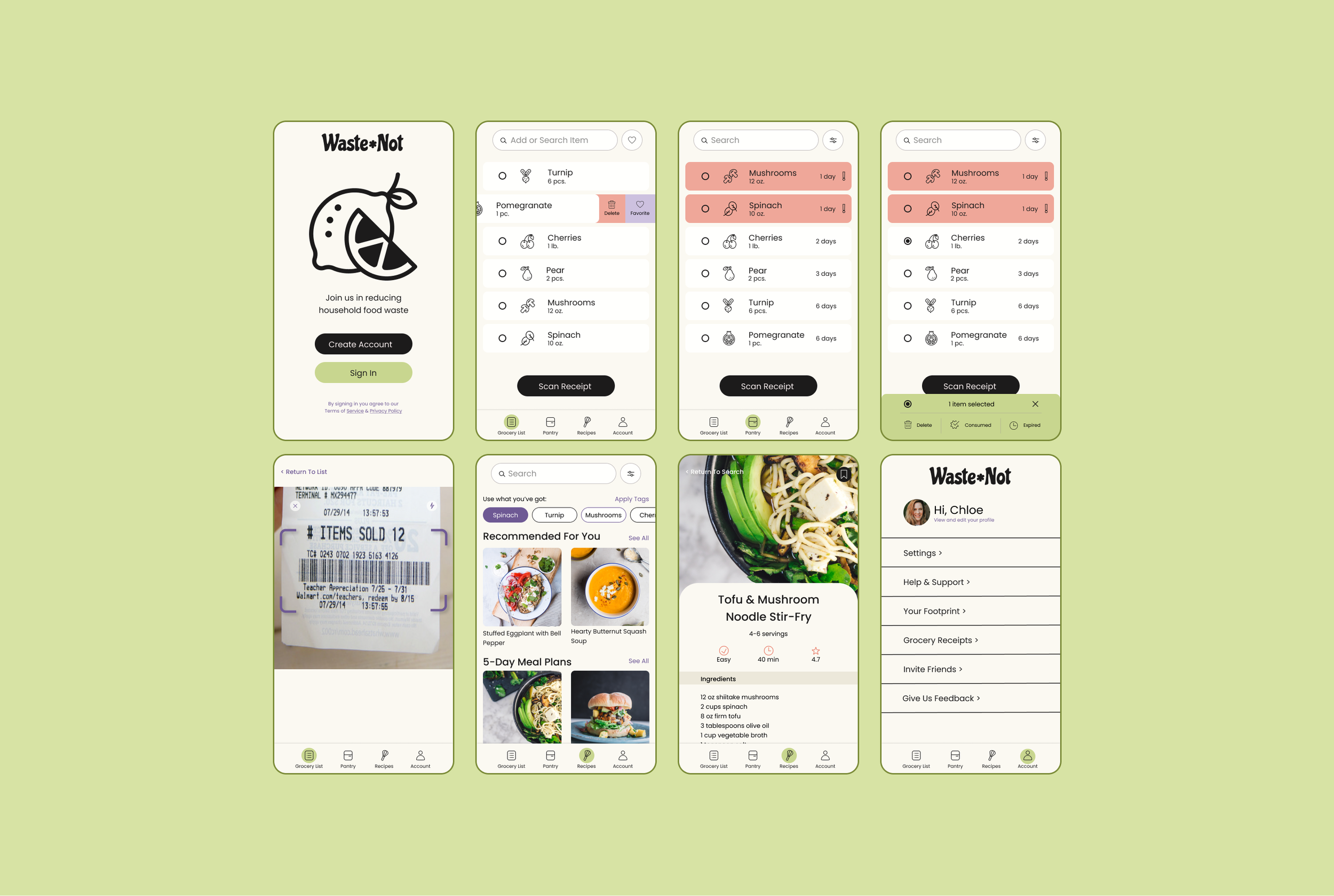
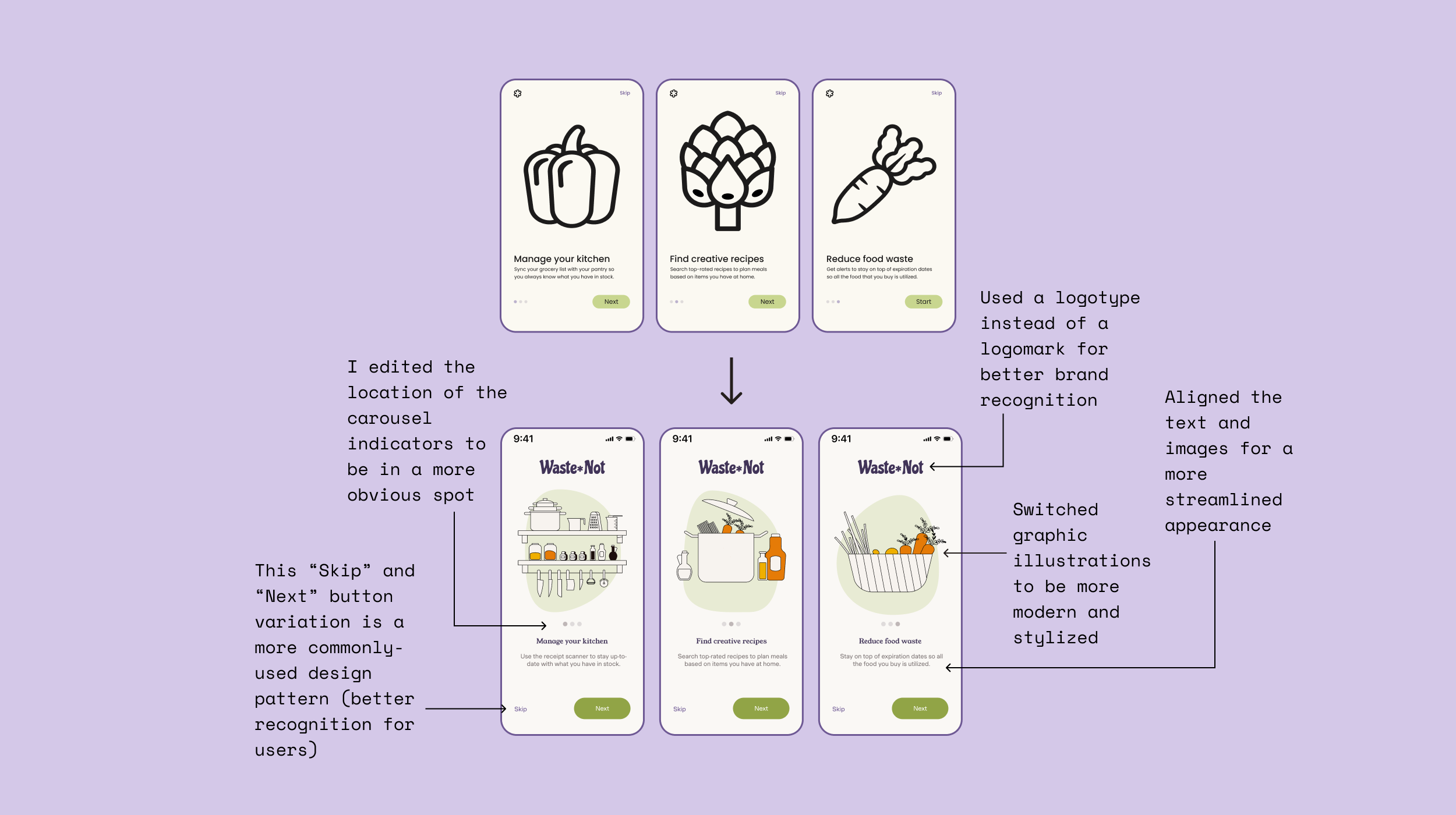
Onboarding
As you can see below, I made MANY changes to the visual design of the app. I had so much fun exploring design pages and finding style elements that I felt truly reflected the personality of WasteNot. I learned about text hierarchy, alignment, spacing, and many other elements that go into making an app or website appear aesthetically pleasing to the user. Coming into this revamp, I really felt like I didn’t know what I didn’t know and it was really gratifying to understand the reasons behind visual design decisions. I was finally able to put what was in my brain onto the screen in a way that was meaningful and beautiful.
Note: In creating my first prototypes (top), I used the art board size for iPhone 8. In the revamp designs (bottom), used the art board size for iPhone 11 Pro/X. Contrary to my prior knowledge, I learned that the iPhone 11 Pro size is more commonly used for mobile prototypes these days.
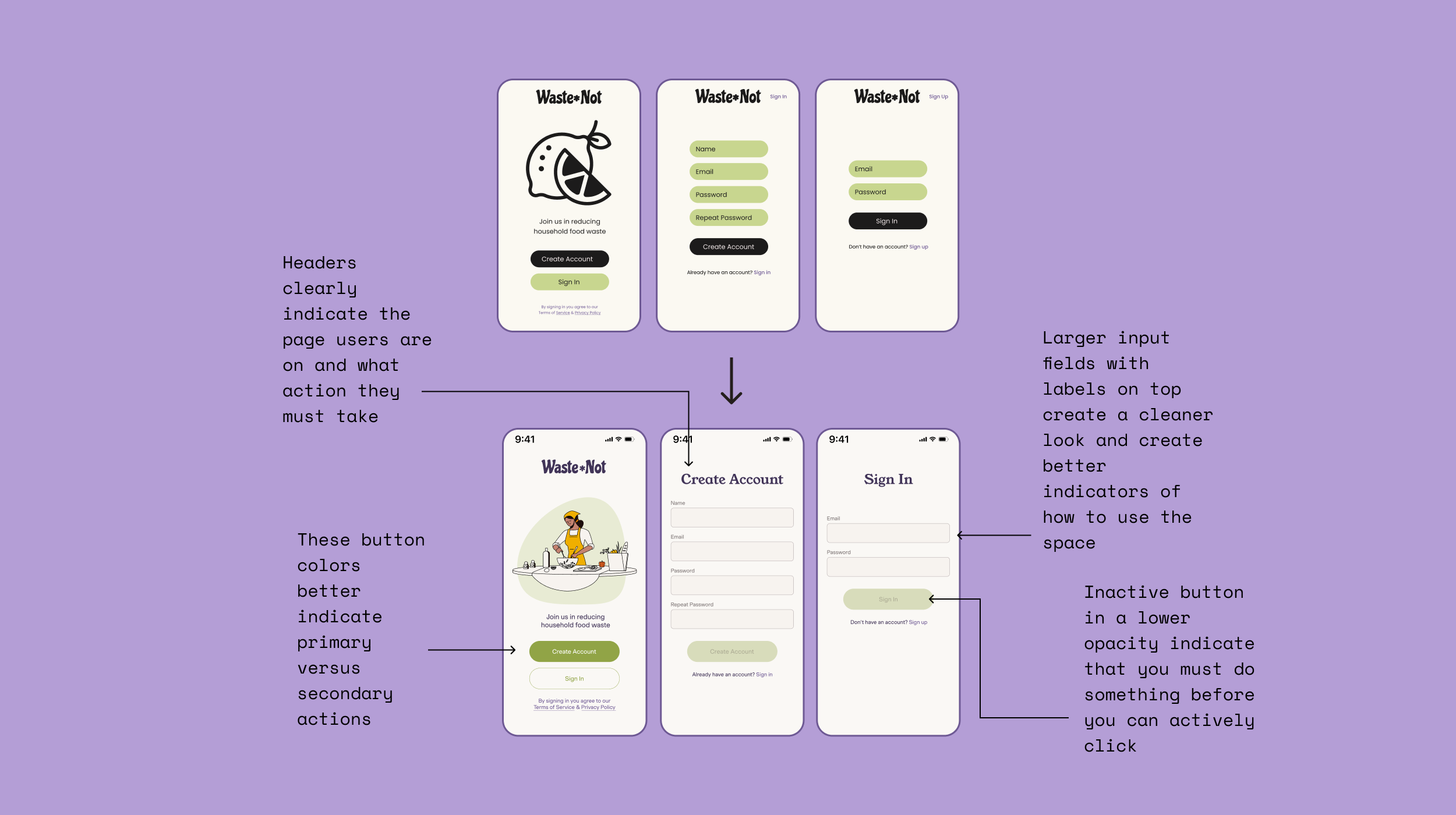
Sign in / create account
I found that changing the colors of elements in the sign up/create account pages really freshened up the page. While the old version incorporated a lot of black and thick lines, the new pages breathe much better. A little white space and fine line work did wonders toward modernizing the app. The largest takeaway here was about button and input field treatment. In my initial designs, I used design patterns that were quite outdated, while with the new designs, I paid a lot of attention to design patterns that reflect best practices. In doing so, I not only created more visual hierarchy on the pages, but the redesign and incorporating headers also cleared up any potential for confusion as to what page the user is on.
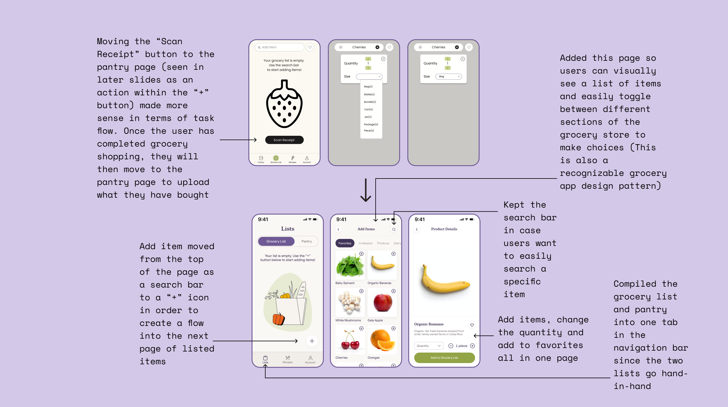
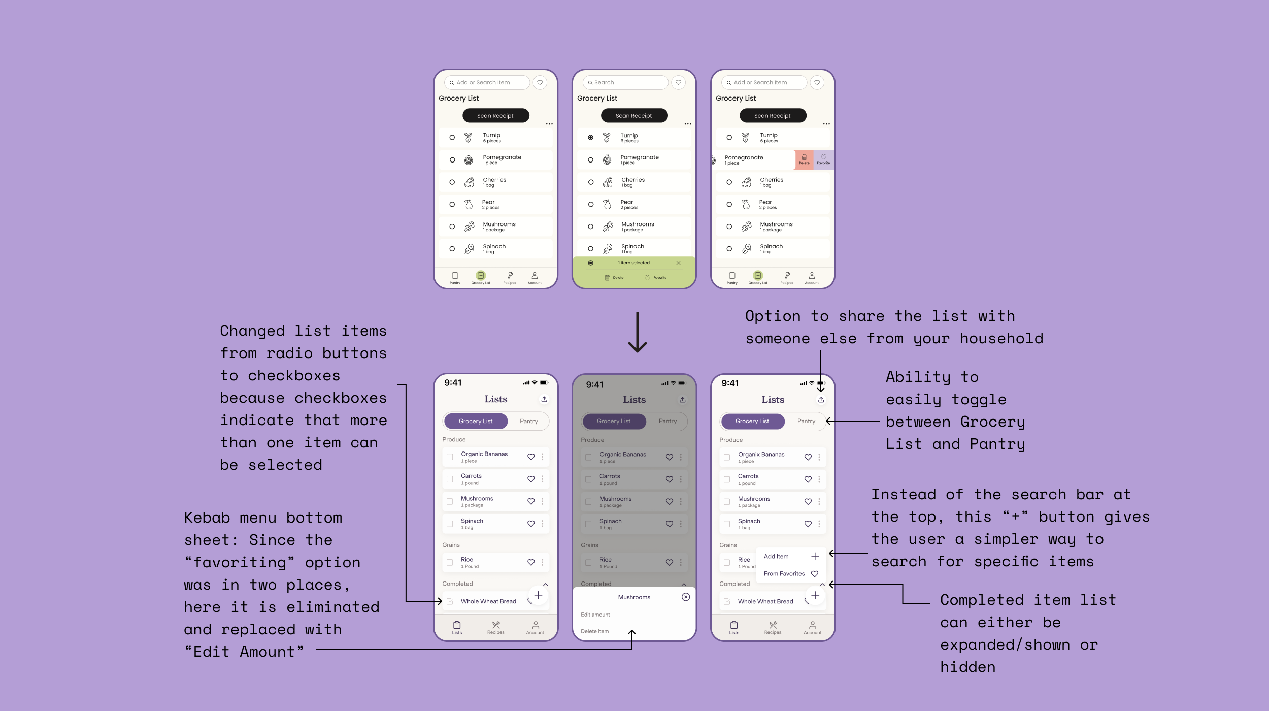
Grocery list
In the revamp, I focused the most time on making improvements to the grocery list. During the usability study, I realized that many participants had trouble distinguishing the grocery list from the pantry page. I wanted to make it abundantly clear that these two had different functions, and to visually separate them, I pulled them both into the same category in the navigation bar (Lists). Within “Lists”, I created a toggle at the top of the page where the users could easily move between both of the lists without confusion.
I also realized that the grocery list had the most varied and important functions within the app. With the revamp, I wanted to make the options one could carry out in this section of the app very clear. Before changing the grocery list section, I conducted a lot of research on design patterns and looked at countless grocery apps for inspiration.
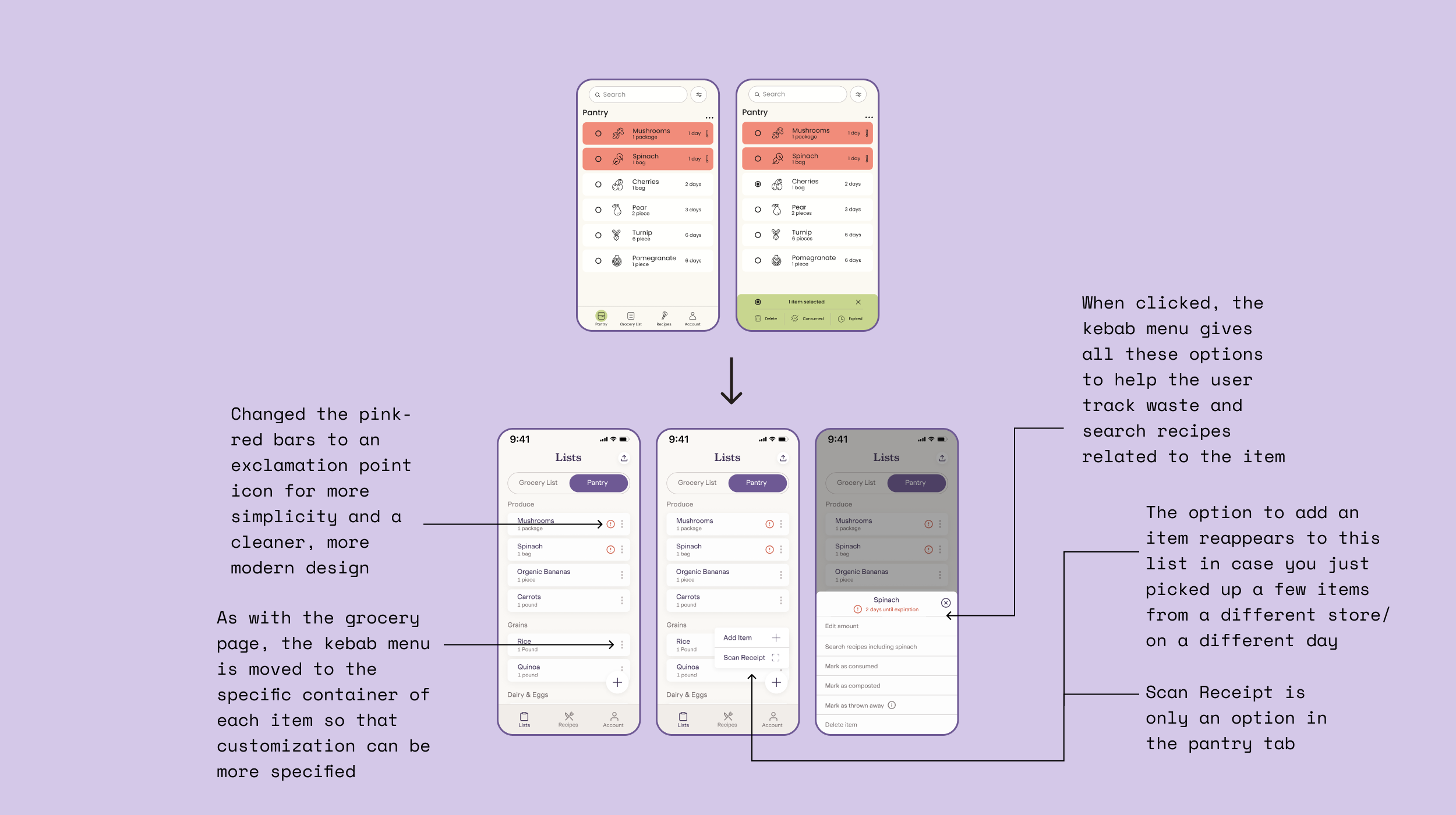
Pantry
The pantry section is the area in the app in which users are able to tell which items are soon to expire. In the original version of the app, I mad this clear with big, chunky red-pink bars and huge exclamation marks. Looking back on this design, I realized it was a LOT to take in for the eyes. In my iterations, I made the page and the actions users can conduct within the page very clear but show them in a minimalistic, organized way. I chose the icons very carefully and tried not to crowd the space with any unnecessary colors or icons. I utilized the kebab icon in order to incorporate many functions into the page in a more minimalistic way.
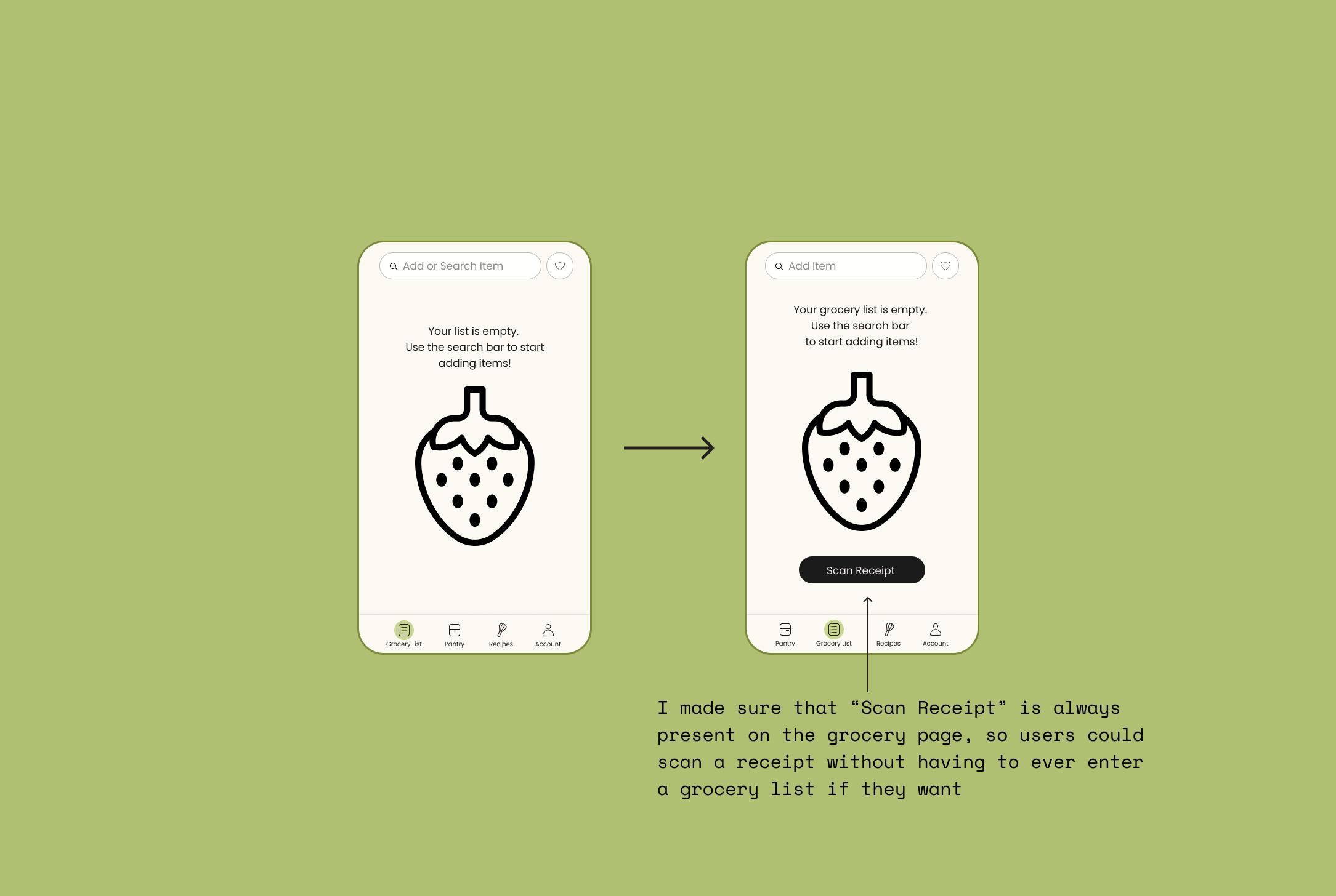
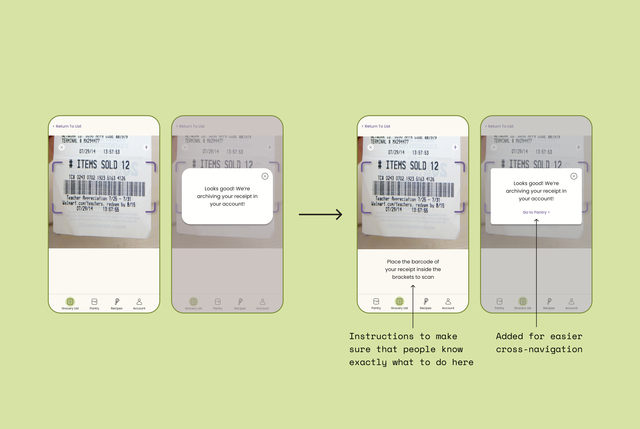
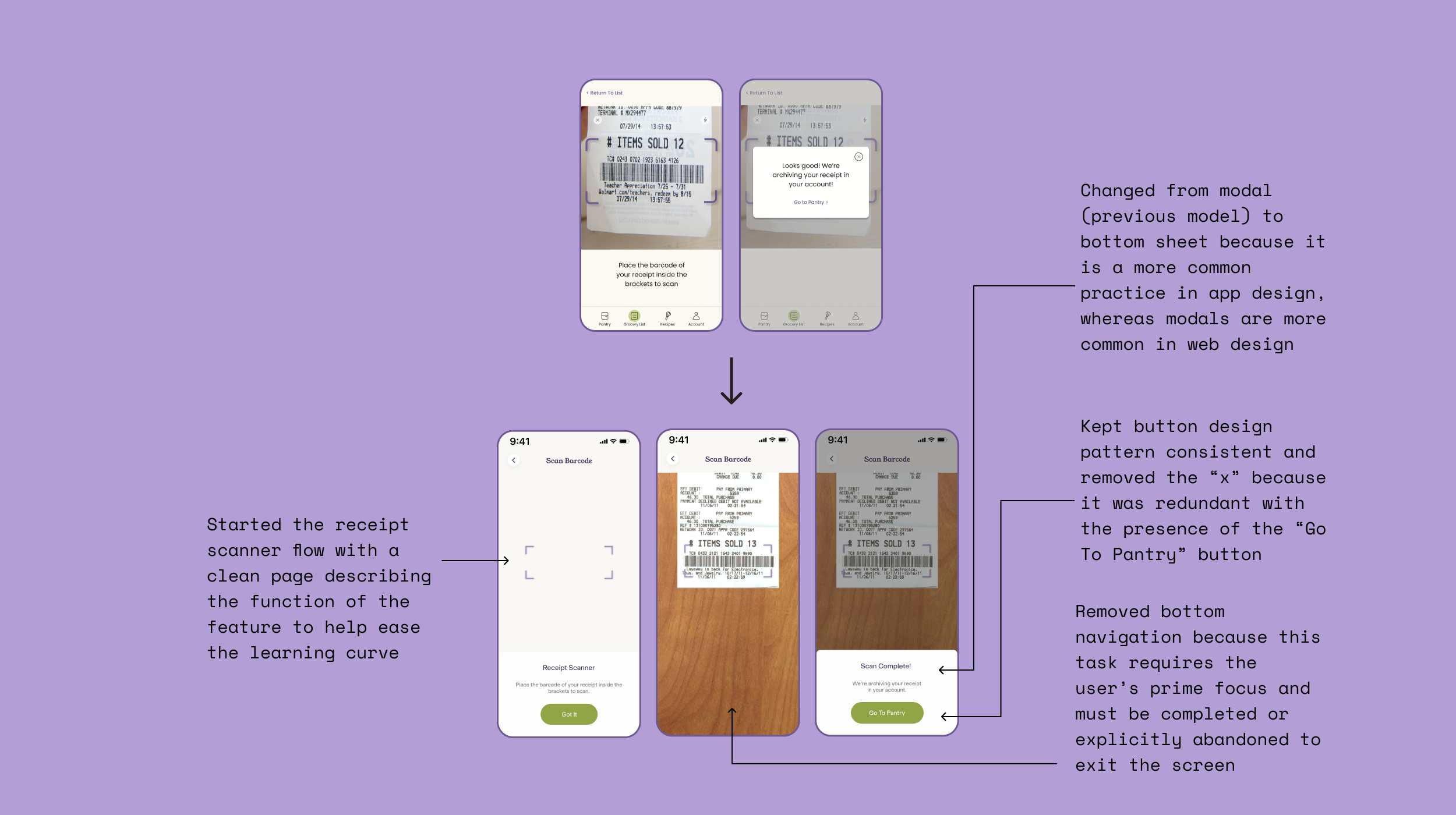
Receipt scanner
In the usability study I conducted, I got many points of feedback concerning the use of the receipt scanner. I think the clunky previous design confused users. I added the title “Scan Barcode” to the receipt scanner and kept the page blank and minimalistic so that it would be obvious to users as to where they should aim at the barcode of the receipt. I also kept button consistency here and used the primary buttons to indicate where users should go next in their task flow.
Recipe page
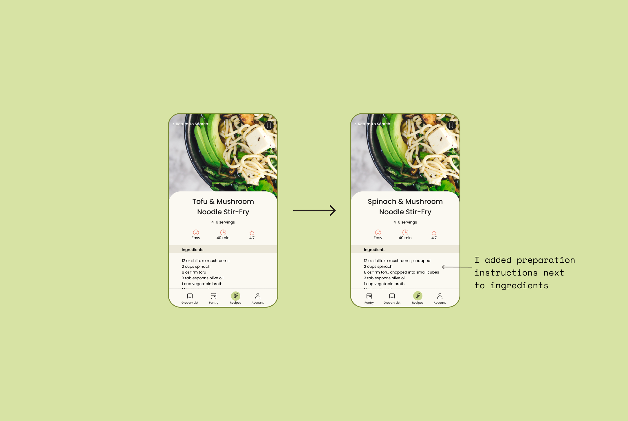
For the recipe page, I also conducted extensive design pattern research in order to revamp the page. I added a save icon so that users could incorporate recipes in to their account. To distinguish this app from any other recipe app, I changed the titles of the sections to relate more to food waste. I got rid of the “Use what you’ve got” section of applying tags and incorporated this option into the filters icon instead. I also researched many recipe pages in apps and on websites and came up with a more minimalistic and visually appealing recipe instruction page.
Apologies in advance for the labyrinth of lines toward my explanations of the changes. I changed a lot. And I wanted to explain it all. Because what’s the point of making great edits if you can’t show them off? Right?
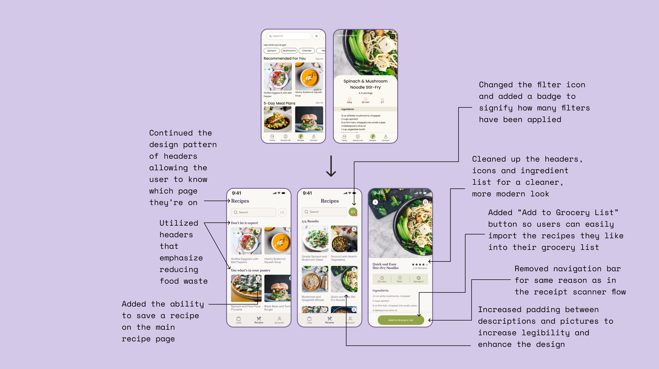
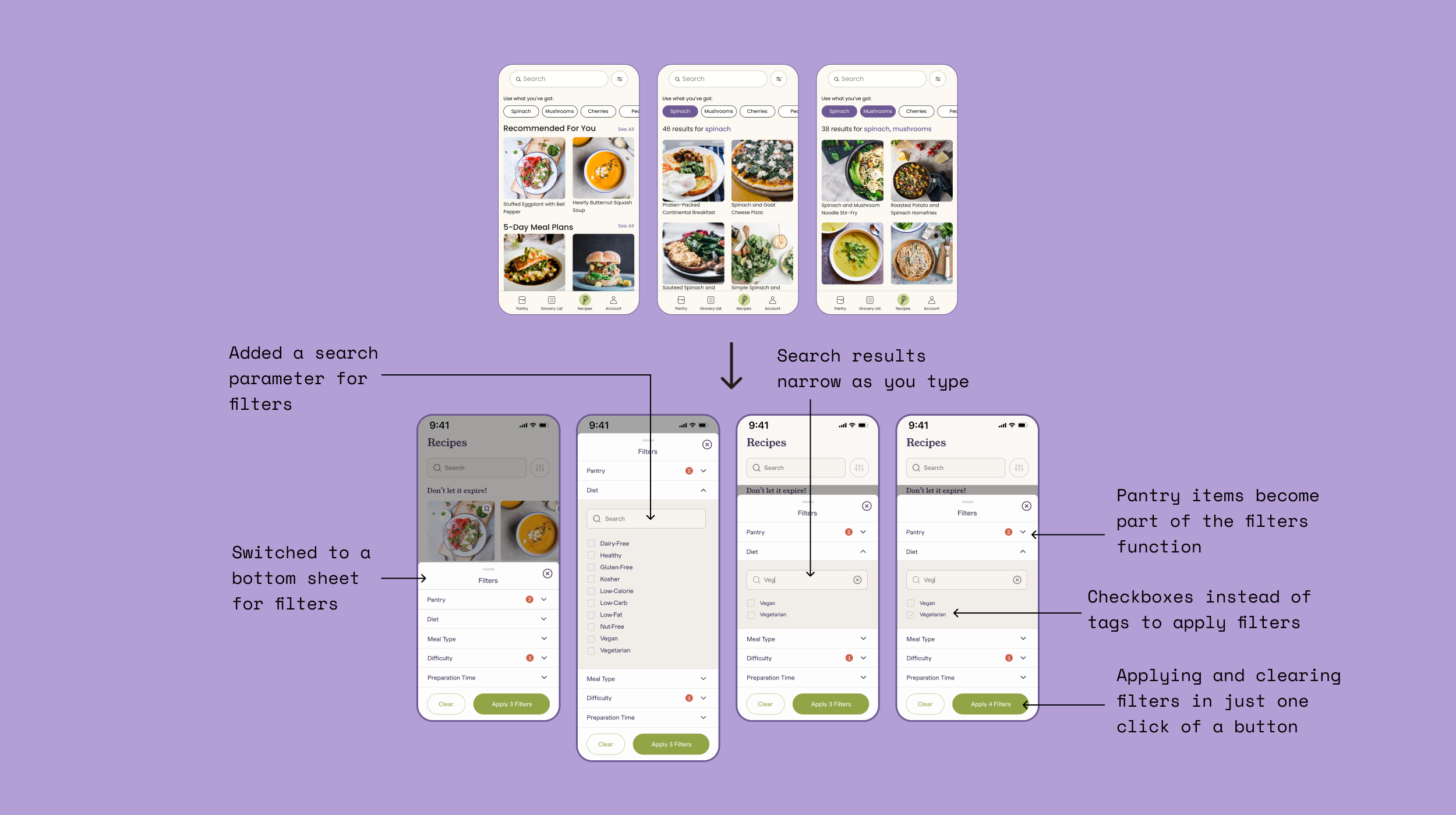
Recipe filters
A huge part of this revamp was adding and refining filters for recipes. This took so much time and so much research, but it was one of the biggest, most important learning experiences of this project. To incorporate the filters into the recipe page, I used a bottom sheet. I took the feedback from my usability study and incorporated filter options that participants said they were interested in. I included red indicators to show how many filters the user has applied and these show up on the actual recipe search page as well so that the user is always able to tell if their are filters applied to their search.
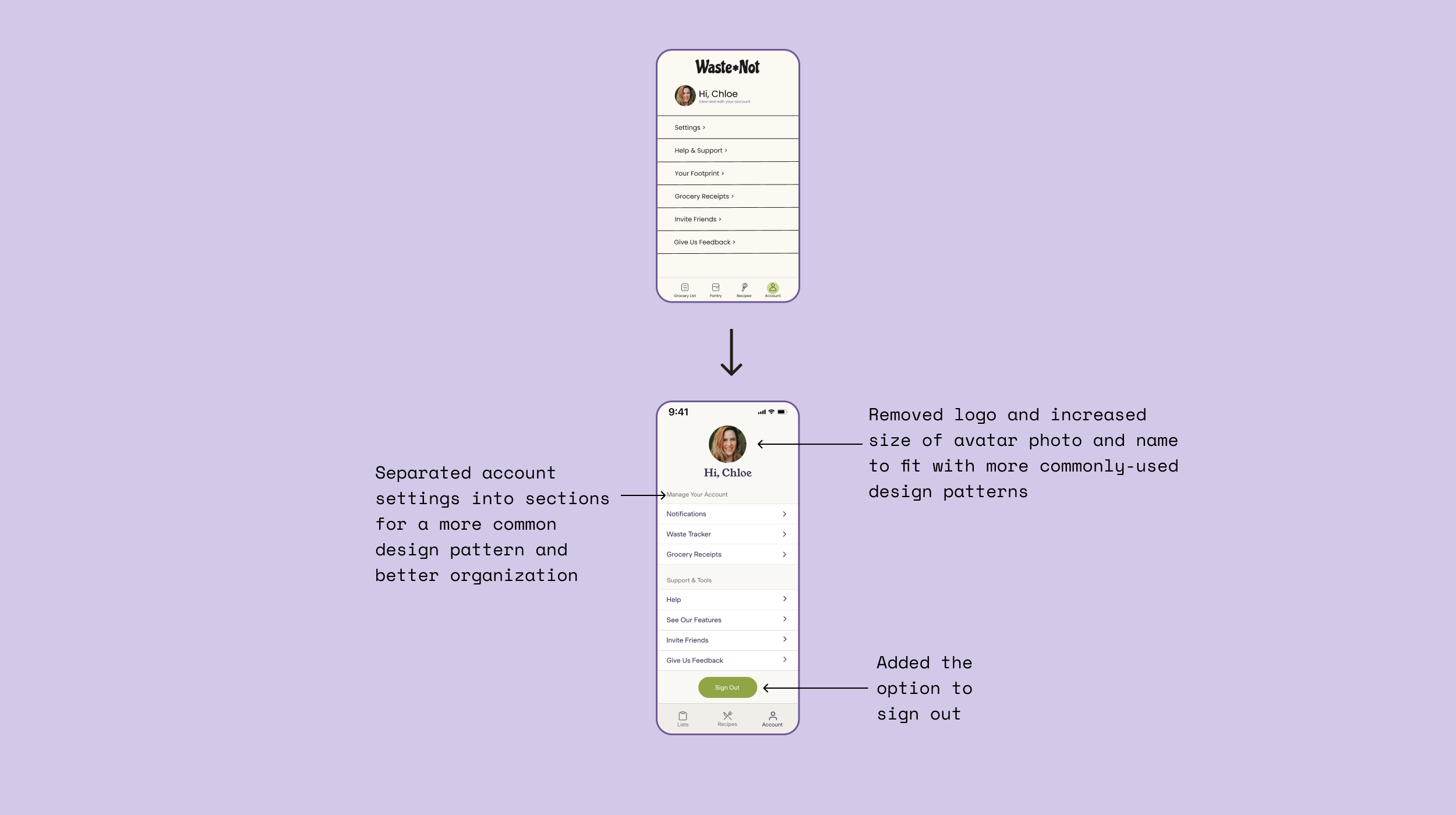
Account
The iterations to the account page are simple but obvious. I brought the page into this decade by using more padding. I also categorized the sections in the account page in a similar pattern that other successful apps use. I changed up a few things stylistically to align with more industry-wide design standards.
Project revamp takeaways
This is the project that I am the proudest of for sure. I really took the time to iterate and research and understand where I could improve. This project is really special to me because I chose a topic that I am passionate about, I iterated like CRAZY, and I came up with a final product that I am really happy to put my name on.
The two biggest areas I was educated on with this project were creating filters and the principles of enhancing visual design. I did extensive research on both topics and came out of this project with a lot more confidence on both subjects than I had before. I learned tactics to research and improve visual design in accordance with accessibility and now it is one of my favorite parts of the UX/UI process. I learned to never have an ego about my designs and I took on the importance of iterating, failing, and iterating again in order to create the best product.
Next Steps
Test my revamp in a usability study (and iterate once more based on results)
Create an actual “Waste Tracker” page where users can track their food waste within the app
Incorporate a sharing feature to share lists and recipes and possibly create the ability to use the app in collaboration with other members of your household
Create a favorites list in the account section
Create the option to set permanent (/more long-term) filters in your account (i.e. vegan, gluten free)