
RESEARCH - UX - BRAND - UI
Take Care

The brief
Take Care is a speculative responsive site that helps match people to the right therapists.
The objective of this project was to match people with the best therapist. I wanted to create something that would save people the frustration of sifting through tons of profiles. I hoped to absorb the admin work of finding a therapist in order to make the process more enjoyable and universal.
ROLE: UX Researcher, UX/UI Designer, Branding
TIMELINE: February - May 2022
Discovery and empathizing
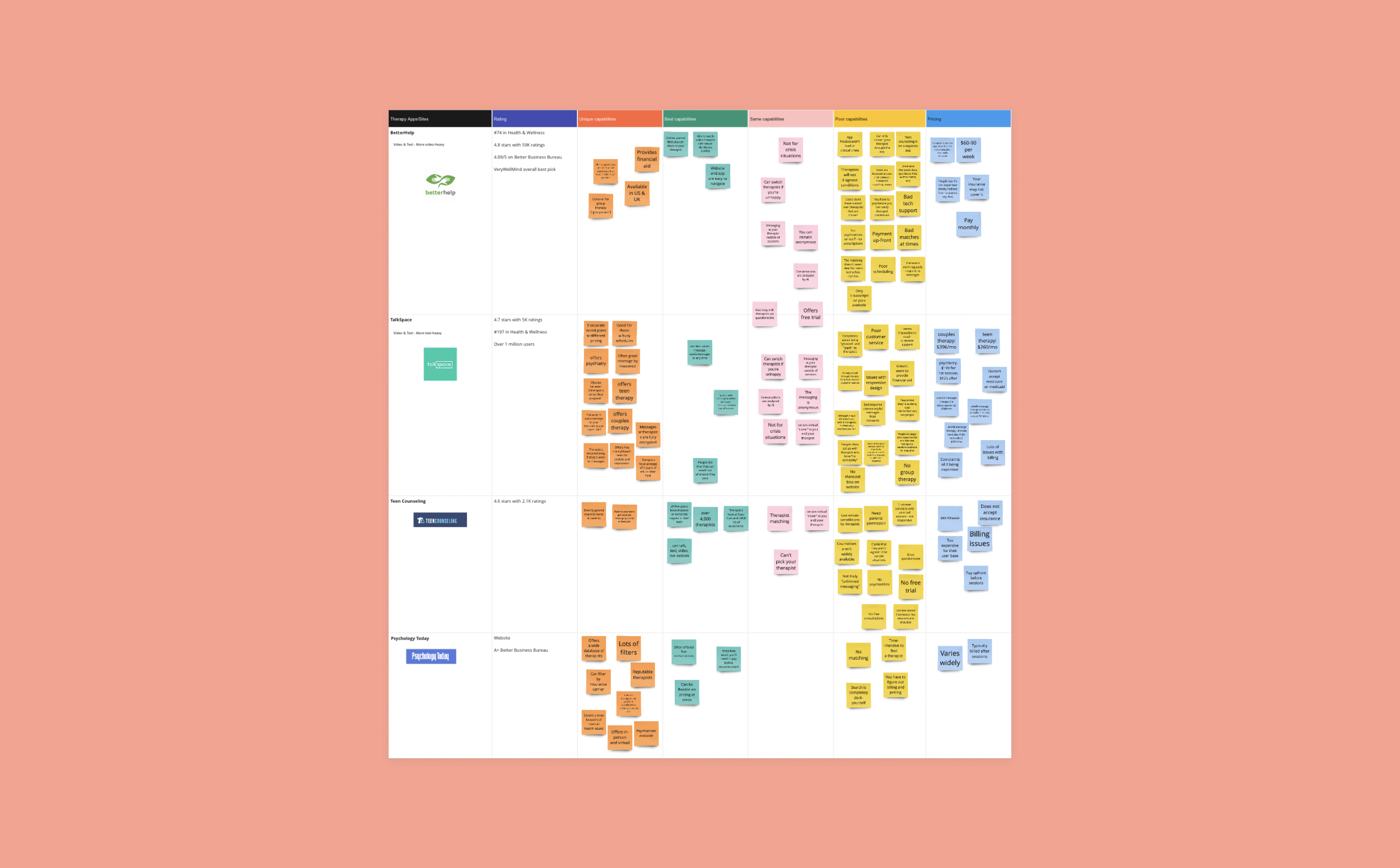
I began the discovery process by researching potential competitors in the online therapy matching and search process. I came up with BetterHelp, TalkSpace, Teen Counseling and Psychology Today as top competitors in the field. From there, I was able to understand top capabilities and opportunity spaces, such as:
Therapist matching
Simple scheduling platform
Comprehensive filters
Providing financial aid
Based on these parameters, I came up with an interview questionnaire and rounded up 5 participants to question about their previous experiences in therapy and with finding a therapist.
Click below to read my full interview questionnaire:
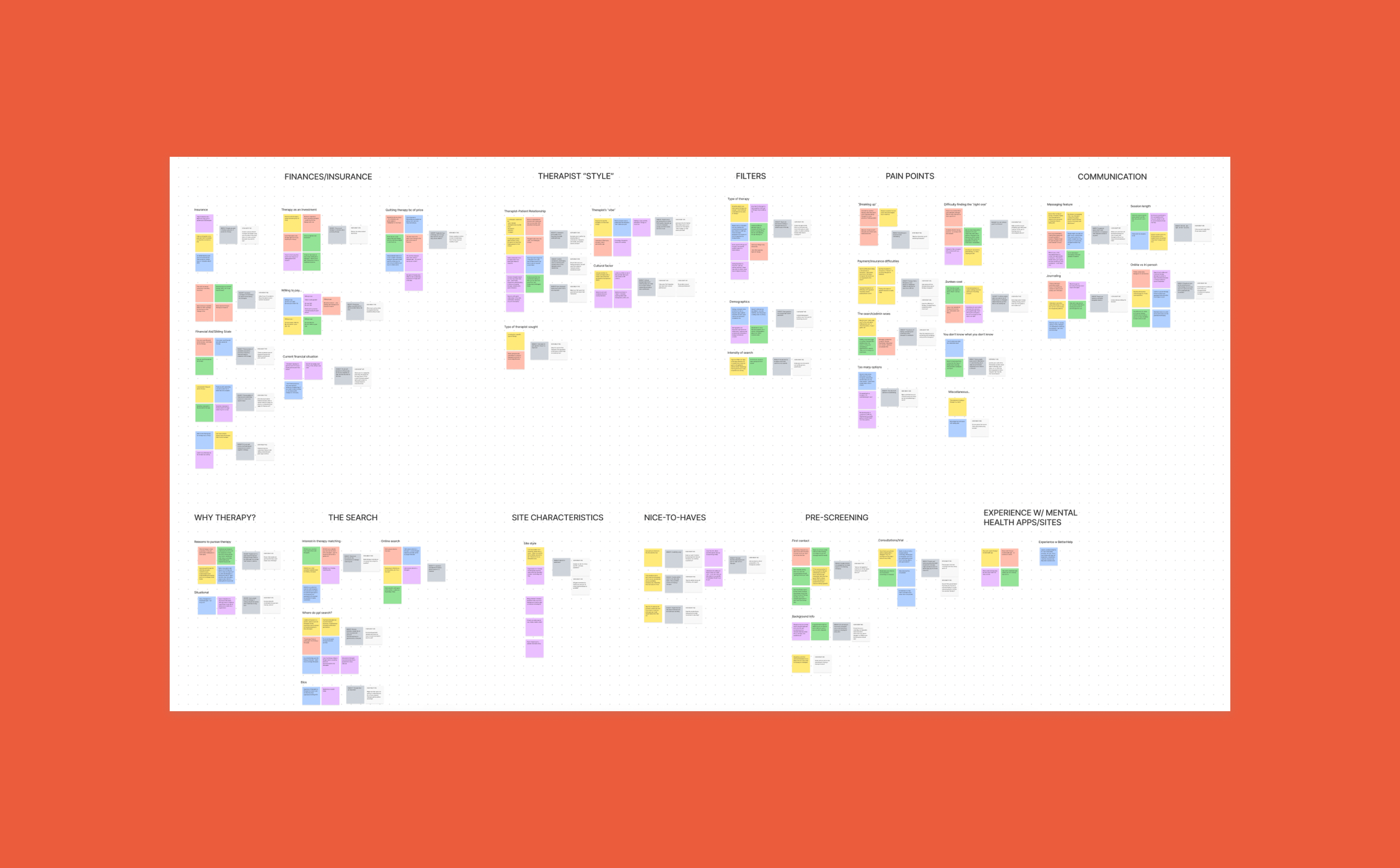
Research insights
When my research interviews were complete, I compiled all the results into categories using post-it notes. I found similarities in frustrations across categories including communication, therapist style and background and the search process itself. The biggest drop-off points for people seeking a therapist and continuing a relationship with a therapist tended to be communication, connection with the therapist’s personality and finances.
I received a lot of information about the search process itself and felt that I was really able to understand pain points of participants in their processes of finding a therapist. This project was the most personal that I have worked on so far. Participants were very in touch with and talked at length about their frustrations with their own experiences with therapy. The information I gained from research was extensive and enlightening.
How Might We (HMW)
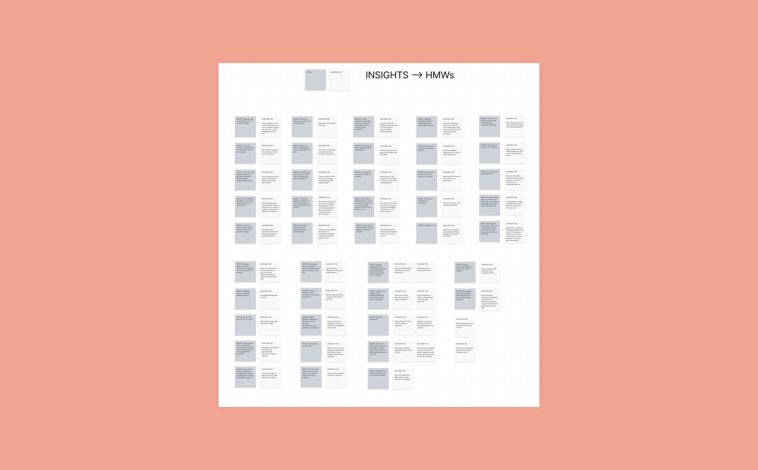
After I analyzed the research results and grouped similar frustrations together, I created HMW (How Might We) statements related to the insights. HMW statements gave me the ability to brainstorm potential ideas to address the problems people from my interviews experienced. HMW statements allowed me to reframe the insights and pain points into concrete opportunity areas for my future product. I love HMW statements because they are not solution-driven. Creating HMW statements allows me to empathize with the potential user and frame problems in a way that emphasizes processing over results.
Brainstorming potential solutions
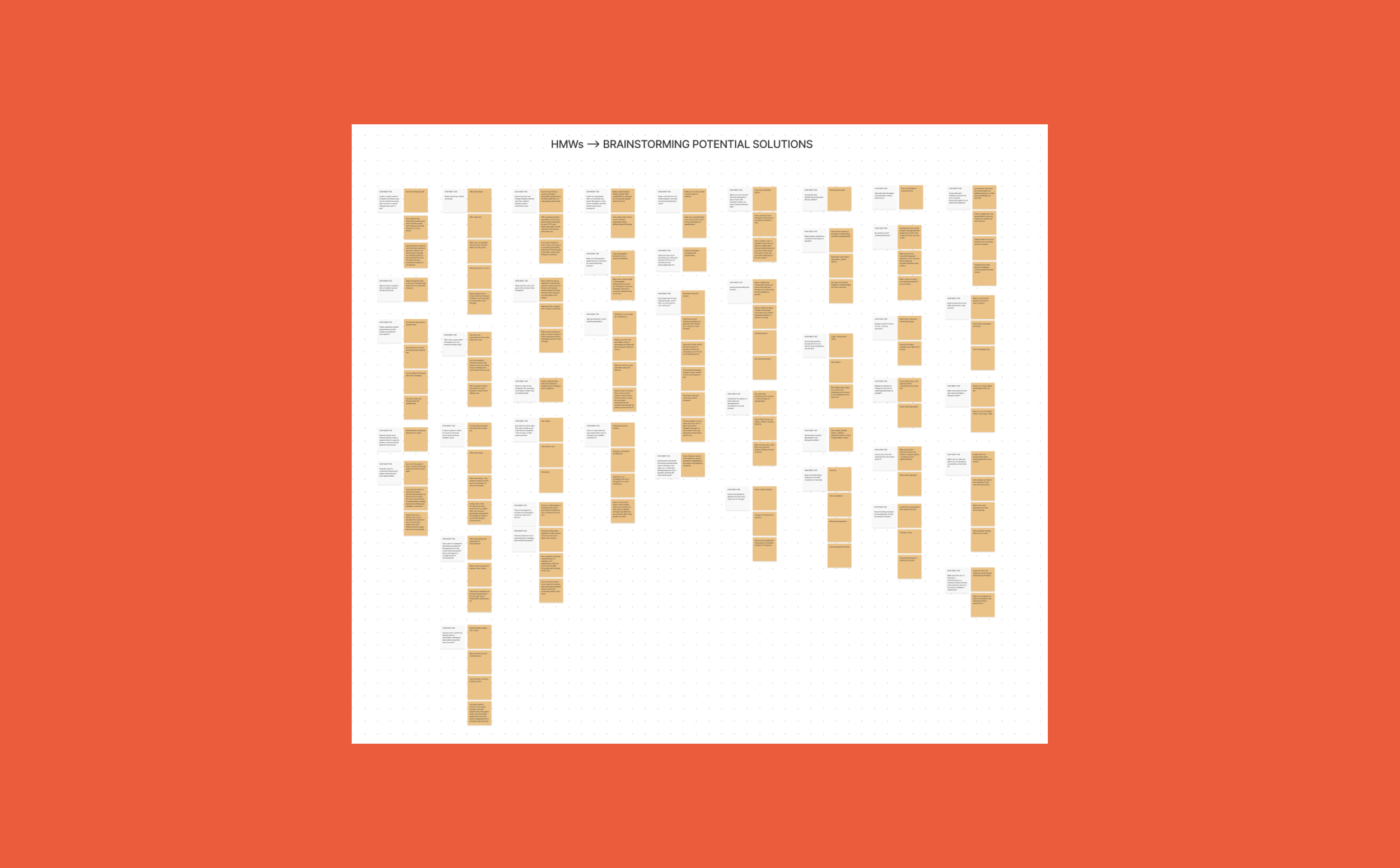
Next in the process I created a prioritization matrix based on gathered insights and HMWs to decide where I should focus my attention moving forward. The idea of this exercise is to spitball LOTS of potential solutions. It is a quick process that allows for “wrong” ideas and creativity. I tried to come up with as many potential solutions to each HMW as possible so that I would not be tied down to any one solution from the get-go. Allowing myself to have a free flow of ideas is one of my favorite parts of the UX process.
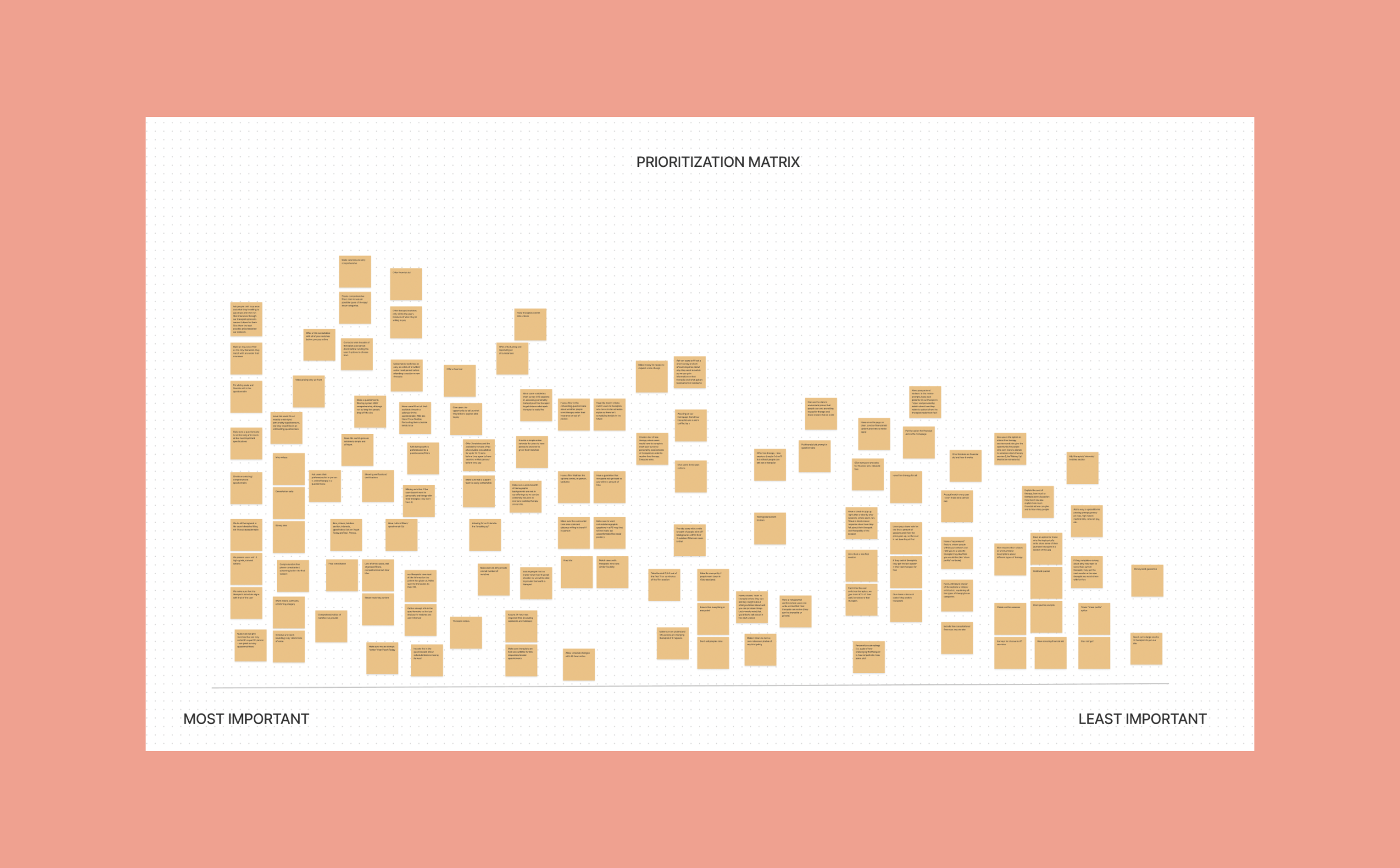
Prioritization matrix
I used the potential solutions I came up with in the last exercise and mapped out which areas I thought were most important to focus on first. This map would serve as my guide moving forward. With this exercise, I was able to narrow down main priorities and focus my attention on these. The prioritization matrix is great because it is a visual guide for how to spend your time on a project. It also proved to be useful in later stages. I was able to look back at this prioritization matrix to check if I was on the right track in supporting my research with my work on the project.
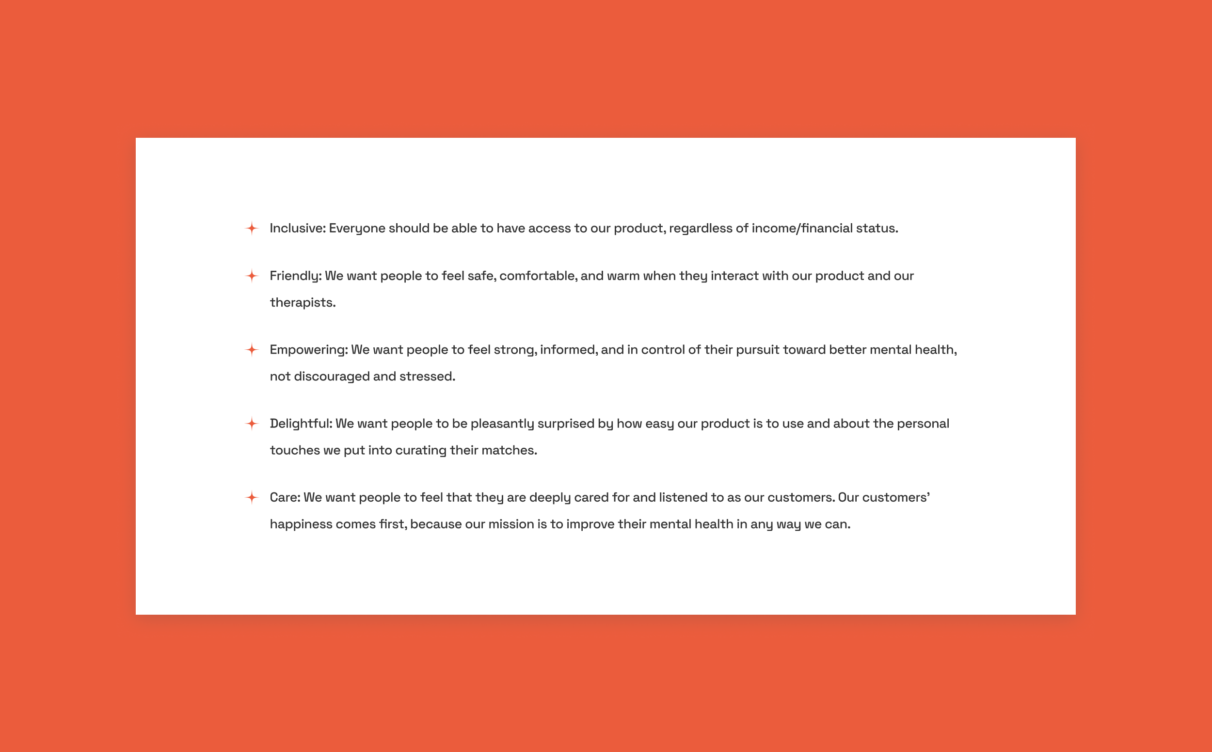
Design principles
After I analyzed all my research, I came up with some design principles for the project to give myself a set of standards moving forward. Based on the information I gathered from my research for the project, I used the exercises above to group and understand problem areas. I laid these design principles out in order to align the actual, physical designs with the research I gathered.
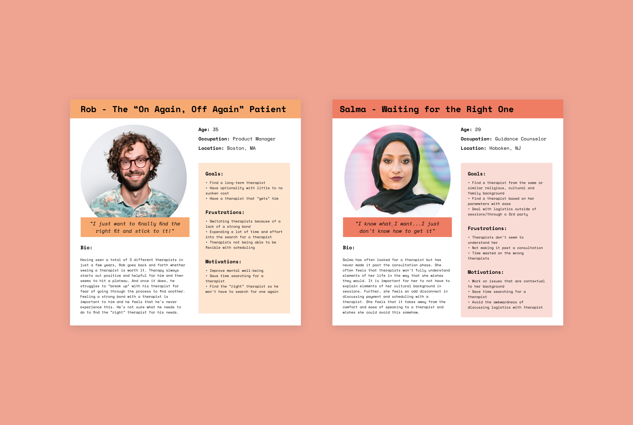
Personas
I created two pretty specific personas based on the research interviews I conducted and then synthesized. I boiled down the main pain points and goals of my interviewees and came up with Rob and Salma.
Rob is someone who has been in and out of therapy but hasn’t ever had a very long relationship with a therapist due to mismatches in personality. He hates searching for a therapist and is ends up seeing therapists for “too long” because of the fear of the search process. He really wants the right personality fit in a therapist and is sick of how much effort it takes to find the “right one.”
Salma has never had a therapist. She only gets to the consultation phase and then ducks out because it’s hard for her to find someone that understands her specific background. She also hates all the logistics and awkwardness of having to deal with payment and scheduling directly with the therapist.
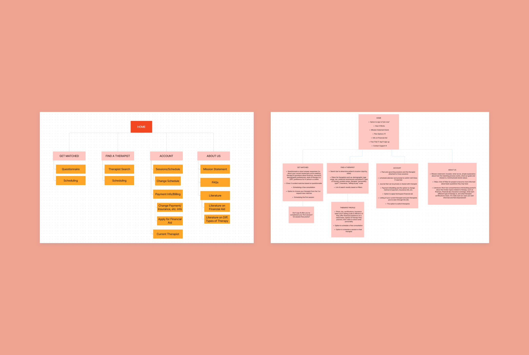
Sitemap
I first created a rough sitemap and then one with product requirements to get more into the nitty-gritty of what each page’s functions would be.
In my sitemap, the main elements I wanted to include were:
A questionnaire to help us understand users’ wants and priorities when searching for a therapist
A directory with a very comprehensive filtering structure
Therapist profiles that would empower users
Scheduling and consultations
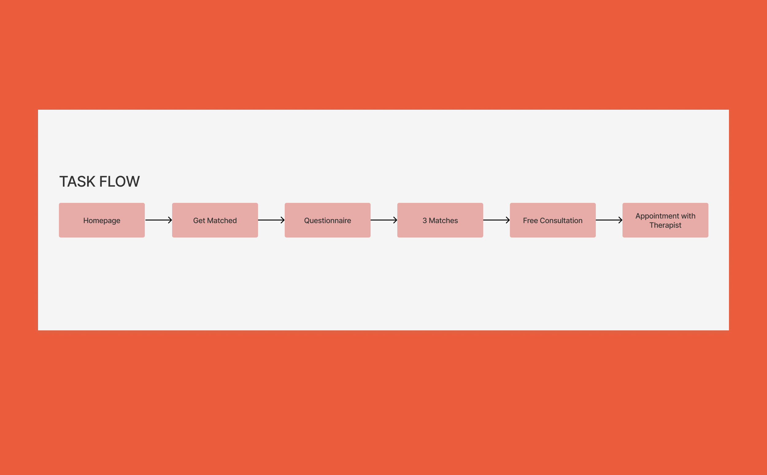
Task flow
In this task flow, I created a small map for the primary use case of the site. This is the path of least resistance for the typical user to find a therapist using Take Care. The main focus behind this project was to connect users with therapist matches using a questionnaire. Creating this task flow helped me ideate connections between each step in the process. Here, I’ve mapped out how to get the user from our homepage to an actual appointment with a therapist in the least amount of steps.
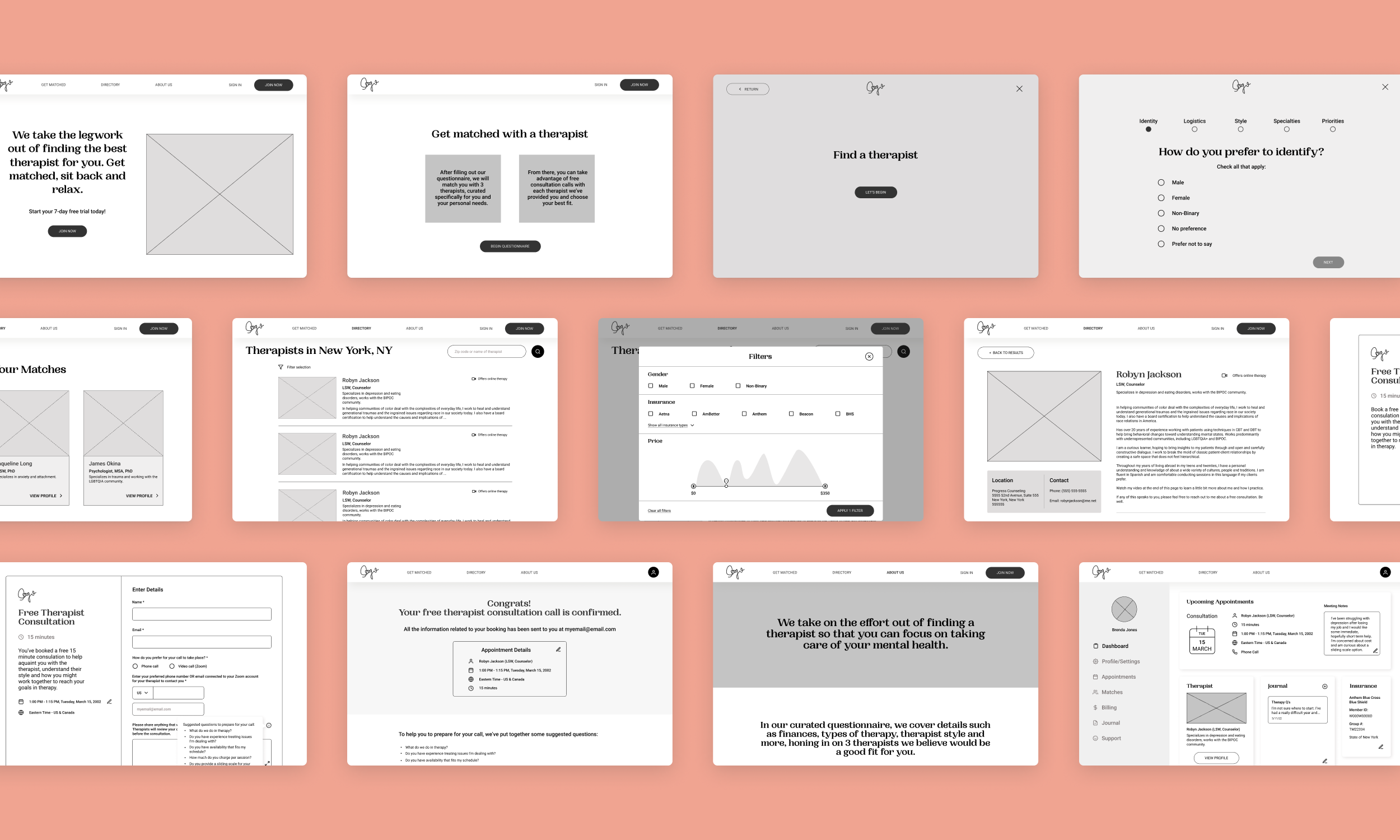
Wireframes
These wireframes were created with the task flow in mind, incorporating the user’s journey. Here, I focused a lot of my time on ideating UX solutions for scheduling and tested out filter options. While these wireframes did not end up being my final product, they definitely gave me sufficient groundwork in understanding flow and hierarchy. When working on wireframes, I always use a large chunk of my time to research design references. For me, finding great design patterns from other sites and apps and iterating upon them to fit my project goals and ideas is always a really interesting, educational step of the design process.
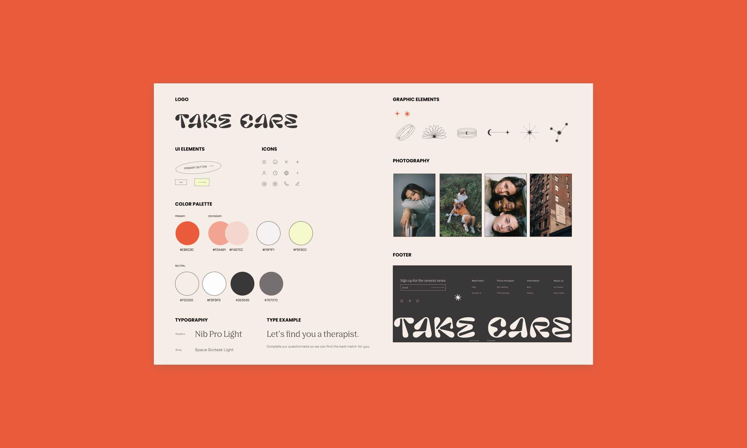
UI kit / brand
I wanted the site to fit my design principles - it had to be friendly and inviting to users. To fit it into the demographic base I was targeting, I wanted to make it fun, young and simple. It was important for me to let the site shine with its style. No other site that I came across for matching or finding therapists had a fun, light air to it. My goal for Take Care was to take the weight out of finding a therapist and I wanted the style of the site to reflect this lightness as well.
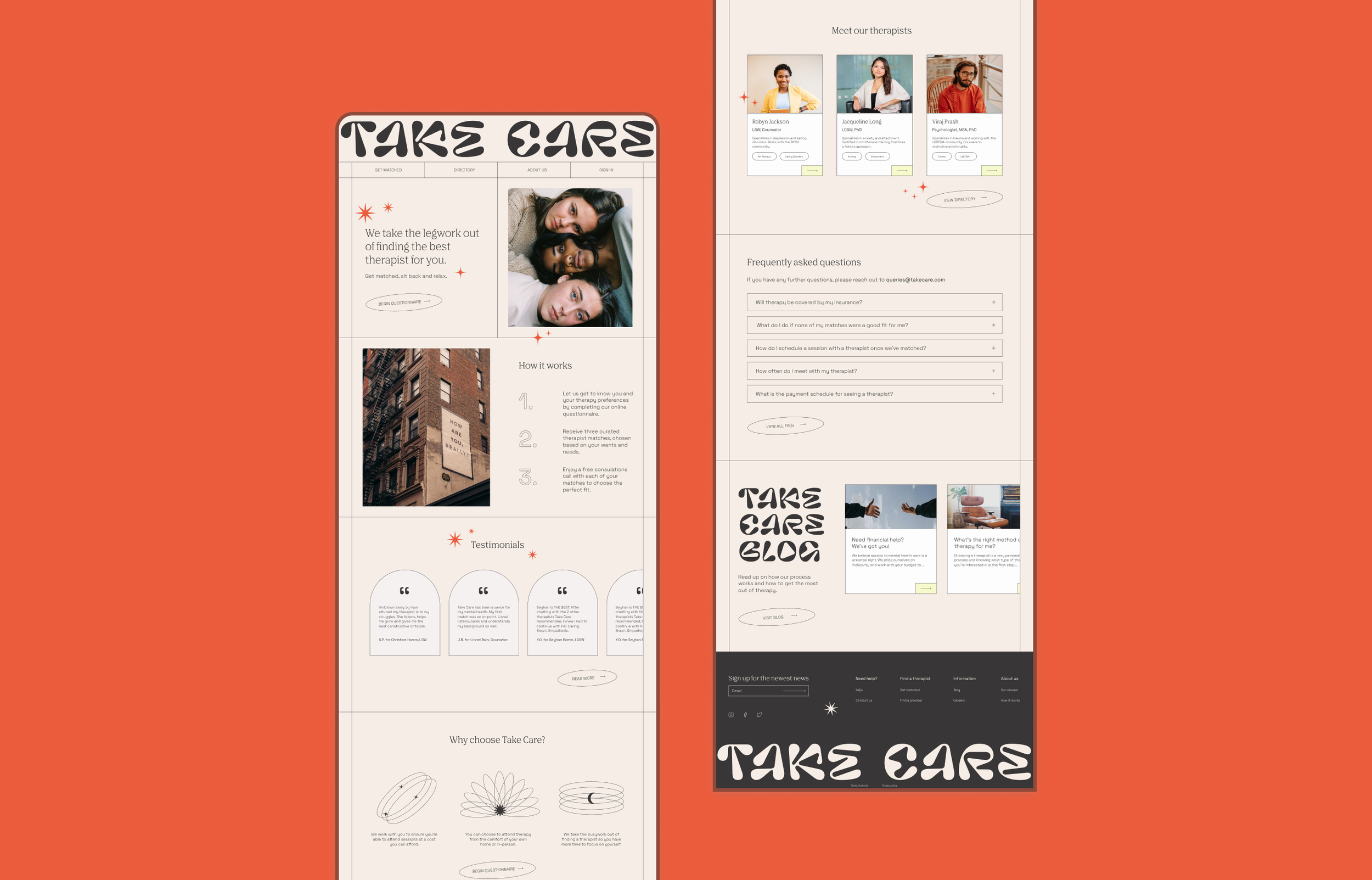
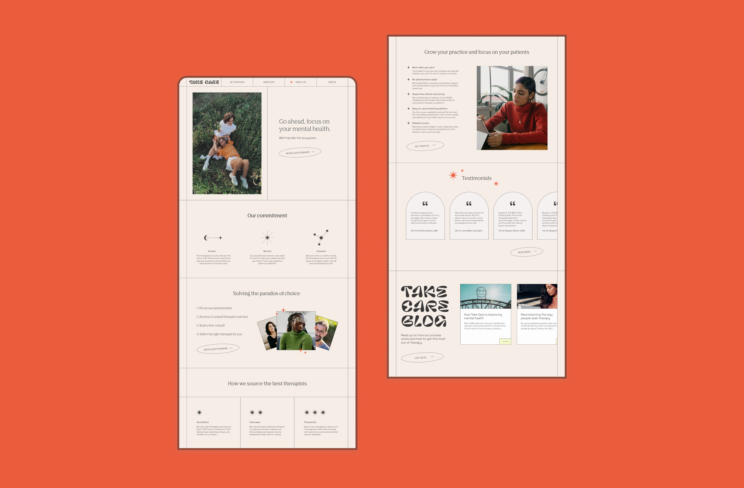
Homepage
For the homepage, I wanted to include answers to users’ main questions. How does it work? What am I supposed to do here? Are people happy with the product? What sets Take Care aside from the competitors? I did a lot of research on homepage layouts in order to come up with the most important information that should be conveyed to users. And again, I wanted to draw users in with a light, young, fresh layout.
Questionnaire
The questionnaire is compiled of wizards. In my research of questionnaires, I found that it was extremely important for users to have breadcrumbs, to know exactly what is supposed to happen once they complete the questionnaire, and for them to feel as though the questions are easy to answer. In adhering to these needs, I think I created a questionnaire format that would truly keep users engaged until completion. You can view all the questions I came up with based on my research and interviews by clicking the button below.

Directory and filters
Filters were the most time-consuming part of this project. During research, wireframing and UI, I came up with varying ideas of how the filters should be presented and what filters were most important to include. I took looooooots of inspiration from land-book and dribbble to come up with this final version. Filters are arguably the most important part of searching for a therapist because everyone has such a personal, specific preference when it comes to finding a person with whom to share the deepest inner workings of yourself. I think in the end I came up with a very simple, straightforward filtering system.

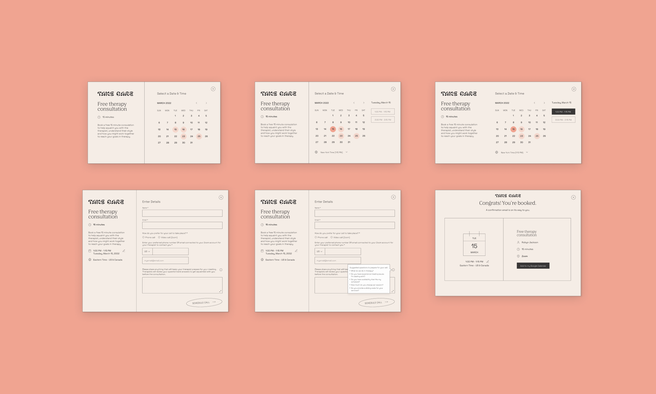
Scheduling
From my research, I understood that scheduling is one of THE MOST painful experiences when it comes to seeing a therapist. Users often stopped seeing a therapist altogether because of a schedule change, bad communication around scheduling, lack of availability and other time-related factors. With this information, I saw that it was important to make scheduling as easy as possible. With the model I came up with below, users are able to schedule a time based on what the therapist already has available. This way, there is no confusion or back-and-forth with scheduling. The only time slots available for scheduling are ones that definitely work for the therapist. I used modals overlaying the directory screens to display scheduling options.
About us
Approachability and synthesis of important information were at the forefront of designing this page. In an about us page, the user should have all the information they need to make an informed decision about whether the product fits their needs. I wanted to build trust and highlight Take Care’s best assets. I wanted to communicate what the company stands for and explain why customers should trust us. To help build credibility, I highlighted how we source therapists, our commitments to our customer base, testimonials and a section on why therapists should join us. I wanted this page to include all the information to help someone make an informed decision about why they should join Take Care.
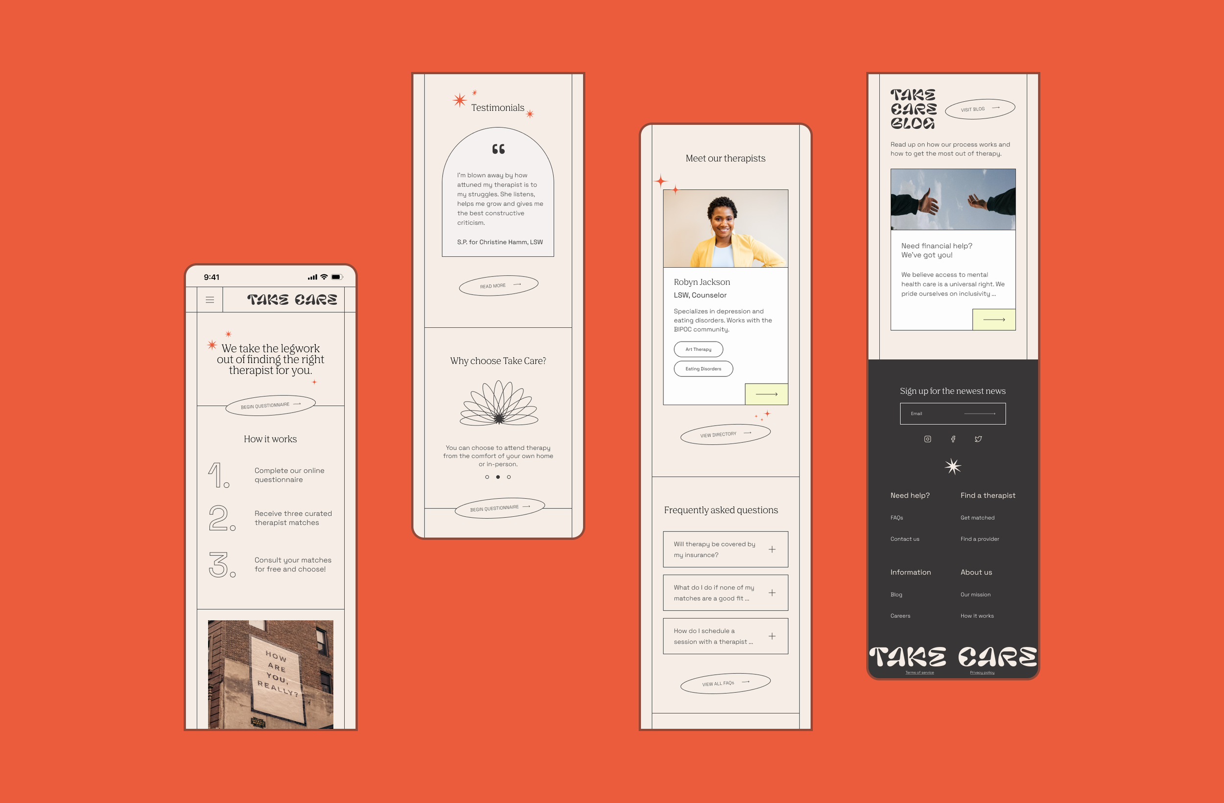
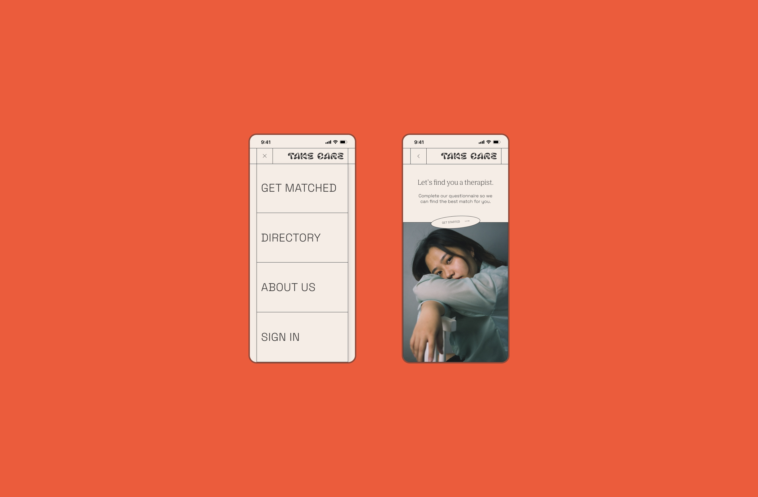
Mobile prototypes
Since I wanted to practice more with responsive design, I created some prototypes of how the Take Care landing page, navigation menu, and questionnaire would look in a mobile version. In these versions, I practiced with carousels, footer design and scaling down elements and sections. It is never easy to fit all the information you want to relay to users into mobile design, so it’s important for me to practice this skill. For the mobile prototypes, I used a hamburger menu and in the second image, I show what the navigation elements would look like when the menu is opened up. In that image, I also display a prototype for initial page of the questionnaire flow.
Project takeaways
This project was a HUGE learning experience in UI/visual design. It’s the first project where I really got to flex my UI/visual design muscle and it was extremely beneficial toward building my confidence as a UX/UI designer. With Take Care, I was really able to be extremely creative and had a great time playing around with stylistic elements. Creating a balance between stylish and usable was a really interesting challenge. This was also the first project where I created a questionnaire. I gained knowledge on how to use wizards and to use modals with the scheduling portion of the site. I was also able to refine my knowledge and use of filters. Gathering data and practicing these elements was a very valuable part of creating Take Care for me.
Next steps
Conduct usability testing (and iterate based on the results)
Focus more on financial aid and how to incorporate a sliding scale into the UX of the site
Highlight the benefit of practitioners joining the site more strongly
Build out all the questionnaire wizard pages to see if the questions I came up with resonate with potential users
Incorporate a journaling and/or messaging platform for patients to update their therapists before and after each session
Explore how to incorporate matching users with therapists whose sessions are covered fully or partially by insurance
Prototype all mobile pages