
UX - UI - INFORMATION ARCHITECTURE
Pair Dental
The brief
Pair Dental is a website that connects dental practice owners to dental specialists.
The focus of this project was to create a responsive help center. This help center needed to be a hub where practice owners could access all the information and resources they needed to in order to navigate the member portal and utilize the website’s services. The goal of the help center was to reduce the number of interactions with customer service representatives, to give practice owners more agency in using the site, and to simplify a complex web of information into a few pages.
ROLE: UX/UI Designer, Information Architecture Designer
TIMELINE: June - August 2021
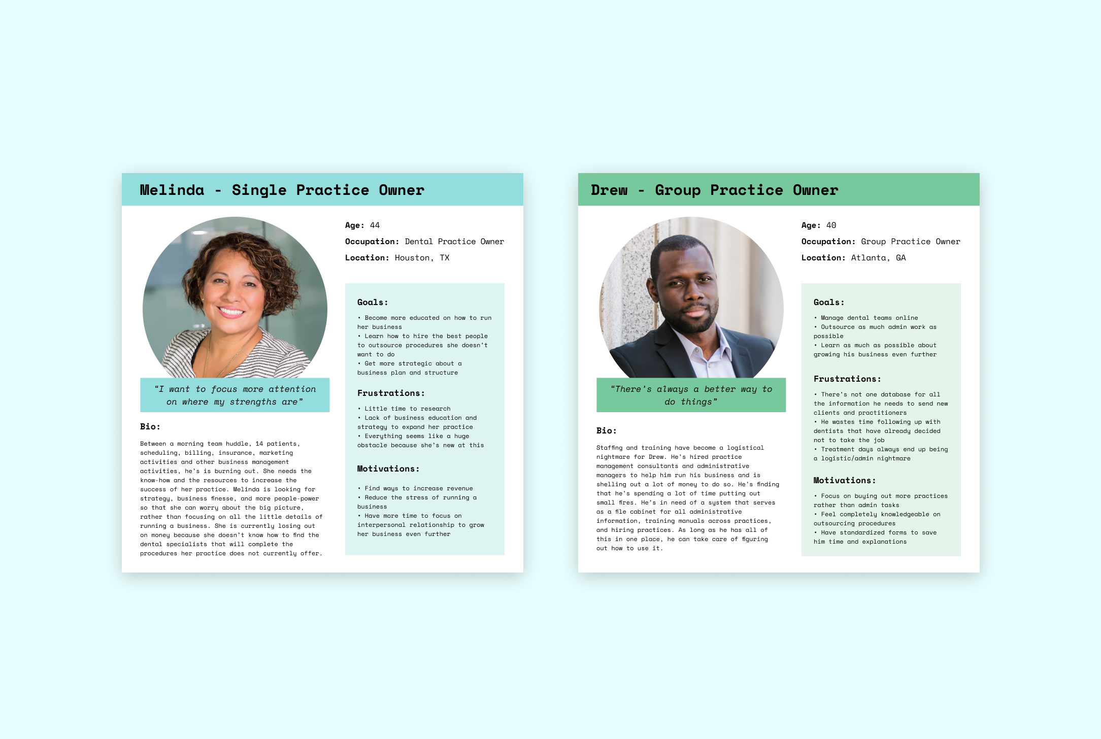
Personas
The client I was working with already completed the research of interviewing users and gaining insights from a first-person perspective (the CEO was a dental practice owner himself). Since the client had already done their own set of user research, I was given their previous market research and documents to review and synthesize in a way that was meaningful to the UX of the project.
From these categories, I came up with “Melinda” as the ideal focus subject of my project.
From their research, the ideal user was separated into 2 categories:
single practice owner — wants to provide excellent patient care and support their employees
group practice owner — wants to grow their company
From these defined categories of users, I compiled both into an ideal practice owner named Melinda. (see below)
Design patterns
Since he had a lot of data about the market and the industry, I was assigned the task researching design patterns. I set out to find sites whose help centers really stand out due to their intuitiveness and efficiency of use. My other focus was to find inspiration for compiling lots of information, text and articles in a clean, easy-to-navigate way.
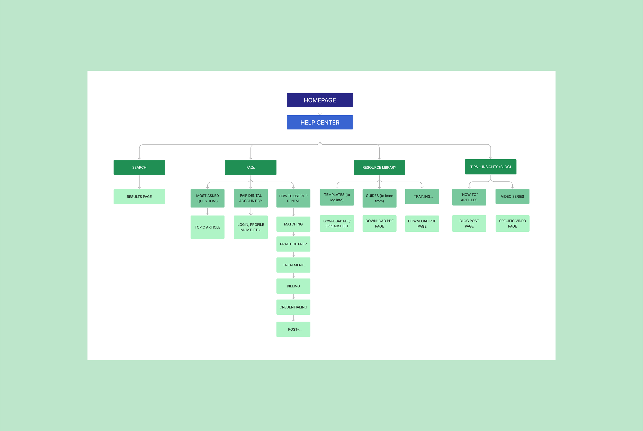
Sitemap
This was by far the most difficult part of the project. I was given a Notion folder full of different ideas and information to squeeze into the help center and I had to sift through all of it and narrow it down. Within the company, no one could agree what information was essential to provide to the dental practice owners. This complicated the process quite a bit.
I was given 4 main menu sections to work with: Navigation/Search Field, FAQs, Resource Library, and Tips & Insights/Blog (the client couldn’t really define what Tips & Insights, Blog, and FAQ were and what the difference between each of the 3 items would be). When discussing the FAQ page, no one on the team knew if they wanted this to be in a question and answer format, a blog post, or an article with SEO tags. There was grand confusion amongst team members which was a bit unnerving at first, but proved to be an extremely satisfying challenge to solve.
This is version 1 of the sitemap. Later I would create a new sitemap where the resource library and blog pages no longer exist. In meetings with the CEO and head of content, we teased out which items were a priority for us to focus on in the time being. It was interesting to see how every team member felt about each section. I was able to observe and understand the motivations each member had for supporting their opinions about what should be included in the help center.
Task flow
The task flow to the left is following the original sitemap. Here, the confusion continued…
re: FAQ: is it an article? blog post? dropdown? We didn’t have the answers yet.
BUT, the confusion here led me to understand that my clients and I needed to define how we were going to present the information.
We determined that the paths in these 3 task flows could be much simpler and more comprehensive.
On the right, I show 2 task flows following the newer sitemap. The task flow on the top is the ideal case, in which a practice owner finds all the information they need within an article in the help center. The task flow on the bottom affords the practice owner the ability to interact with a customer service representative via chat (or email or call).
We really wanted to make the help center as comprehensive as possible because the team is very small and customer service calls and interactions were being forwarded to the CEO, who already had a lot on his plate. Customer service was a big time and energy suck for the team, so it was of the utmost importance that the information architecture was really sturdy in order for practice owners to feel that needing to contact support is a last resort option. For this project, the name of the game was user empowerment!
The ultimate task for the flows on the right was “Find the answer to a specific question.”


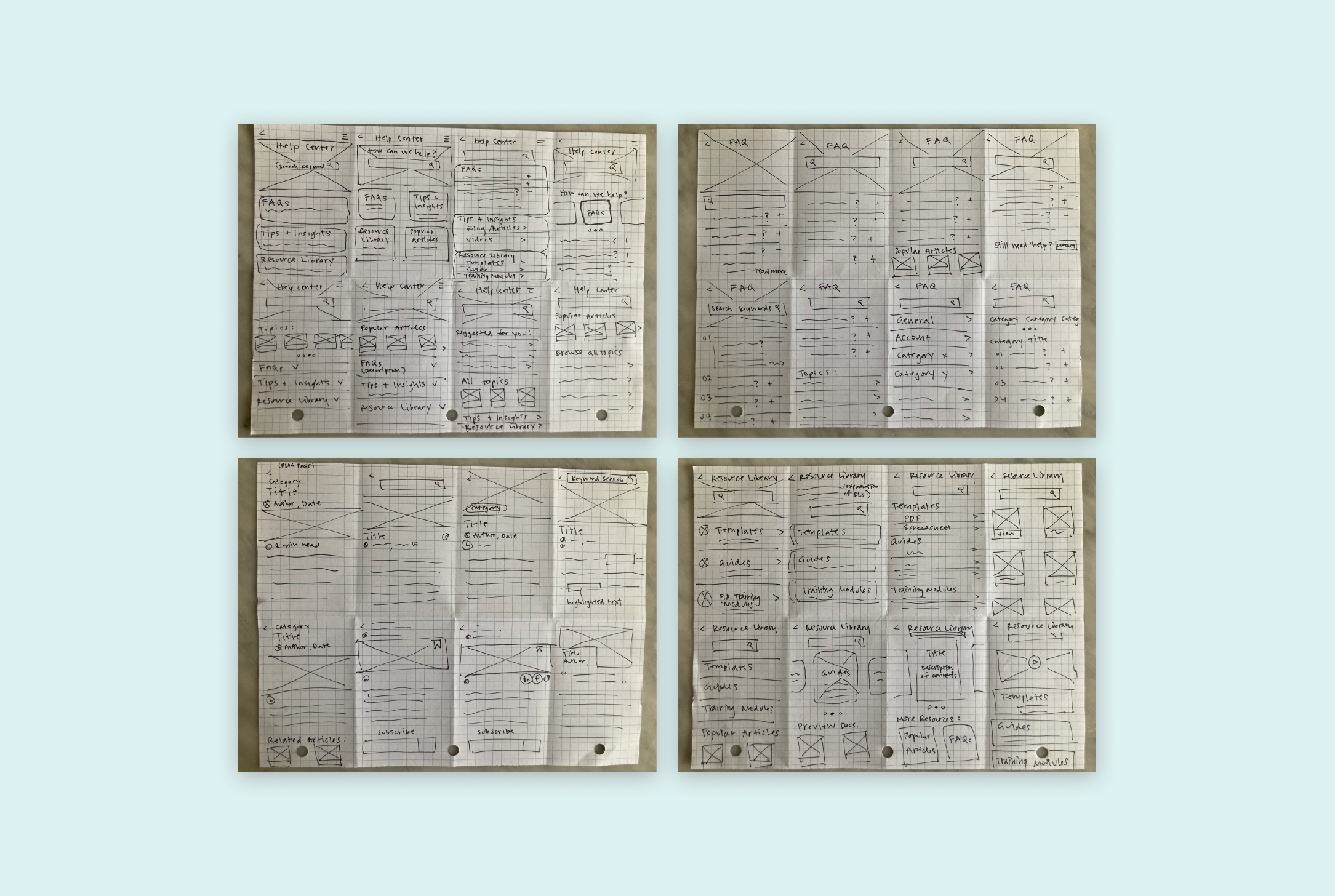
Sketching (mobile)
In this exercise, I created quick sketches for each of the 4 pages we decided to focus on in the help center. The purpose of this exercise was to ideate quickly and emphasize quantity over perfectionism of ideas. This is my favorite way to begin the brainstorming process because it allows me to think outside the box and not be too critical of my ideas.
This practice turned out to be a very useful collaboration tool. When I brought my ideas to the clients, it sparked a lengthy discussion parsing out what each page should entail. Before I came to the team with my sketches, each member of the team realized that had differing ideas about what a blog post and FAQs entailed. Once I presented my sketches to my clients, they decided to forgo the Tips & Insights/Blog Page for the moment. They also decided that a resource library was unnecessary at the moment since the content for this page didn’t actually exist yet and would probably not for the foreseeable future.
I created the sketches below in mobile format to assess which elements were essential, and then would scale up for web later.
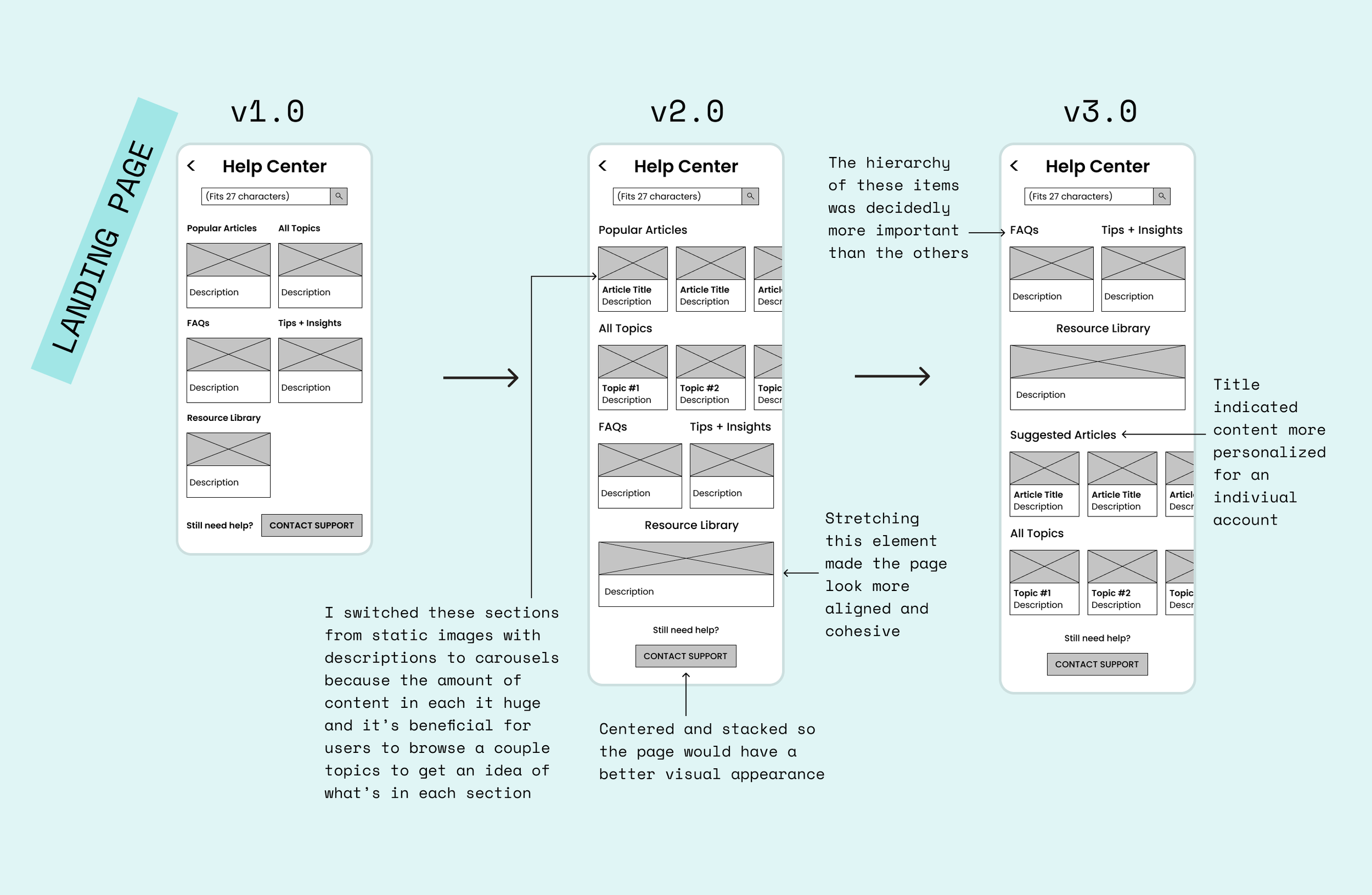
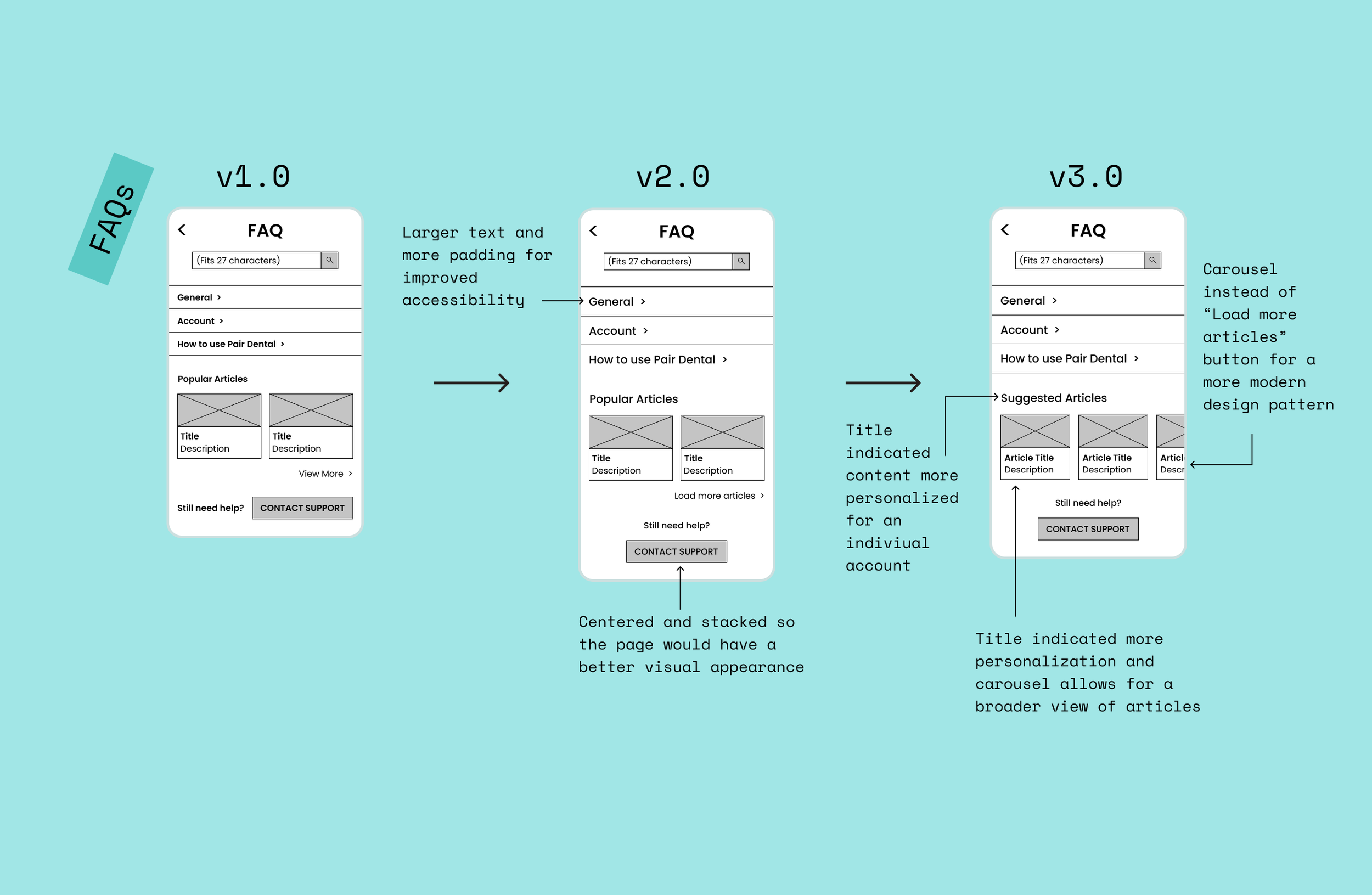
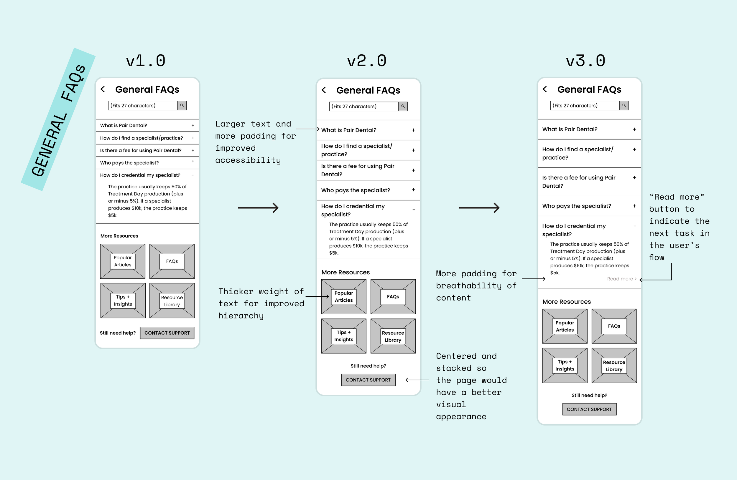
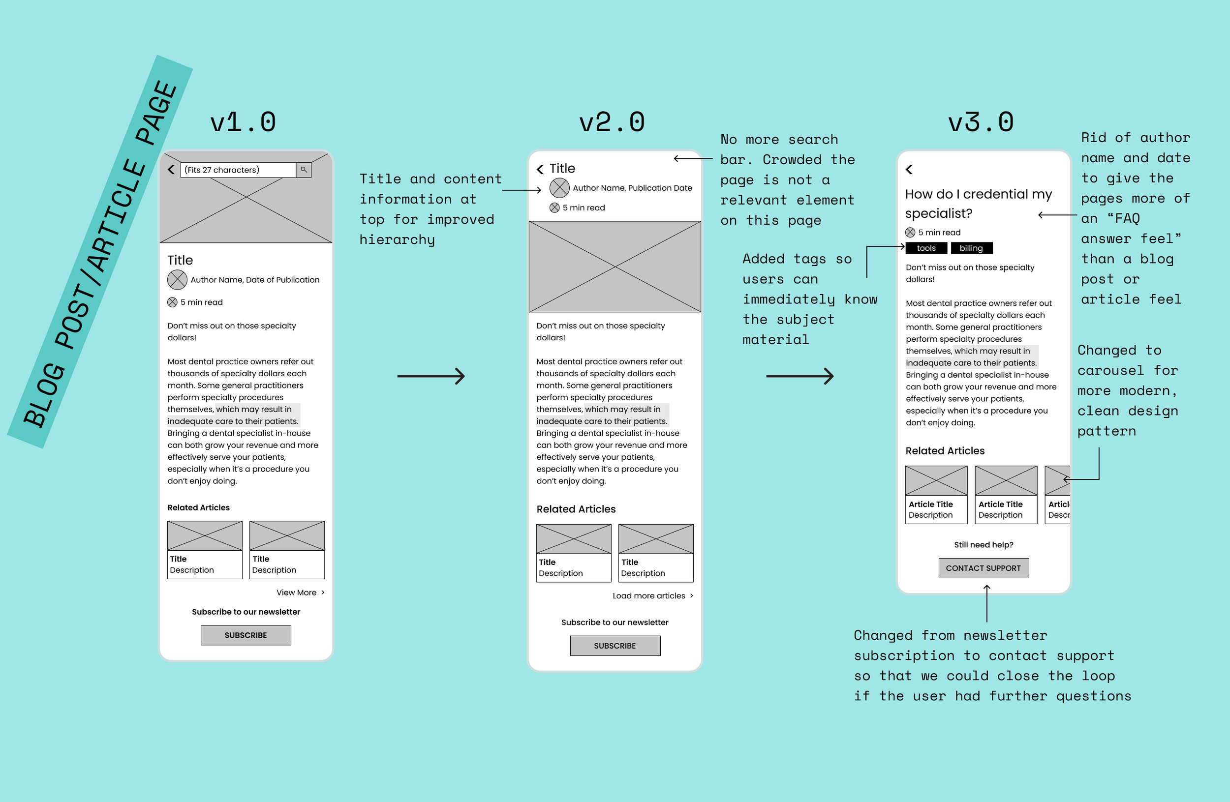
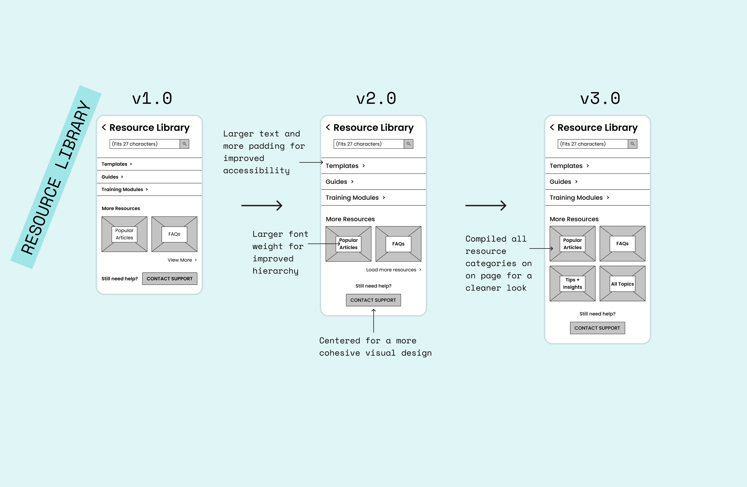
Mobile wireframes
With the confusion surrounding information architecture, I went through 3 extensive versions of ideating mobile wireframes. I wasn’t sure whether I was to model the FAQ answer articles after a blog, a WikiHow, or what. I also played around a lot with the hierarchy of information. Information architecture took up the largest amount of time by far on this project.
Below, you can see Versions 1 (at top), 2, and 3 (bottom) of the mobile wireframes iterations I created. In red, I marked my changes from one version to the next. The bottom version is the final iteration of mobile wireframes I created or this project.
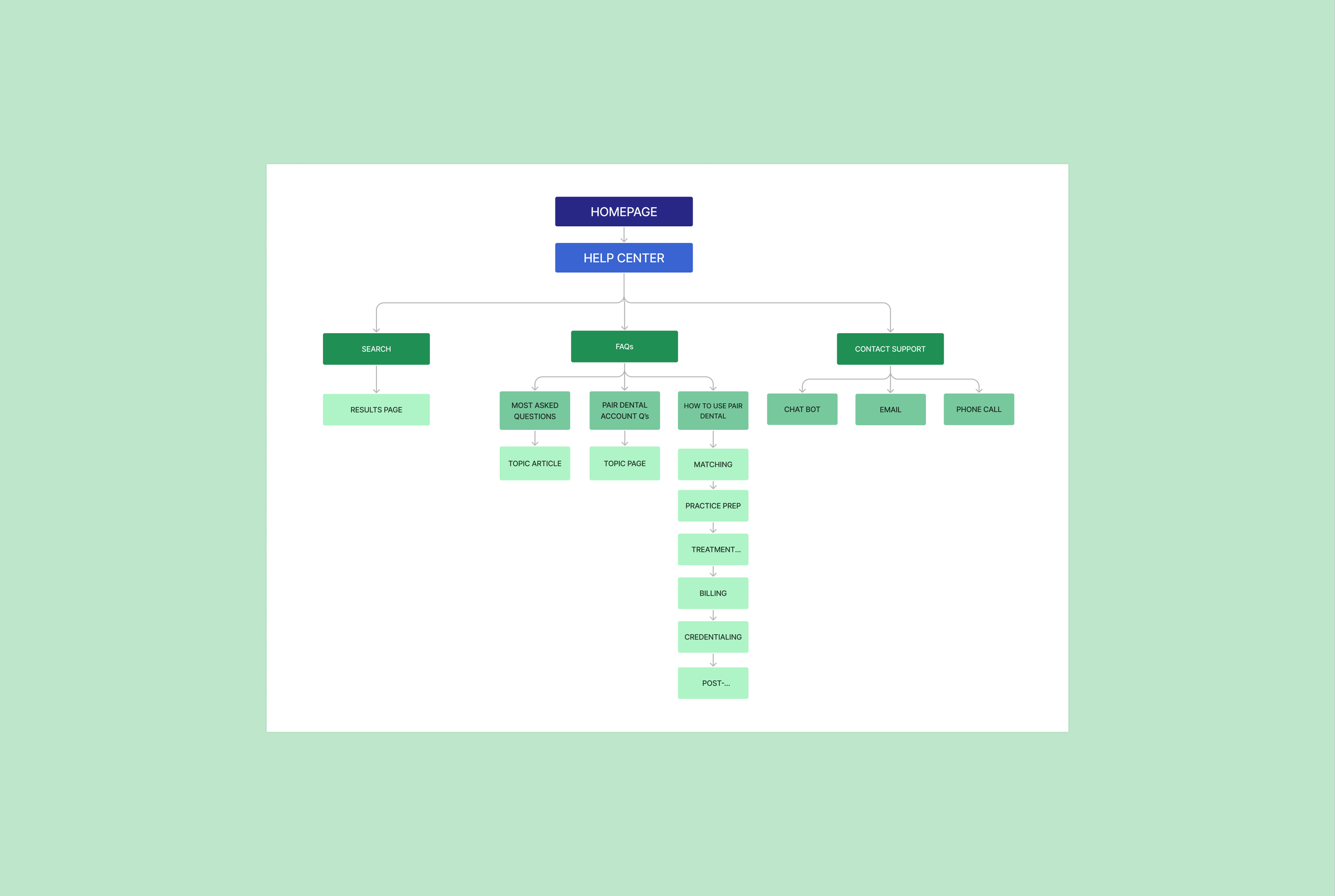
Sitemap 2.0
The most intensive aspect of this project was information architecture. The further along the team and I got in the project, the more we realized that the original scope we discussed was too large and ambitious for the company’s resources at the moment. We spent a lot of time in meetings talking thorough ideas to parse out which elements were most important to focus on. I learned so much about prioritization of features and content and about how to communicate with clients through this project.
In initial meetings about the help center, the team had grand ideas about what the help center could include. By sketching, creating wireframes and talking through my brainstormed ideas, we all realized that the focus of the project needed to be pared down to include fully realized elements. Since templates, guides and training modules didn’t even exist yet, we decided to cut this out of our MVP. We also got rid of the video series since we realized it would take a lot of the company’s time and money to produce these items. We added a contact support option to the sitemap as well, seeing as the users would still need a way to figure out the answers to questions they could not find on their own.
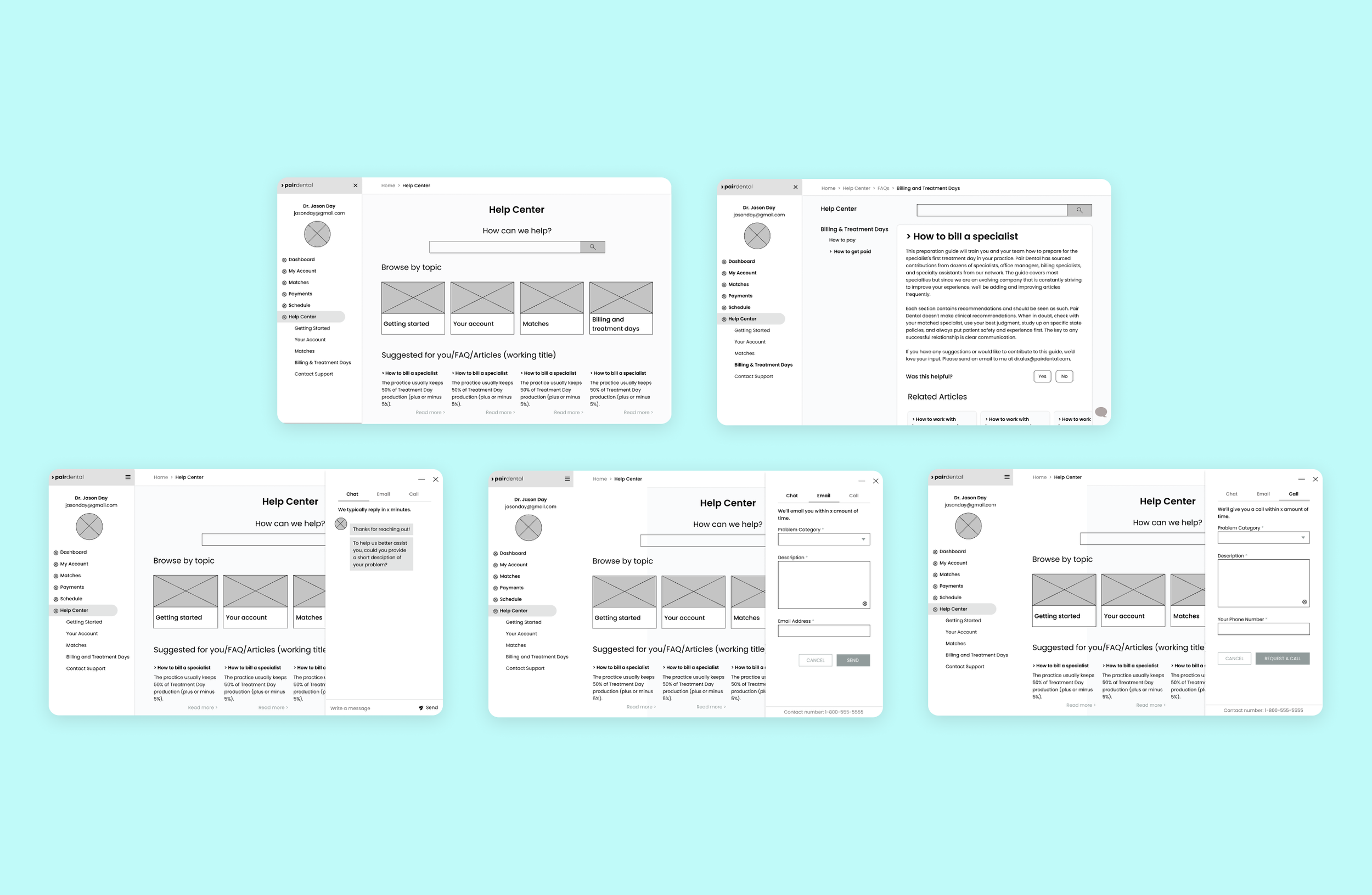
Desktop wireframes
Most of the messing around with hierarchy and information was sussed out in the mobile wireframes, so once it came to desktop it got a bit easier for me. Shown below are not all the versions of the wireframes I created, but these are the ones that informed my final designs the most. These are the most polished of the wireframes I created for web.
It was an interesting journey to get here because I saw how creating wireframes could really help tease out which elements are necessary for the MVP, which can be cut out, and which need to be higher/lower in the hierarchy of needs. Once I discussed the mobile wireframes at length with the client and his team, we all came to the realization that the blog page and the resource library were confusing concepts to us. They encompassed too much information and were jumbled in meaning across team members. And if we were confused, the user would definitely be.
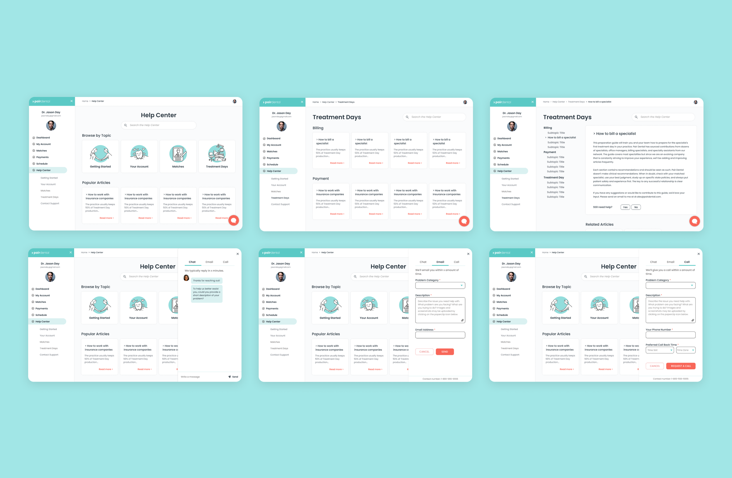
In the desktop wireframes, I focused a lot on the chat popup. I researched loads of chat features, and came up with some key elements:
Displaying response time
Input fields for the email and call tabs
Ability to attach a screenshot of the issue the user is facing
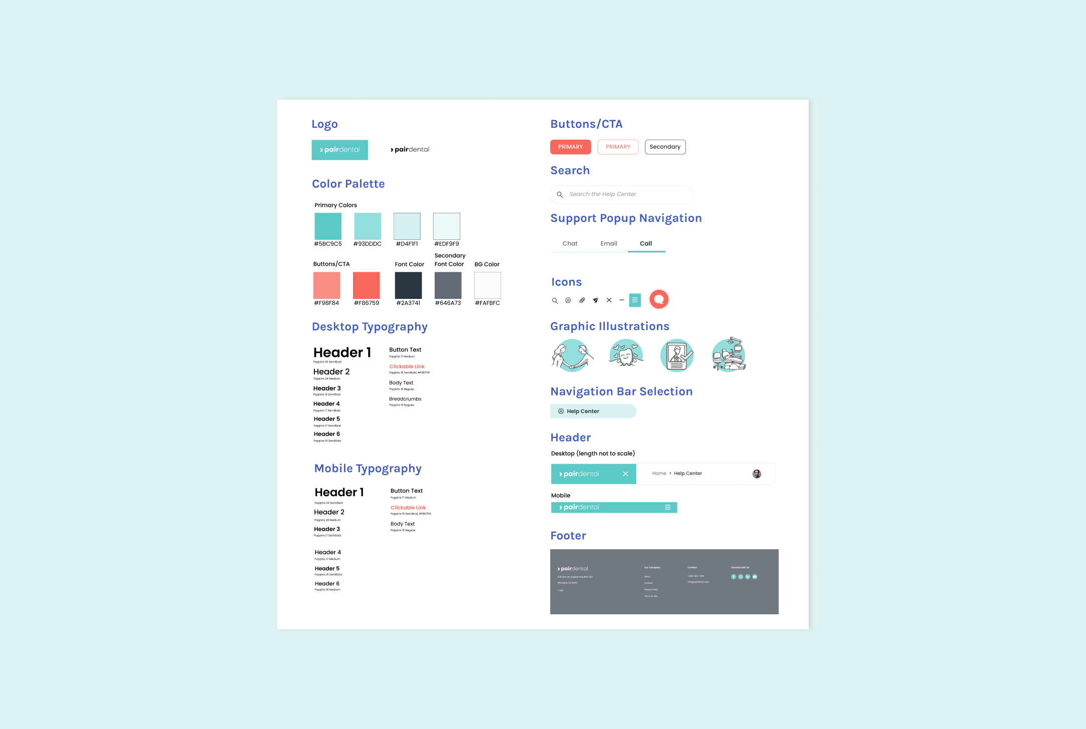
UI kit / brand
The team already had an established logo as well as colors and fonts that they wanted to stick with. When I came onboard, they were also already working with an illustrator to create graphic images for the site. From here, I felt a little like I was combining the established UI elements and filling in my wireframes as if they were a paint-by-number. The thing we changed up most was font sizes. We played around with the font for hours trying to decide what combination of accessible and not geriatric we could make the font on the site.
Playing around with font sizes also taught me that no two fonts are made the same. Since the client was already using Poppins, we had to keep in mind that it is a larger-than-average typeface, and adjust accordingly. We would not have treated Times New Roman or Inter in the same way, because they don’t have such expansive widths and heights as a bubbly font like Poppins does.
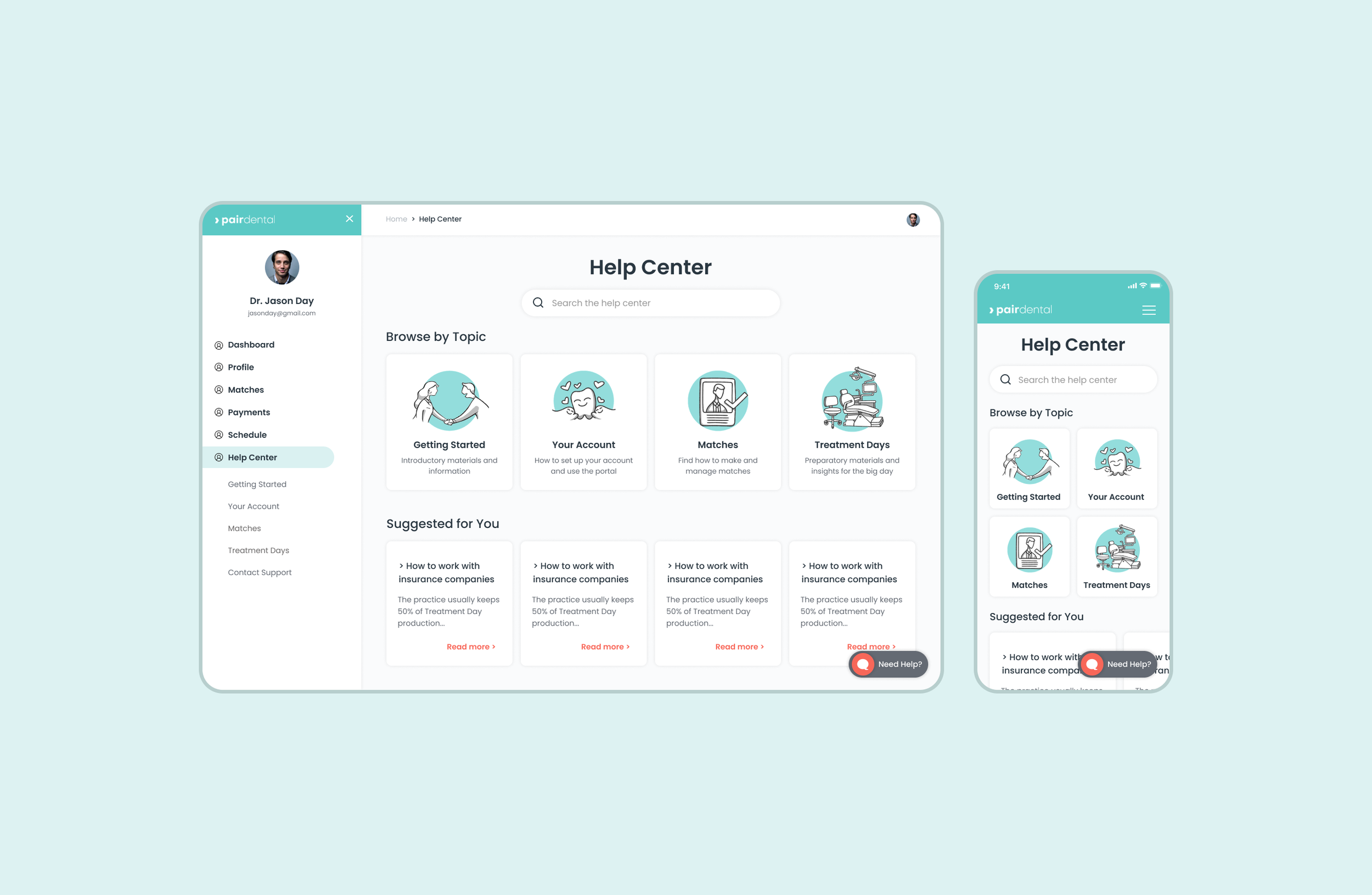
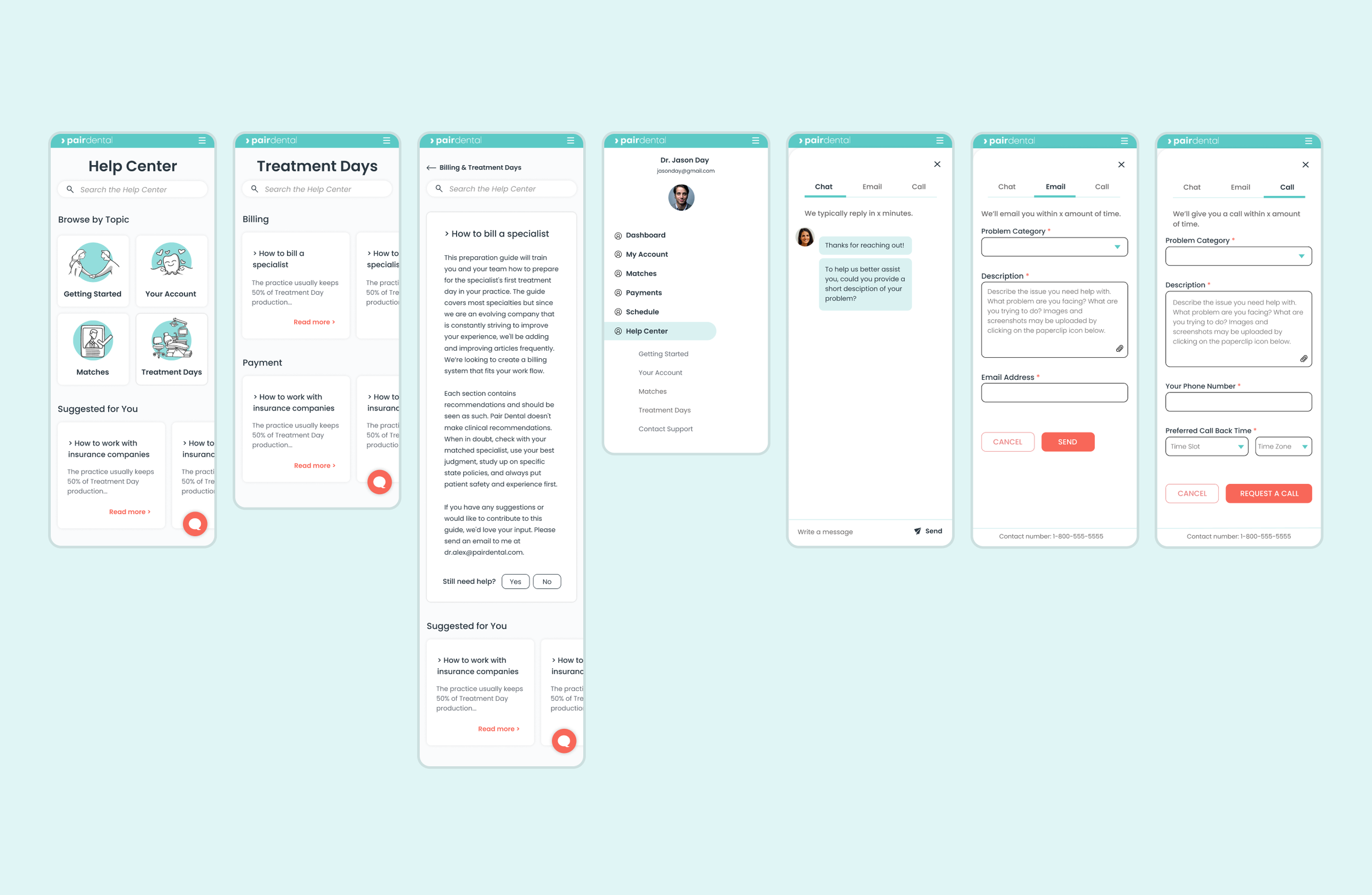
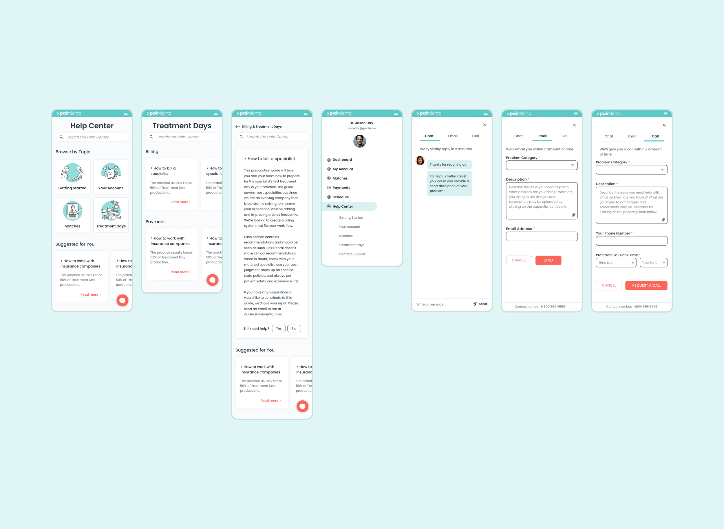
Hi-fi prototypes
I dabbled with a lot of low- and mid-fi versions before I landed on these prototypes. I had to really figure out how to utilize space on the page and pare down categories. It was helpful for me to create the mobile wireframes first for this reason. Once I started working on the desktop version, everything felt super breezy. The biggest challenge with the desktop version was figuring out how to lay out the specific article page (second image, page 3, top row). I wanted the user to be completely empowered and have breadcrumbs showing them all their options.
Usability testing
I conducted interviews via Zoom and recorded my participants’ screens with their permission.
I had 3 participants for this study, ranging from 26 to 58 years old.
Test Objectives
Find out if participants would be able to find the answers they were looking for before turning to customer support for help
Observe if users are able to utilize the customer support popup with ease
Discover what participants typically like/dislike about chatbots and other customer support contact options
Observe any areas of hesitation, confusion, difficulty, etc.
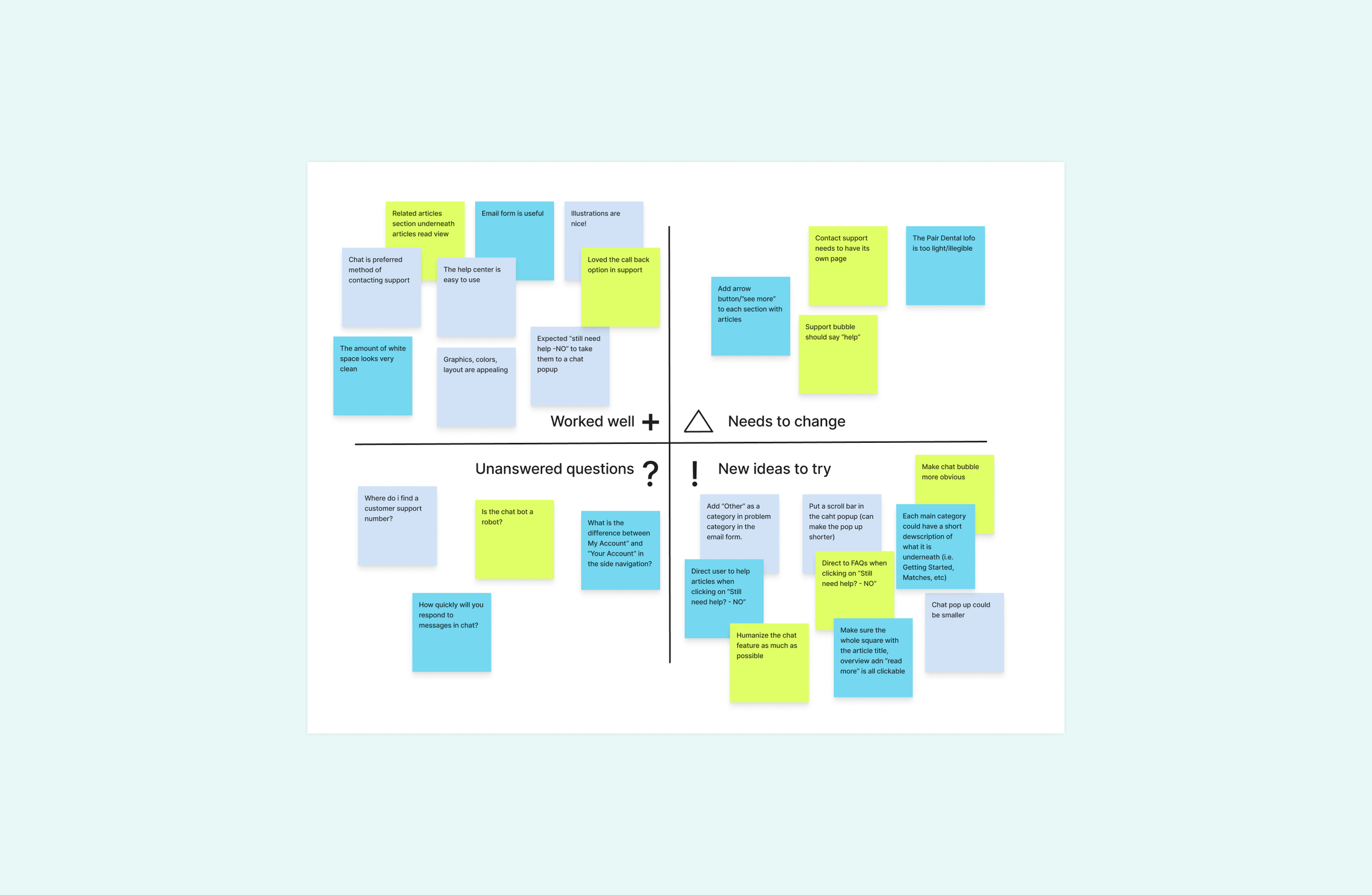
Takeaways
What felt right:
Email, call, chat options
The design — lots of whitespace was appreciated
The different options to find help were intuitive
Room for improvement:
Need a page entirely for “contact support”
Function of support bubble needs to be more obvious
Need to maneuver users to more information if they haven’t found what they were looking for
Sections in the help center could have short descriptions explaining what they are
Click below to read the full compilation of insights I gained from the usability study…
Desktop iterations
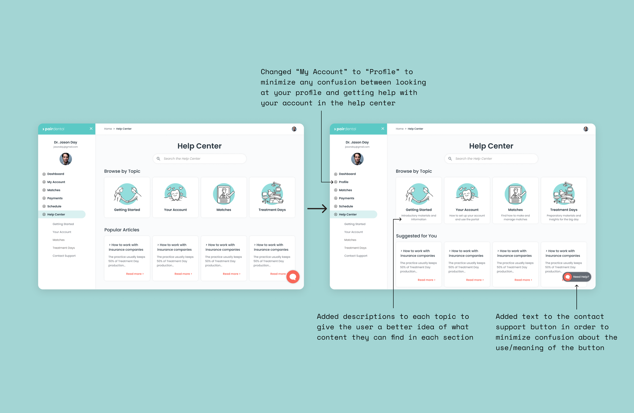
For the landing page, a big takeaway of the usability study was that I needed to make some of the wording on the landing page of the help center more intuitive. In order to do so, I changed the following:
Change “My Account” to “My Profile” to mitigate confusion between viewing your profile and making changes to your accoutn
Add descriptions underneath topics on the landing page
Add “Need Help” to the chat bubble
Make the contact support icon on the bottom right of the page more intuitive by adding a tooltip bubble
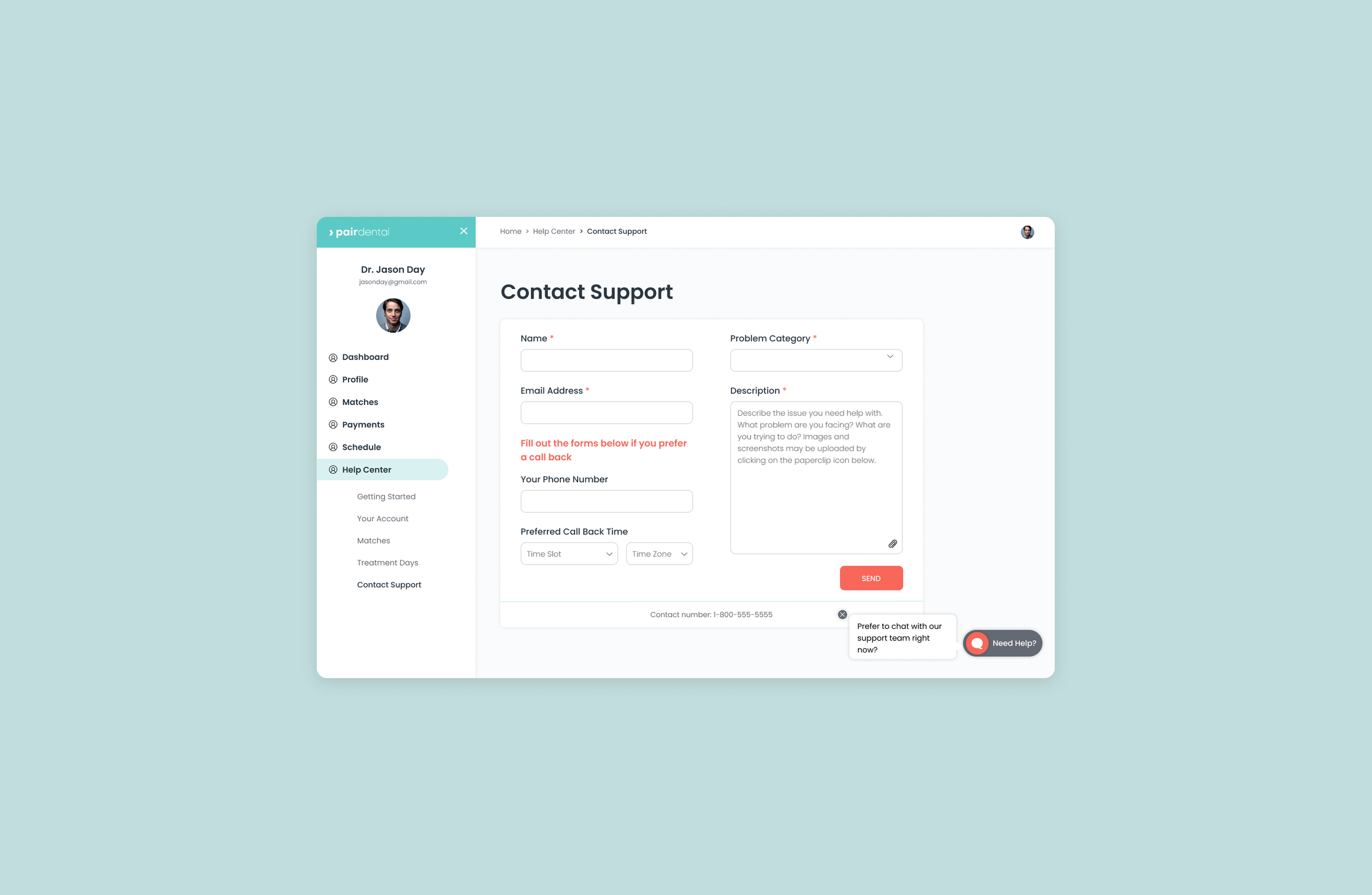
I also realized in the usability study that I needed to design a contact support page. People who come to the site need all the resources to be able to access the help they need in order for the site to run well and to keep people satisfied with the service. The second image below shows the contact support page that I created.
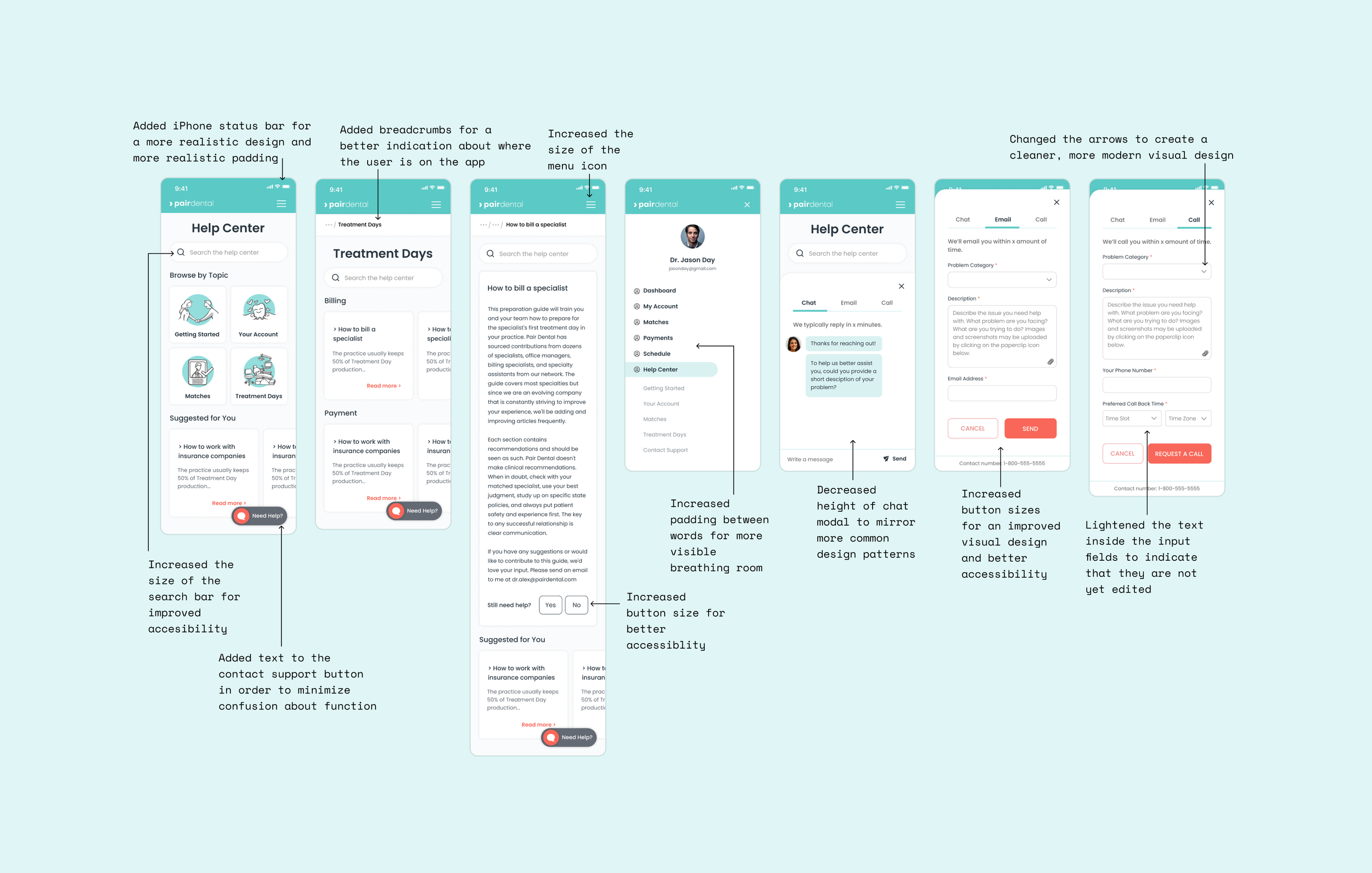
Mobile iterations
I mostly made visual design iterations and changes to elements in order to make them more intuitive and accessible to users. I added more padding, increased button and text sizes and changed/added wording to some elements. It came to my attention during the usability study that users were not sure how to use the chat bubble and so the main focus of my iteration process was doing design research into finding patterns that would make this function more intuitive.
On the left below is my hi-fi mobile prototype before the usability feedback, and on the right is the iterated model that I created after I received feedback from the usability study. I made short notations of each of the changes that I made to the version on the right.
Project takeaways
In this project, I learned what it was like to work with a very small team. Collaborating closely with the head of UX gave access to a mini design mentorship that helped me improve my practice. I also gained confidence in my ability to work out the kinks of information architecture. I chose this specific project in order to improve my information architecture skills and by the end of the project, I felt very capable in that step of the design process. Specifically, by creating multiple iterations of the sitemap for this project, I was able to really understand the building blocks of what the site would look like, making the rest of the project flow smoothly and efficiently.
Next steps
Redirect users to a page with more articles if they click “Yes” after "Still need help?”
Test with actual users of the site (The client did not want me to do usability testing with actual users before they had the help center coded. The time of the practice owners who use the site is very precious, so the clients wanted to be sure they had something concrete to work with when they reached out for participants)
Add sections for a resource library and a blog (The clients had not come up with content for these sections at the time, so we altered the sitemap and decided to hold off working on these pages until the content was actually created for these pages)
Test out the contact support page with users to see if the design makes sense
Test out the new contact support bubble design to see if users now understand and are able to utilize the feature