
PRODUCT DESIGN
Backroom Social Club
The brief
Backroom Social Club is a virtual platform connecting fans at home with performers and guests via live streaming concerts events.
The objective of this project was to improve the chat feature and to add direct messaging to the site. The goal of adding direct messaging feature was to help existing users engage more deeply and make stronger social connections on the site. The user base consists of musicophiles and event planners who want to connect with like-minded people through live streaming events and chat rooms.
ROLE: Product Designer
TIMELINE: May - July 2021
Challenge and goals
Challenge
[See below for original landing page 😮]
My focus on this project was the chat feature (to the right), but I also ended up giving advice and making mockups of the entire page for my clients. As you can see, the chat section here is very minimalistic and pretty much feature-less. Further, there were a variety of issues with stylistic elements that I had to remediate (unmet accessibility standards, page crowding, lack of hierarchy…just to name a few…). I had my work cut out for me!
This project was a really fun challenge and I worked with an amazing, open team who taught me how to collaborate and communicate on a job. Moving forward, I wanted to answer the following questions: How can people be encouraged to use the messaging feature? How can I, as a designer, stay within existing design patterns while creating more accessible, friendly features?
Goals
Add a direct messaging feature.
Improve the chat feature based on user research and feedback.
Make social interactions more fluid and easy to navigate.
Increase connectivity amongst users.
Competitor analysis
The stakeholders sited Shotgun and Twitch as their top competitors and said they wanted to create messaging capabilities similar to those of Zoom. For further research, I included YouTube Live and Cercle as other live streaming platforms that I suspected I could learn from.
Opportunity space
Messaging capabilities that inspire users to connect deeply
Focus on “chatting” rather than “commenting”
Private chats/direct messaging
Focus on a intimacy and community

Heuristic review
I created a heuristics review of the existing site to show the stakeholders what areas could be improved upon. I thought it was necessary to start with a heuristic review so that the stakeholders and I could get on the same page and discuss the weak points of the site before we began getting into the nitty gritty. It was also an important part of the process for me to hone my design eye and to reiterate the importance to myself of accessibility and ease-of-use.
User interviews
I interviewed 5 participants (aged 26-43) over the phone and focused my questions on how my participants currently use Backroom and what they would expect from chat and messaging features.
Takeaways
There is currently VERY low interactivity with the chat feature - almost none of the participants used this feature
Participants would rather use a chat feature than talk while an event is streaming
Connectivity with other users was the most important aspect of the site to participants
Elements such as timestamps, an emoji library and “liking” messages is important and expected in a messaging feature
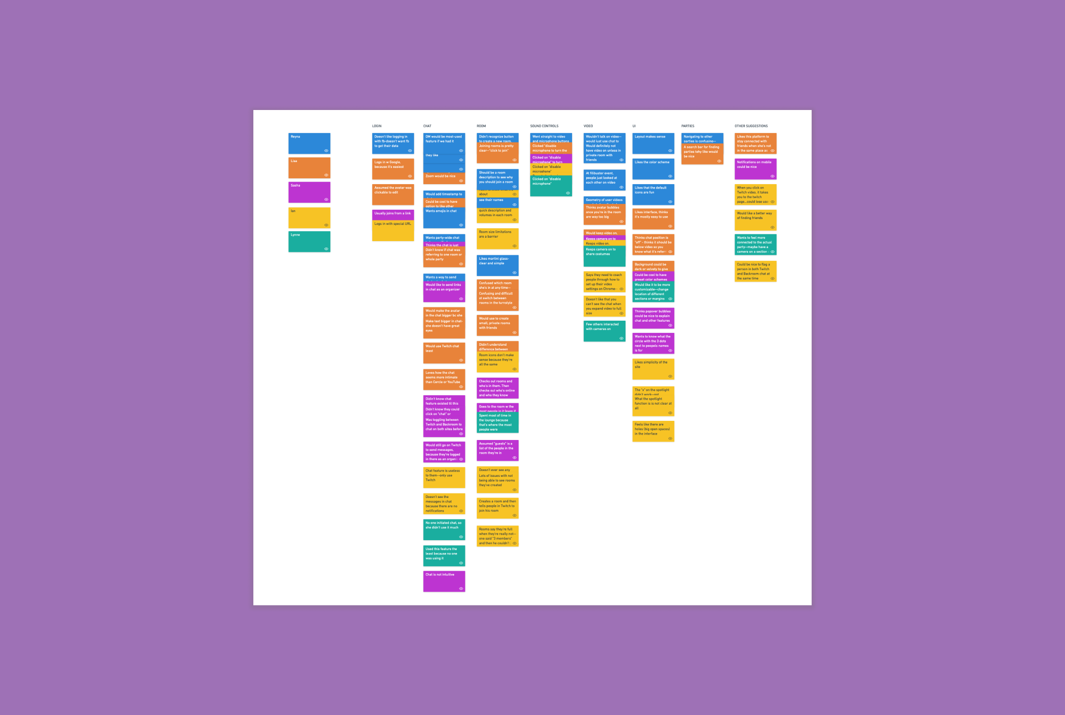
Affinity map
When my research interviews were complete, I used an affinity mapping exercise to compile all of the user feedback I received into specific categories and make the data more cohesive. I compiled the results by stacking similar points of feedback into categories. I gathered a lot of information and feedback on the chat feature specifically. From here, I had so much information and data to work with in order to improve the site.
Personas
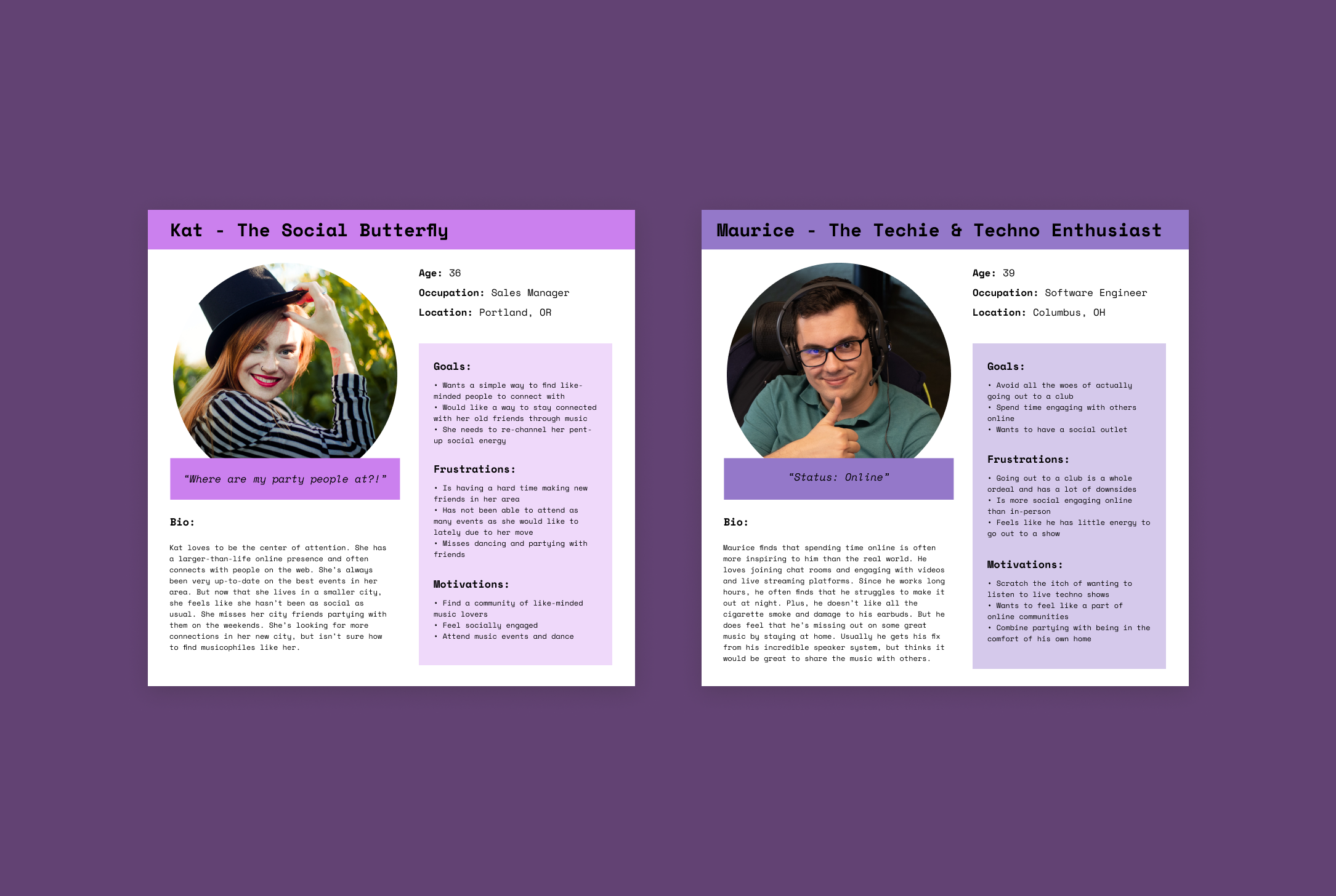
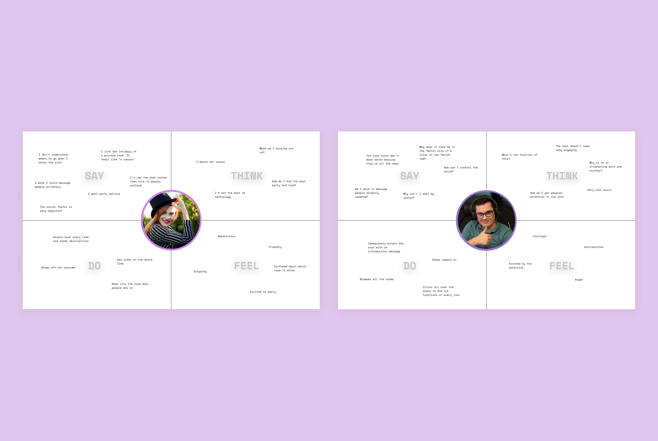
Based on the user base that the stakeholders were seeking and the people that I interviewed, I came up with two personas. I have Kat, “The Social Butterfly” and Maurice “The Techie & Techno Enthusiast”. After my user interviews and usability study, these two personas were the amalgamation of very specific qualities I found in the users with whom I spoke.
Kat is the typical user who wants to party, “peacock”, and chat. She’s the super social user who is using Backroom to find connection with others. She represents the user who is utilizing Backroom to gain access to events that she cannot typically find in her area. We serve as an important, unique social and musical resource for her.
Maurice is someone who is very comfortable online. He’s a bit of a homebody, but loves techno music. He’s both a computer and a sound nerd. Interacting with others online is his primary source of extroversion. He’s the king of the chat room.
Empathy map
In this exercise, I created one empathy map for each persona. Empathy maps served to help me and the team to really understand our users and prioritize their needs. They serve as a visualization of who our ideal users are as a whole. Down the line, I would refer to these maps in order to align my design decisions with the users’ needs. I find this exercise useful to get a fill picture of our users, including contradictions in their thoughts, behaviors, words and overall feelings.
HMW (How Might We)
After I analyzed all this data, I came up with HMW (How Might We) statements related to the insights I gathered. HMW statements gave me the ability to brainstorm potential ideas to address the problems people from my interviews experienced. I broke down insights from the usability study I conducted and related them to user needs. I then created POV statements based on those needs that highlighted why users had certain needs. From there, I deduced HMW statements to help spark the brainstorming of ideas about what functions the chat feature could potentially include.

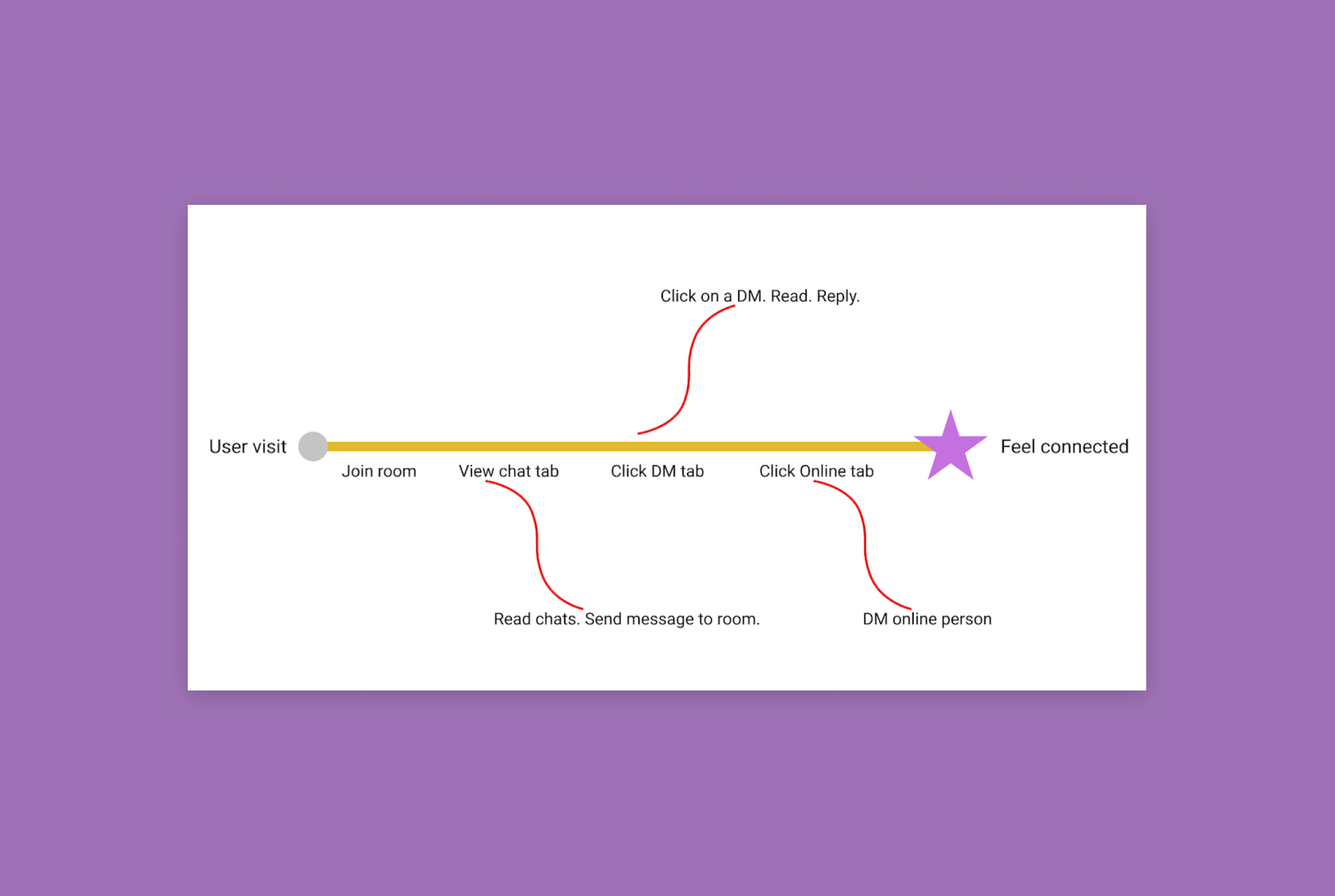
The happy path
I used the information I gathered in my interviews and created a “Golden Path” to focus on the MVP of the site in relation to the messaging feature. This helped me prioritize key features. Now that I’d laid the groundwork for the project, it was time to go crazy and have a bit of cheeky fun.
With the golden path, the intent for the user is to feel connected on the site. The way we hoped to make users feel more connected was to make the chat feature simple and accessible. Through my usability study of the existing site, I found that users needed to join a room and receive alerts about new messages in order to really interact with the people and events.
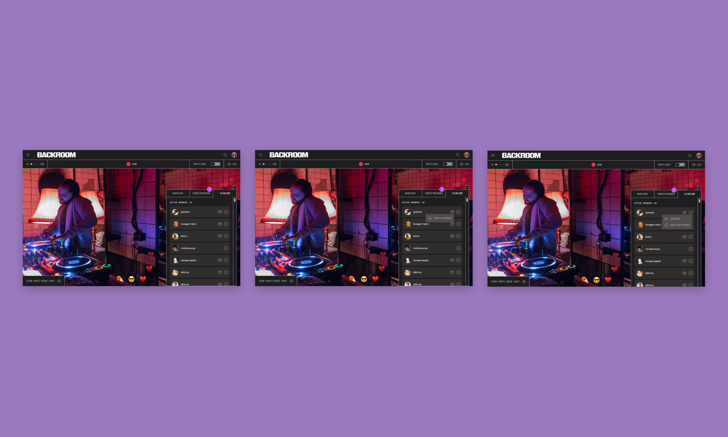
Mid-fidelity mockups
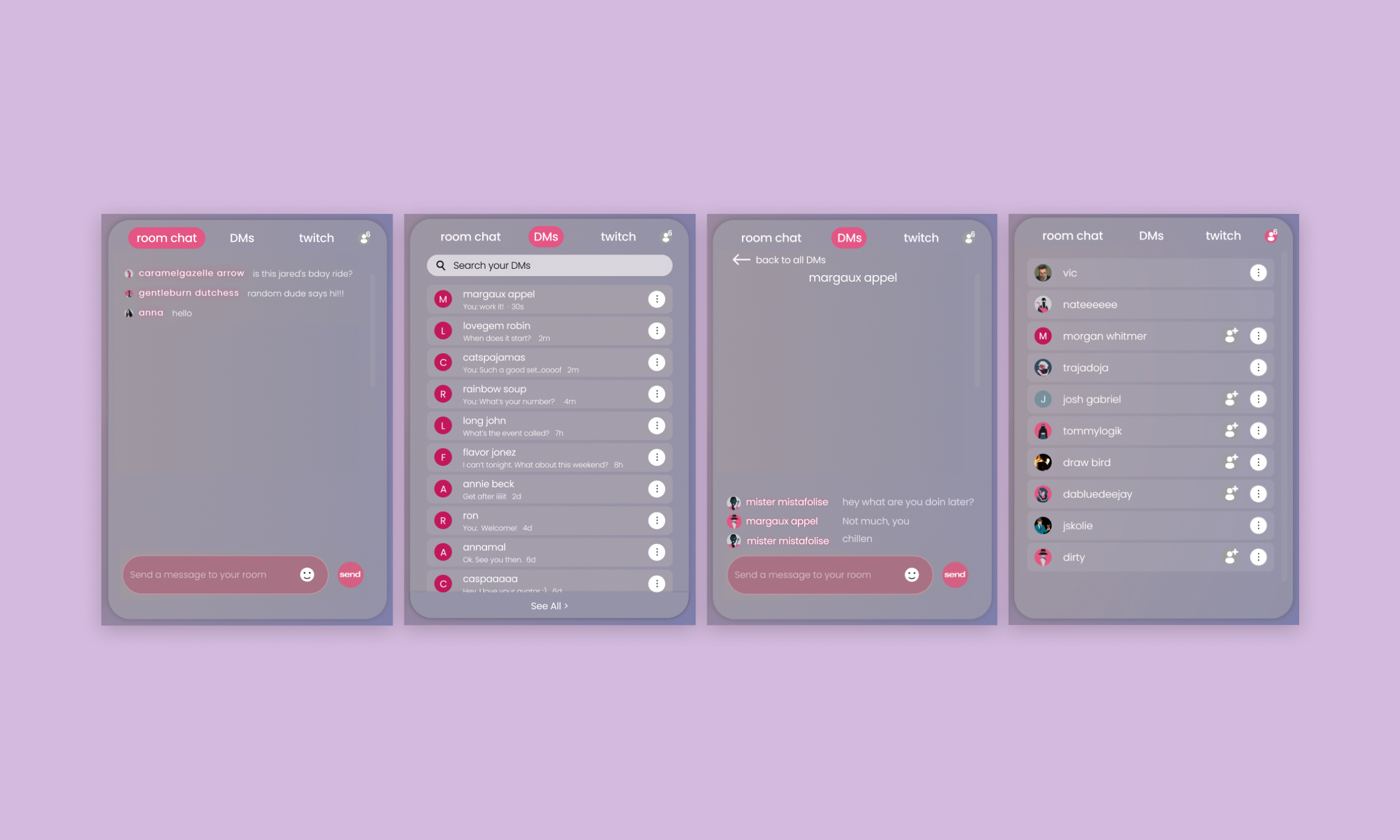
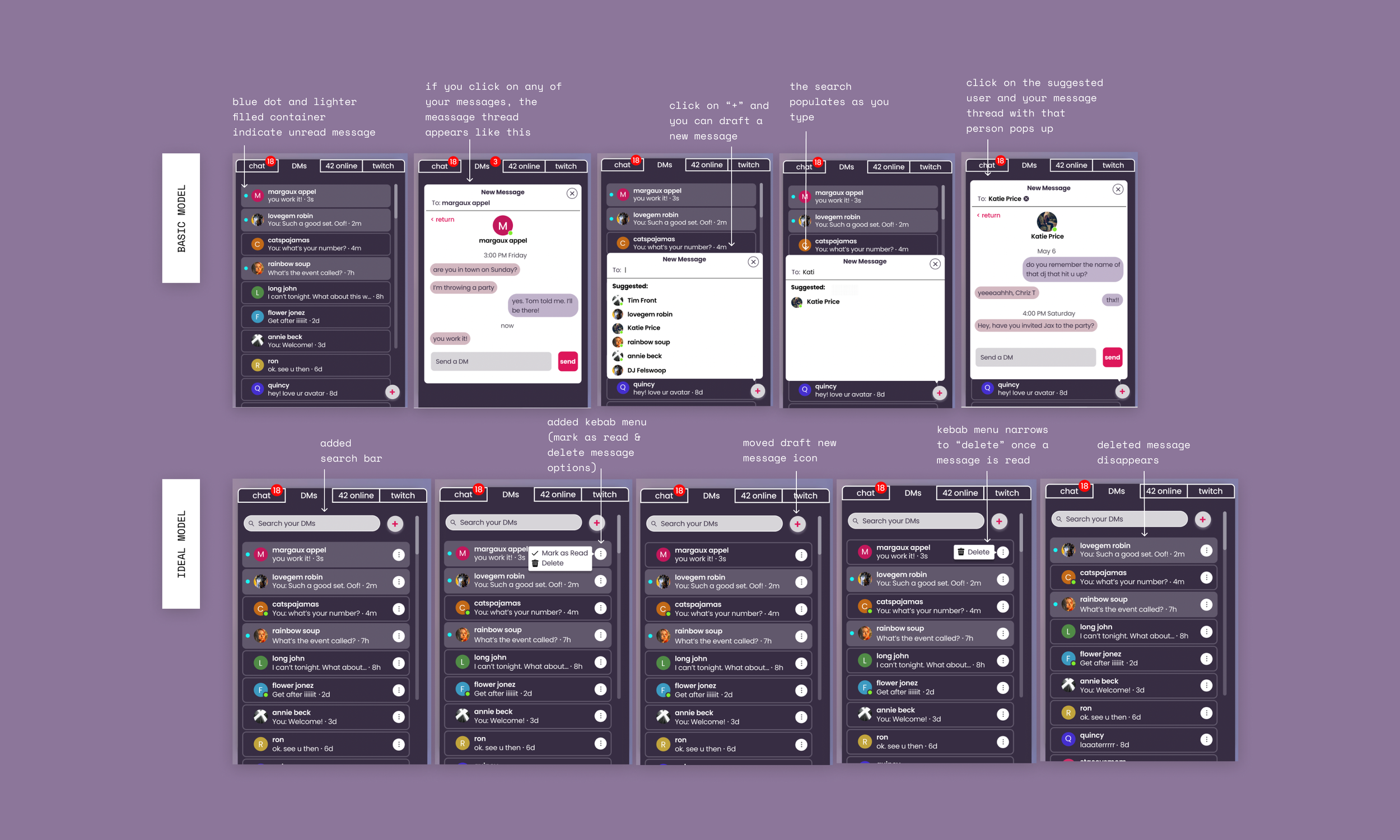
I put together some initial mockups for the messaging feature (see below). The main elements I focused on were room chat, direct messaging and online guests tabs. The Twitch tab was to be phased out in the near future, so I was asked by the stakeholders not to focus on this tab at all. The existing tabs were “chat”, “guests”, and “twitch”. From usability testing, I found that the function of these tabs was confusing to people based on the labels. I switched the labels to “room chat”, “direct messages” (DMs), and “twitch”, and added an icon signifying the number of people online.
The trickiest part of this phase for me was staying within the design patterns of the existing site. The UI Kit as it currently existed was not accessible and the elements appeared very low-fi and out-of-date.
I realized here that I could stick to the original scope of the project and upgrade the existing chat feature or I could make a chat feature I was really proud of and excited about. I chose to put in the extra work and do the latter. In the end, I created a final version within the framework of the existing site AND I built a completely new design so that I could ideate in a way that I could really get excited about. And it was definitely worth the extra time spent on this project in the end.
I submitted a basic version and an ideal version of the existing chat feature to the stakeholders. Then I used all the research that informed those design decisions and put applied them to my redesign of the entire landing page and chat feature.
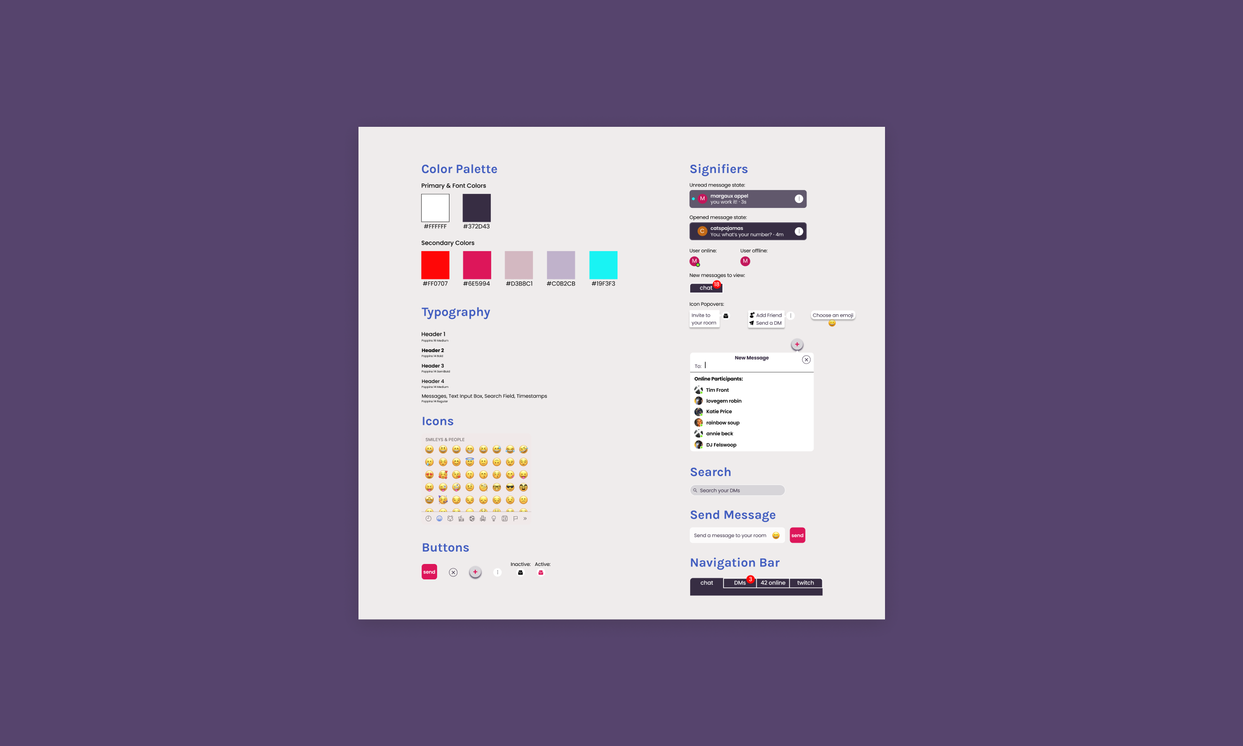
UI kit
I discussed my views and talked through the heuristic review I conducted of the current site with the stakeholders. From this discussion, they decided that they were open to making changes toward more accessible color ways and switching up some design patterns, but the dev team said that they did not want to do a complete overhaul of the site just yet. I decided to deliver designs of the chat feature to them within the existing framework (with lots of tweaks). But for myself, I also decided that I would not be happy with the final product unless I envisioned a complete redesign of the site.
I created this UI kit and the following designs in order to provide and produce deliverables that the team would be happy with for the time being. Following this process, I went off on my own to create designs that would make me happy. I shared these with the stakeholders in the end as well, and they were excited about the prospect of incorporating more of my designs down the line.
Hi-fi prototype (basic vs ideal models)
For this next phase, the stakeholders and I discussed key features and elements. They wanted me to create both a basic model that they could code relatively quickly and an ideal model that they could implement down the line. For this later phase, they wanted me to create another prototype option that had all the bells and whistles we discussed. For now, I took the bones of what I learned in my usability study and interviews.
The changes I implemented with the basic model:
changed the colors to make the feature more visually accessible
added the number of active members in each room
added the name of the room you’re currently in
added a direct message tab!
added the ability to invite someone to your room from the online tab
For the ideal version, I added:
hover states for buttons
an emoji library for all messages
“Mark as Read” and “Delete” options for direct messages
“Add friend”, “Send a DM” options for the online tab
changed the position of the + icon for sending new messages in the direct messages tab
I suggested that the team add a profile page, where there would be a backlog of direct messages and a friends list for each user. I left the kebab menu (3 dot menu on the right side of DMs tab) open to further options down the line. The main focus here was on the direct message or “DM” tab. We wanted to create and inspire more connectivity amongst users. I added functionalities and features to each tab with this goal in mind.
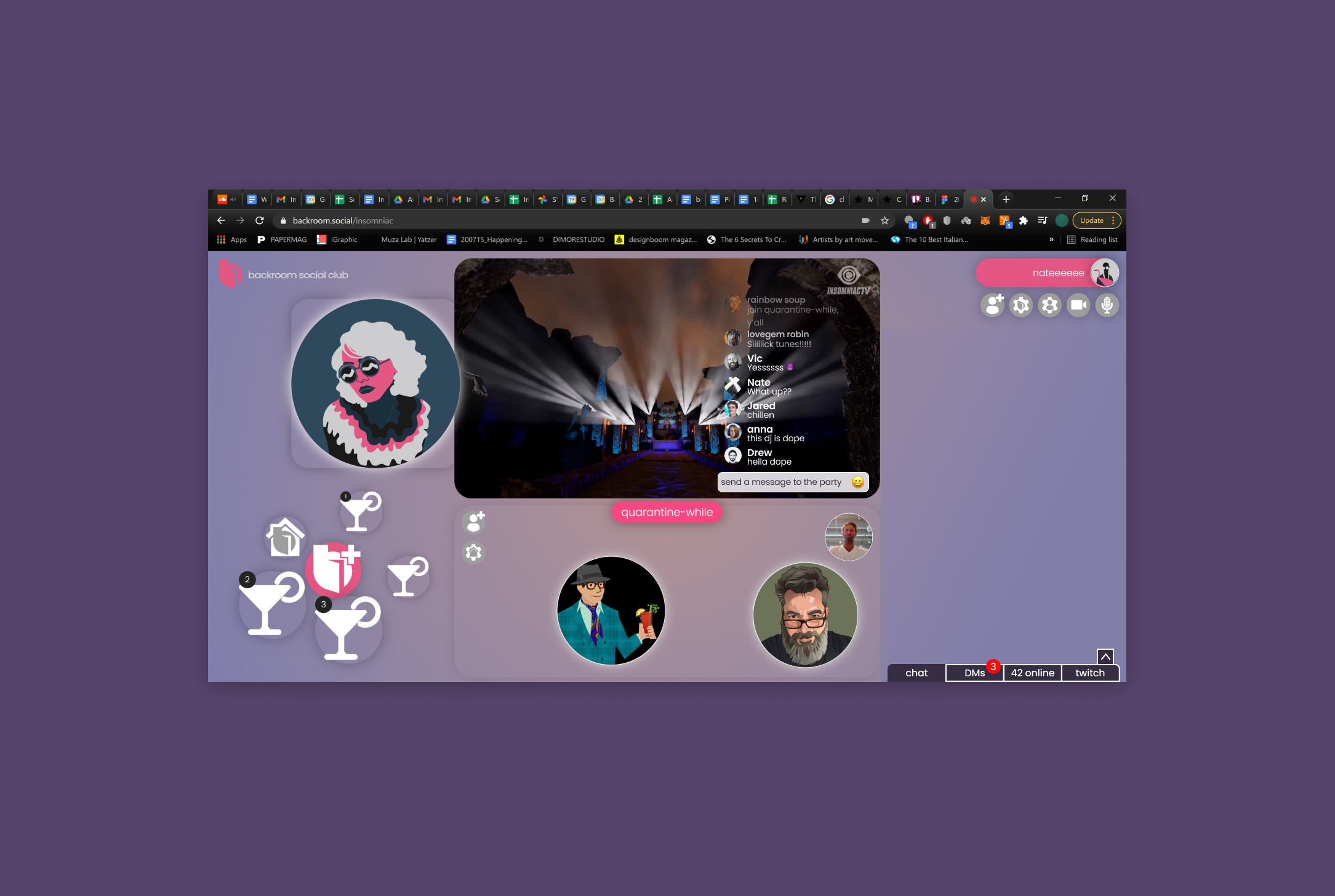
Room chat
For the room chat, I learned that users were not joining rooms because they had no idea who, if anyone was in that room. They also had trouble understanding which room was which and if there were new messages in that room. People were not entering rooms or entering the chat in the previous platform. In this new version, when users enter the site, they are in the lobby room. To switch rooms or join a specific room, users would click on the hamburger menu in the top left corner of the page. Within that menu, they’d click “JOIN A ROOM”, and from there they are able to join a specific room from a list of options.
I added these features to the room chat:
A signifier as to which room you’re in currently
The number of active members in that room
An option to add emojis
Added notification badges to the top of the tab
I also improved these aspects of the existing chat:
Enlarged the avatar pictures for better visibility
Improved accessibility by changing colors to fit WCAG standards and increase legibility of messages and usernames

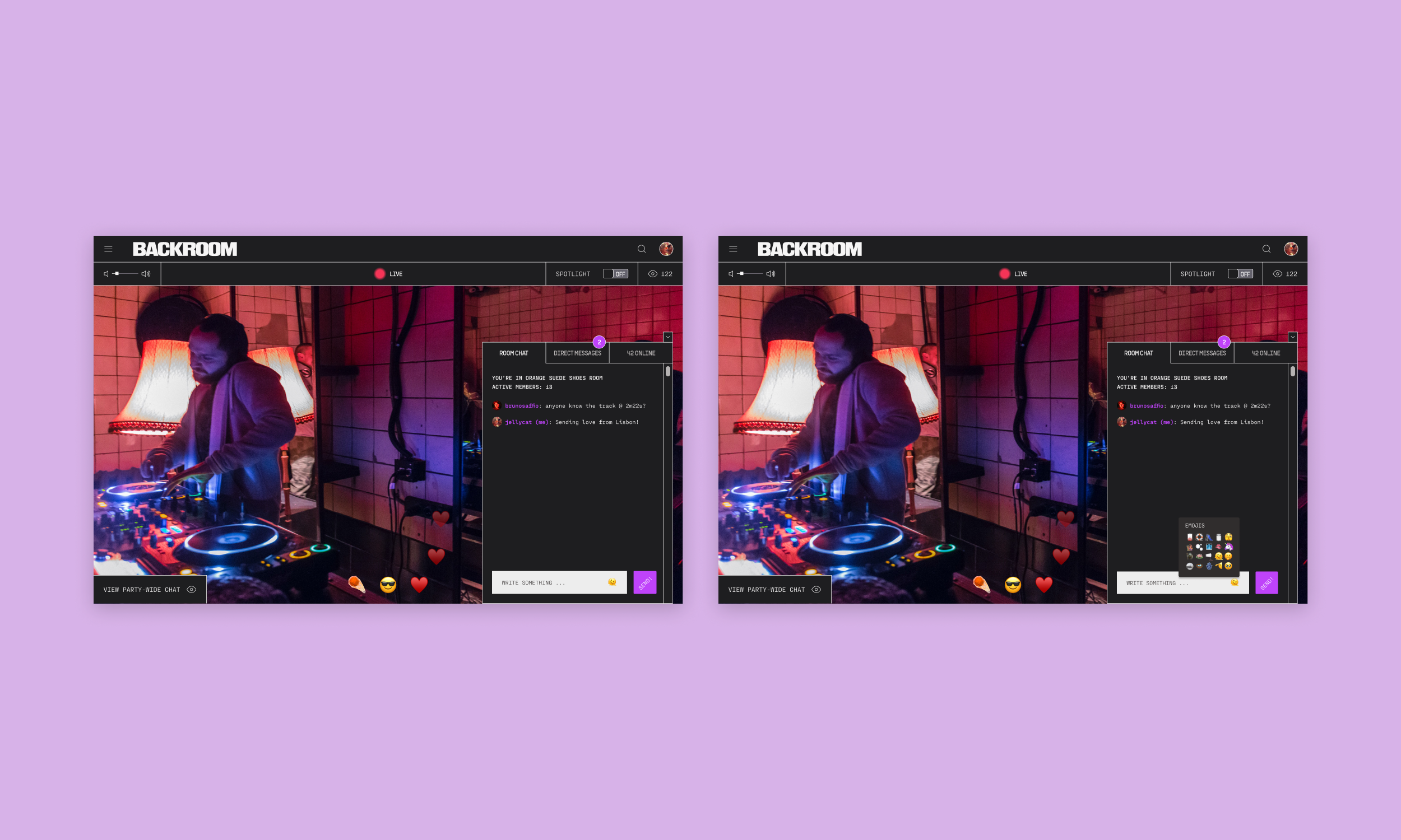
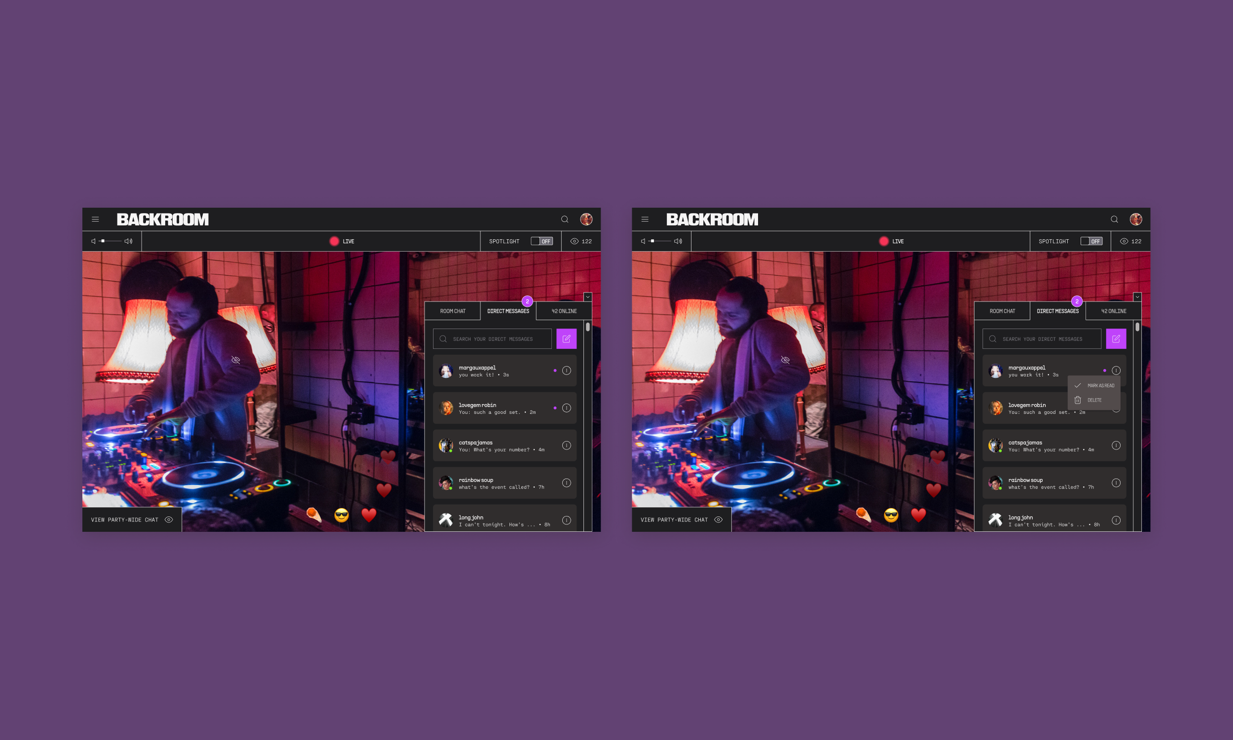
Direct messages
Since the direct message feature didn’t exist in the original version of the site, I was able to really ideate from the ground up. I used my research to come up with solutions based on what people told me they would like to see. Again, I was focusing on greater connectivity amongst users.
The idea of direct messages was to eventually take the site to more of a social media platform, where people would have profiles and “friends”.
In this tab, the features I included were:
The green dots on the bottom right of avatars signify “online”
Search field at the top for finding specific messages
Icon next to the search field to draft a new message
Kebab menu with the options “MARK AS READ” (mark the message as read) and “DELETE” (delete message)
The bright fuchsia dot next to messages signifies “unread”
The direct message feature was very fun and interesting to create because the stakeholders gave me free rein to go bold with ideation. I created the version you see below and I also created a basic model and ideal version for them to work with in the meantime, without overhauling the style of their entire site. In this project, I learned SO MUCH about working with stakeholders and creating a minimum viable project. I realized what I could push back on and how to ask questions to the dev team to help me understand the limitations of their time and ability.
Online tab
The original site didn’t have an online tab. From my research, I found that users were not interacting at all in the chat or even joining rooms really because they had no idea how many users were actually actively interacting in either. For the online tab, it was important to: 1) show how many members were online and 2) allow users to connect with those members easily.
In ideating ways to help users connect with members online and keep users online and interacting with the platform, I added some features to the online tab.
The features I included were:
An envelope icon with the function to invite that user to your room.
A kebab menu icon with the functions “ADD FRIEND” (the actual function of this would be featured in a “next steps” iteration) and “SEND A DIRECT MESSAGE” to that user.
I found it important to add functionality to the online tab so that users could gain more access to messaging and staying in contact with the people they meet and know on the site. Before, there was not a way to hone in on these more specific questions and it left people feeling disconnected on the site.

Usability testing
Using the Maze.co testing platform, I tested 4 different actions for my usability study: Viewing a specific direct message, marking a message as “read”, inviting someone to join your room, and checking/sending messages in the chat bar.
I had 11 participants for this study, ranging from 26 to 45 years old.
Test objectives
Find out if users understand how to move between tabs to find what they are looking for
Find out if the actions within the tabs are intuitive
Observe any areas of hesitation, confusion, difficulty, etc.
Takeaways
What felt right:
Participants performed well in navigating to the correct tabs to find what I was asking them to
3/4 of the tasks were completed with at least 72% of the participants having direct success.
All of the tasks were somewhat intuitive - the error rate was 0% across the board.
Room for improvement:
There was a high level of indirect success with marking messages as read
Participants wanted the ability to view the video as the main element, and have the other elements on the page expand and contract at their whim
Participants didn’t understand exactly who their messages were being sent to in the chat tab (the whole party? the room they were in?)
Some participants were confused about the meaning of “DM”
Usability study iterations
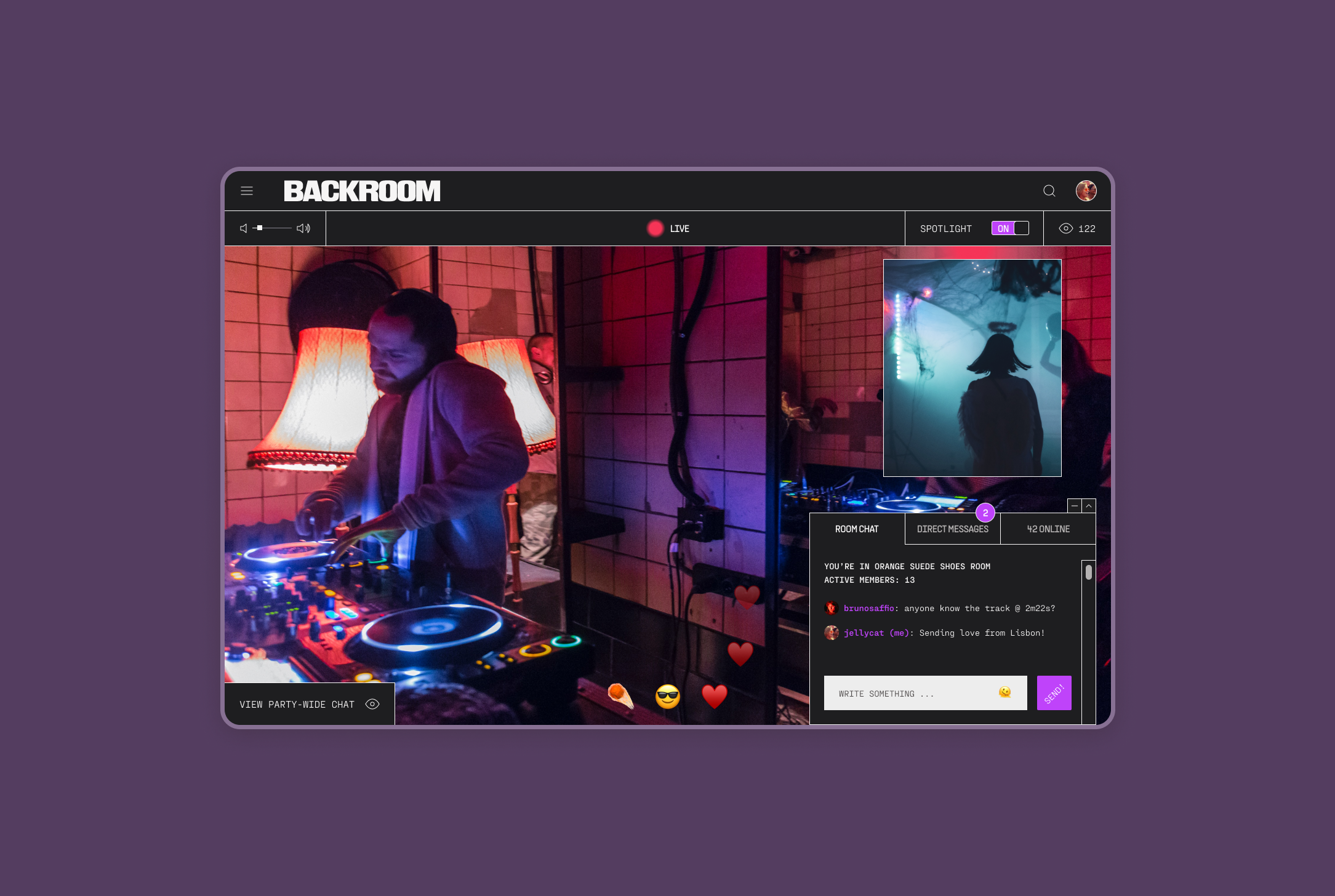
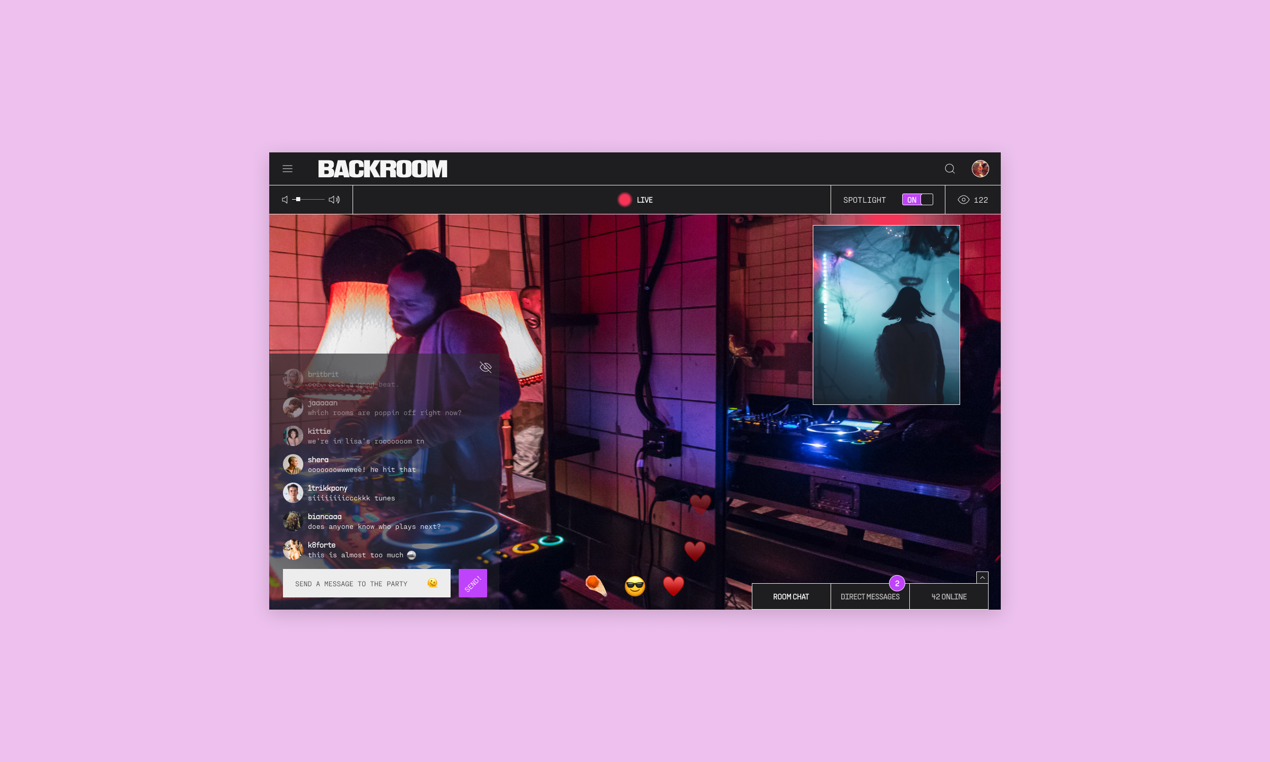
After I completed the usability study, I mocked up a new simple iteration to the site. I separated the room chat at the party-wide chat, as I think that was one of the biggest confusions amongst participants in my study. People were unsure of who their messages were reaching, but wanted the optionality of small room chats and chats that the entire event would be able to see and interact with. As a solution to this, I used a similar design pattern to Instagram live, with a disappearing stream of messages overlaid on the live stream.
I also added the option to expand or collapse the message tab in order to give the screen more whitespace. Another issue aesthetically, heuristically, and with my original usability study was that the site was way too cluttered. I wanted to incorporate the option to diminish the amount of elements on the page in order to decrease the visual overwhelm.
Hi-fidelity mockups (my own version)
The site as it was was very outdated and simple, so I decided to play with that and make my version appear a bit analog and brutalist. The user base is around the late 30s, early 40s age range, so I wanted to call back to a time in the internet that they had experience interacting with. I thought this could increase usability. Backroom is also a platform for musicophiles and ravers, so I wanted to mimic that in the visual design of my site. The focus in these frames is purely a pared down messaging platform.
Room chat
For the room chat redesign, I basically just took the ideal model I’d created and changed the UI. I also incorporated a way to collapse the tab so that the user could potentially just watch the video without the chat taking up space on the screen. I figured this would give more optionality to the members who wanted to only participate in the party-wide chat, or who wanted to just pop on the site to watch the live streaming.
Direct messages
I got feedback from the usability study I conducted that participants did not know what “DM” meant, so I changed the tab title to “DIRECT MESSAGES” to clear up any confusion. I also changed the icon for drafting a new message. I used the compose message icon, rather than the + symbol. The design of the list of direct messages before was a bit cluttered and confusing. Instead of keeping the message bar a different color and having a blue dot next to messages to indicate that they were unread, I just utilized a fuchsia dot in this version to indicate the same thing. I also gave the elements more breathing room by adding padding.
Online tab
I took the ideal model from my ideal model and I didn’t change much except for the visual design. I switched up the icons to make them more young and fresh, and I changed the text in the hover state of the buttons to be all capitalized, to go with the design of the rest of the page. I’m much happier with the overall look and feel of the redesign and I think the brand identity is much stronger and clearer. I also believe that the stylistic changes would lead to greater usability and accessibility because I really minimized the site and took out elements that were crowding the space, replacing them with simple signifiers and collapsible tabs.
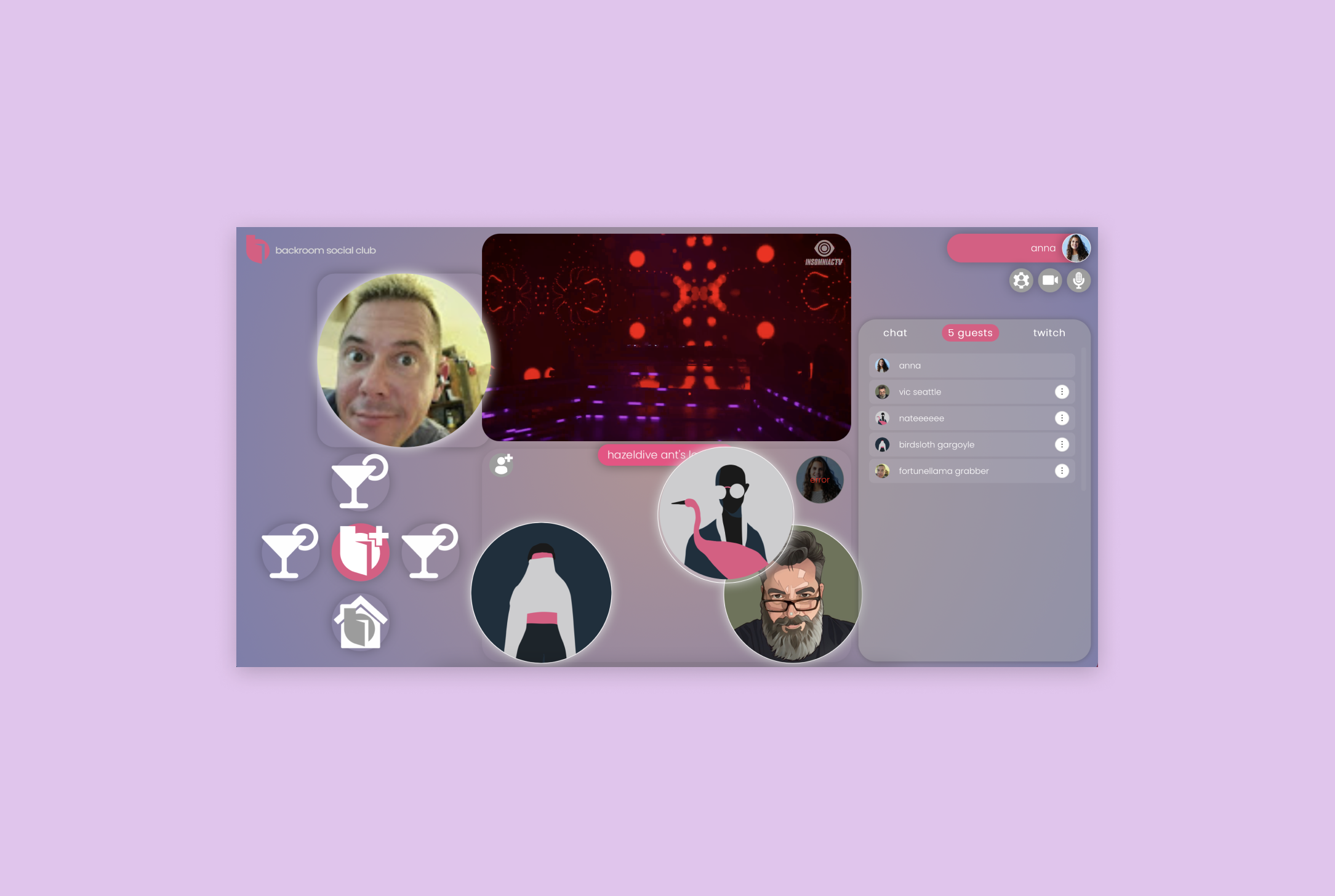
Simplifying the landing page
The original landing page was problematic on so many levels. Amongst the most important were that it didn’t meet accessibility guidelines, the spotlight was confusing, joining rooms didn’t make any sense to users, the imagery was very jumbled and chaotic, and users just basically had no idea what any of the icons and images meant.
I decided to pare the landing page down by compiling elements together and giving more breathing room to the live stream itself. This is what the users came to the site to view and interact with, after all. The martini glass icons were originally each separate rooms, but the users didn’t know this and were even more confused by the jumbled imagery in the bottom center of the page, which was meant to signify the room you are in and the members inside that room. Needless to say, no one “got” it.
In order to remove the confusion surrounding joining rooms, I added a hamburger menu to the top left of the page. This would allow users to join the room that they were interested in. Joining a specific room would also automatically enter users into the chat for that room, where they could interact with the members via messages.
The hamburger menu also allows for event organizers to schedule events. The site is not only for guests of music events. The stakeholders created it as a platform for event organizers to publicize and host events. It was important to showcase this in my mockups because on the landing page of the initial site, this was not obvious.


Tidying up and enhancing
In order for users to actually use and interact with secondary features on the site, it was paramount that they be aware of their functions. To improve functionality, I added signifiers. Before, no one that I interviewed understood what the spotlight was and people were frustrated that they could not remove the spotlight feature from their page since it took up so much real estate. Here, I added an “ON”/“OFF” toggle above the spotlight. As I mentioned before, I completely removed all the confusing room martini icons and the huge rectangle in the middle bottom of the page.
Party-wide chat
There was also a lot of confusion surrounding where the messages in the chat were being sent. Some users thought that they were going out to every active member on the site, and some thought they were going out to only the room. To clarify this misunderstanding, I separated the room chat (featured in the chat tab to the right) and the party-wide chat (projected as a disappearing stream overlaid on the live streaming video in the lefthand corner). In the top right corner, I added the number of members viewing the live stream so that users were able to tell how many people their messages were reaching.
The party-wide chat also functions to be able to write a message to the DJ/artist. Further, the stakeholders discussed the party-wide chat streaming on a projector at the live event, where guests would also have access to a tablet where they could interact with the people chatting from home. The party-wide chat is the most important feature connecting the people on the ground at the event and the viewers at home.
The emojis in the bottom center would be quantified under the recording of the event on the site. (i.e. DJ Koze live at KaterBlau in Berlin, 2022: ☄️ 80, 😎 100, ❤️ 158. The emojis I used in this mockup were just potential examples.
Project Takeaways
This project taught me how to work with a team for the first time. I loved collaborating with the other members of this start up. Bouncing ideas off one another and having weekly meetings was really beneficial to making important and insightful changes to the chat feature. In working with a team, I also understood the challenges a designer can face when trying to communicate the importance of certain design ideas to the dev team.
In this project, I faced the challenge of taking a UI kit and design patterns that were quite jumbled and inconsistent and altering the design to make the new features on the site heuristically sound and more minimalistic. This was a very difficult task, but one that was satisfying in the end because I saw that I was able to work within parameters that did not necessarily fit my aesthetic and was able to transform them into work that I am proud to show.
Further, I felt really empowered and excited to work on my own version of the site. I was able to ideate and challenge myself with finding design patterns that would work to incorporate a lot of different functions without the site looking too busy.
Next Steps
Include the ability to add friends
Have a friends list and a profile for each user
Add more functionality and options to the kebab (3 dot) menu in the direct messaging tab
Test my hi-fi version with users and iterate based on the feedback